Child Container Header
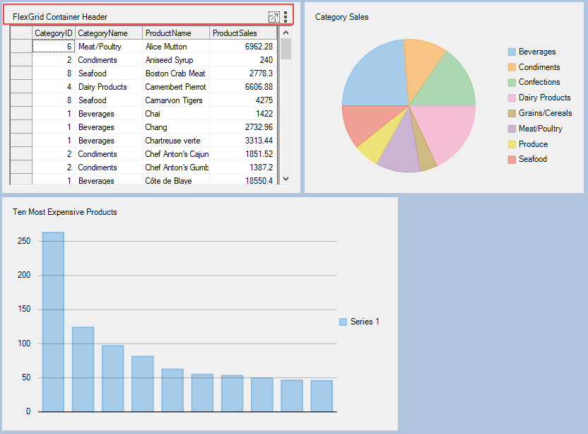
DashboardLayout allows you to display the child container header by using SetCaption method of the C1DashboardLayout class. This method sets caption for the header so as to make the header visible. The header consists of caption text, a maximize icon and tool-icon with three dots positioned vertically, which can be used to hide or drag the child container.
The following image shows a header in the child container.

For setting header on a child container, use the following code:
c1DashboardLayout1.SetCaption(c1DashboardLayout1.Items[0].ItemContainer, "FlexGrid Container Header");c1DashboardLayout1.SetCaption(c1DashboardLayout1.Items(0).ItemContainer, "FlexGrid Container Header")You can also add custom elements to the child container headers using Options.HeaderElements at design time. For more information on styling child container headers, see Dashboard Styling topic.
Child Container Context Menu
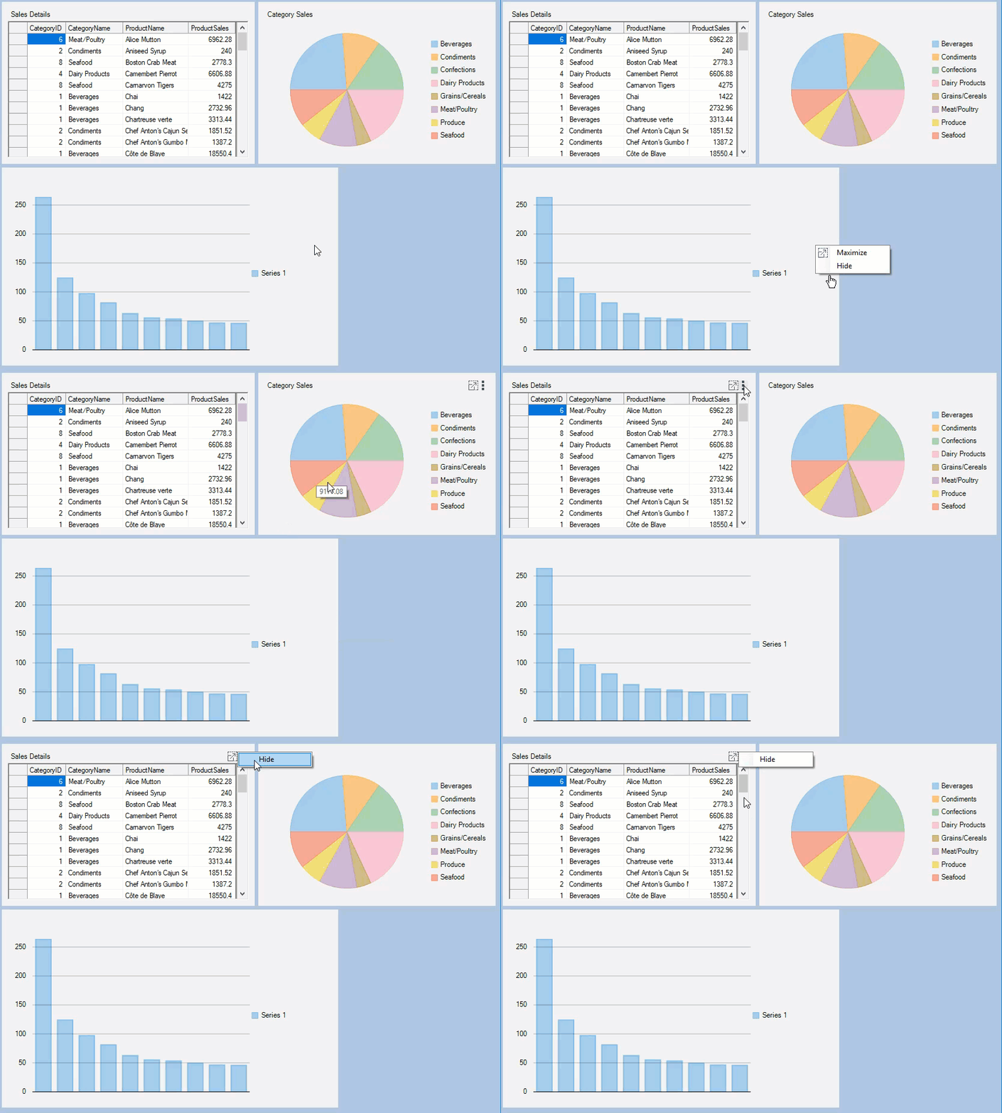
Child containers have embedded context menu which allows hiding or maximizing a child container. At runtime you can show this context menu with a right click on the empty area in a child container or with a click on the tool-icon.
The following GIF illustrates context menu displayed on right-clicking the child container.

The context menu can be customized using the ContextMenuStrip property of the DashboardOptions class. To create a custom context menu in DashboardLayout control, see Creating Custom Context Menu topic.


