- 2D Chart for WinForms Overview
- Key Features
- Chart for WinForms Quick Start
- Design-Time Support
- Chart Fundamentals
- Common Usage for Basic 2D Charts
- Specific 2D Charts
- Design-Time Tools for Creating 2D Charts
- Charting Data
- Data Binding
- Charting Labels
- Chart Area and Plot Area Objects
- Customizing Chart Elements
- Loading and Saving Charts, Data, and Images
- End-User Interaction
- Chart for WinForms Samples
- Chart for WinForms Tutorials
-
Chart for WinForms Task-Based Help
- Rotating the Y-Axis Title
- Rotating Data Labels
- Displaying the Data Label as a Percent in Pie Charts
- Setting the Font Style for Data Labels
- Adding a Data Label on Top of Each Bar
- Wrapping Labels
- Adding a Transparent Label to Adjust the Gap Between the Values and the X-Axis
- Displaying both the Chart Legend and Chart Header
- Displaying the Legends Vertically
- Getting the Slice of a Pie with a Click
- Creating a Marker
- Add Scrollbar to the X-Axis and Y-Axis
- Add Symbols to Data Series
- Add ToolTips to Chart Elements
-
Adding Visual Effects to Chart Elements
- Access the Visual Effects Designer
- Customize Header and Footer
-
Customize Data Series
- Add a Light Pattern to the Chart Data Series
- Add a Light Shape to the Chart Data Series
- Add a Preset Style to the Chart Data Series
- Add a Shadow to the Chart Data Series
- Adjust the Focus of the Light for the Chart Data Series
- Use the Color Sliders to Enhance an Existing Color for the Chart Data Series
- Increase the Size of the Symbols in the Data Series
- Creating and Formatting Chart Elements Using the Properties Window
- Creating and Formatting Chart Elements Using the Smart Designer
- Candle Chart Tasks
- Frequently Asked Questions
Use the Color Sliders to Enhance an Existing Color for the Chart Data Series
To create a custom color for the Chart Data Series, complete the following steps:
- Open the Chart Properties designer.For details on how to access the Chart Properties designer see Working with the Chart Properties Designer.
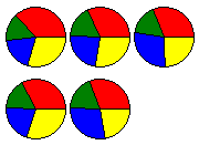
- Set series 0 to red, series 1 to green, series 2 to blue, and series 3 to yellow. For details on how to apply color to the data series using the Chart Properties designer see Modify the Appearance of the Data Series. The colors for each series appear like the following.

- Open the Visual Effects designer. For details on how to access the Visual Effects designer see Access the Visual Effects Designer.
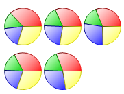
- In the Available Elements list box, click on the box next to Default. The default visual effects settings for the data series appear on the Chart2D control.

- Click on the Colors tab, and then slide the Brightness slider to the value -55. The color appears less bright.
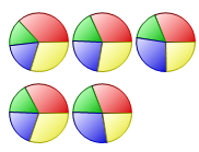
- Slide the Saturation slider to the right and stop at 100. The Saturation is increased to 100% and the color tone appears more pure and vivid. The original colors for the data series are enhanced.

As an option, to change the colors for the data series, complete the following
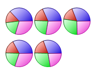
- In the Colors tab, slide the HueShift slider to 247. Notice as you move the slider the colors change.


