ComponentOne RadialGauge for ASP.NET Web Forms
Quick Start / Step 3 of 3: Customizing C1RadialGauge's Behavior
In This Topic
    Step 3 of 3: Customizing C1RadialGauge's Behavior
    In This Topic

    In this step you'll add a slider control. When the thumb button of the slider is moved at run time, the value of the gauge control will change. The following steps assume you've completed Step 2 of 3: Customizing C1RadialGauge's Appearance topic.
    Complete the following steps:

    1. In Source view, add the following markup just below the </cc1:C1RadialGauge> tag to add text:

      <p>Drag and release the slider's thumb button to change the gauge's value:</p>
    2. In Source view, add the following markup just below the <p> tag  you just added to add a slider control to the page:

      <div id="slider" style="width: 400px"></div>

      The page now includes a slider control.

    3. In Source view, add the following markup just below the </div> tag  you just added to enable the slider control:
       <script type="text/javascript">
      $(document).ready(function () {
      $("#slider").slider({
      value: $("#<%= C1RadialGauge1.ClientID %>").c1radialgauge("option", "value"),
      change: function (event, ui) {
      $("#<%= C1RadialGauge1.ClientID %>").c1radialgauge("option", "value", ui.value);
      }
      });
      });
      </script>

      Now when the slider's value changes, the gauge's value will also change to reflect the new value.
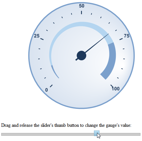
    4. Run the application and observe that the control displays the changes that you made:

    5. Click the slider's thumb button and preform a drag-and-drop operation. Notice the C1RadialGauge control's value changes to reflect the value of the slider control.
      In this step you customized the behavior of the controls. Congratulations, you've completed this quick start guide!
    See Also