Report Designer Interface
The report designer allows you to create and modify report templates. Its user interface consists of several components described below.
Toolbox
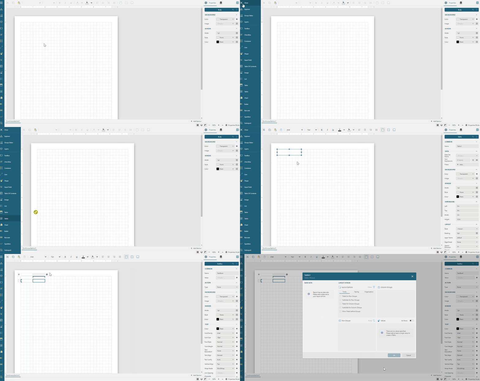
The Toolbox enumerates available report items. By default, the toolbox shows icons, but you can expand it using the hamburger menu on the designer's top-left corner to see the report item names.
To add a report item into a report, you can either double-click the corresponding item in the toolbox or drag-and-drop it into a specific report area.
Expand to watch adding a report item in action
Report Explorer
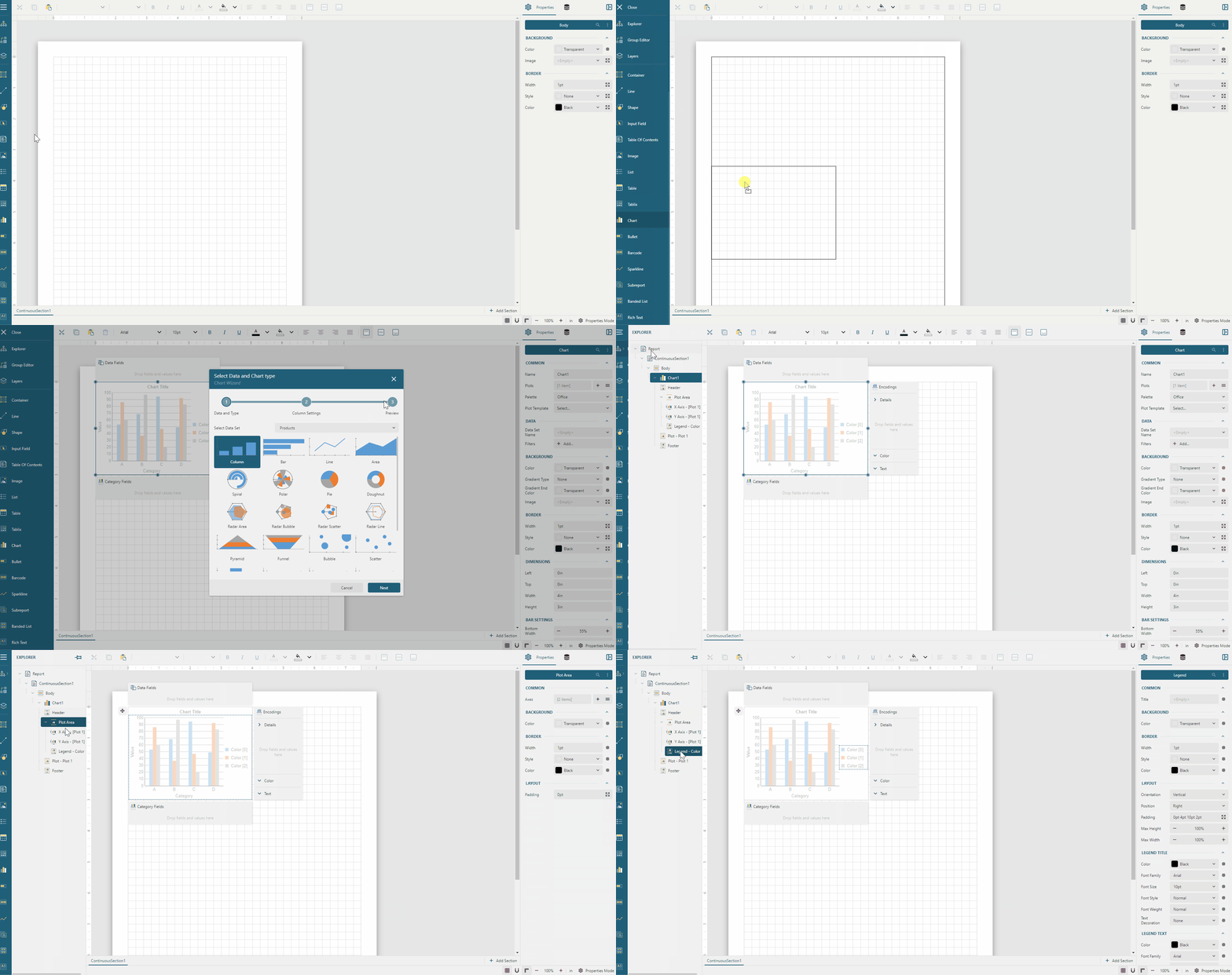
The Report Explorer allows you to navigate the report structure and quickly select a report item or its part. To open the report explorer, click the tree icon beneath the open toolbox button on the designer's top-left corner. You could also pin the report explorer to keep it open using the corresponding button. Click an item in the hierarchical report structure to select it.
Expand to watch using the report explorer in action
Group Editor
The Group Editor can be used to navigate the Tablix structure and quickly modify it by adding or removing tablix members. To open the group editor, click the icon beneath the open report explorer button on the designer's top-left corner. You could also pin the group editor to keep it open using the corresponding button. Check the Tablix documentation to learn more about using the group editor.
Report Layers Editor
The Report Layers editor can be used to add or remove Report Layers and modify their properties. Visit the Report Layers page for more information.
Toolbar
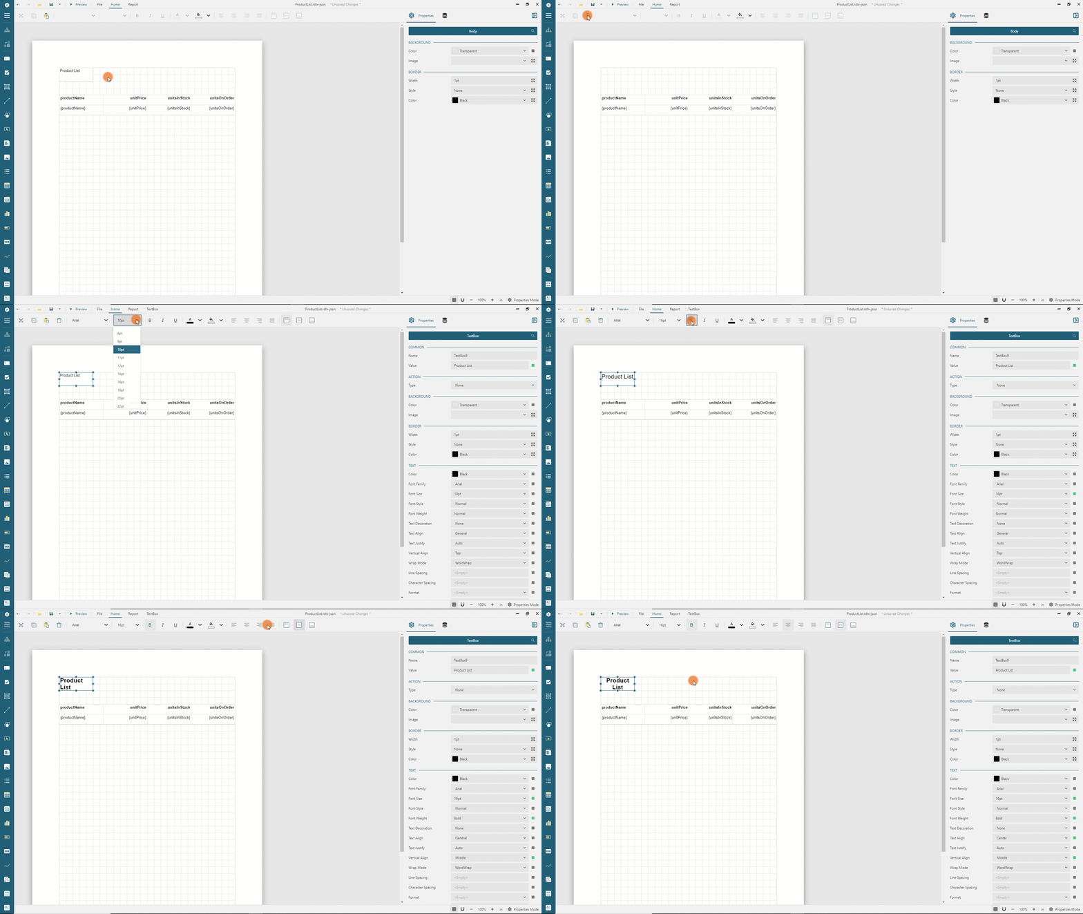
The Toolbar located on the top of the report designer allows you to cut, copy, paste and delete a report item and also to configure its text properties.
Expand to watch using the toolbar in action
Report Layout
The Report Layout is a visual surface in the form of a page that displays report items and allows to select and re-arrange them. You can use the UI element on the right-bottom corner of the report designer to configure various design-time properties of this page surface.
Use the
Gridbutton to show or hide the grid.Use the
Zoom out,Zoom in, orZoom levelbuttons to set the zoom level.Use the drop-down menu of the magnet-like icon to set the
Grid Size, and configure the following options.Snap to Grid- if it is enabled, then report items' location and size will be aligned to the grid points.Snap to Guides- if it is enabled, then the report designer displays the guidelines that allow you to easily align the size and location of a report item with other report items.
Property Inspector
The Property inspector is located on the right side of the report designer and consists of two components: the Properties panel and the Data Panel.
Properties panel
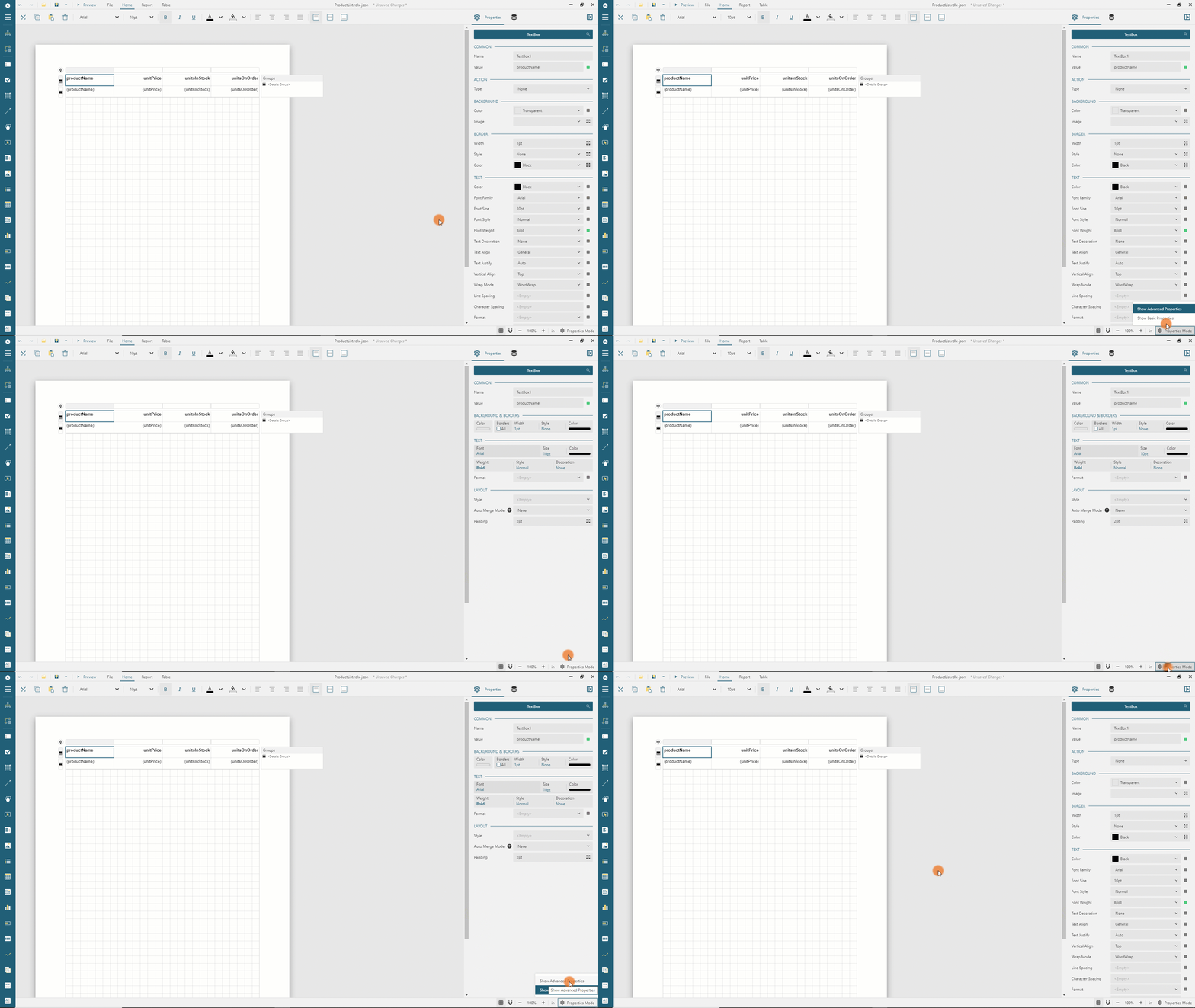
The Properties panel is opened by default and allows you to modify report item properties. The Basic mode only displays the essential properties, while the Advanced mode shows all the properties. You can use the drop-down menu on the right-bottom side of the report designer to switch between Basic and Advanced modes. On the left side of this drop-menu, you can find the switch that sets the default unit of measure for Length units.
Expand to watch Basic and Advanced modes in action
Data Panel
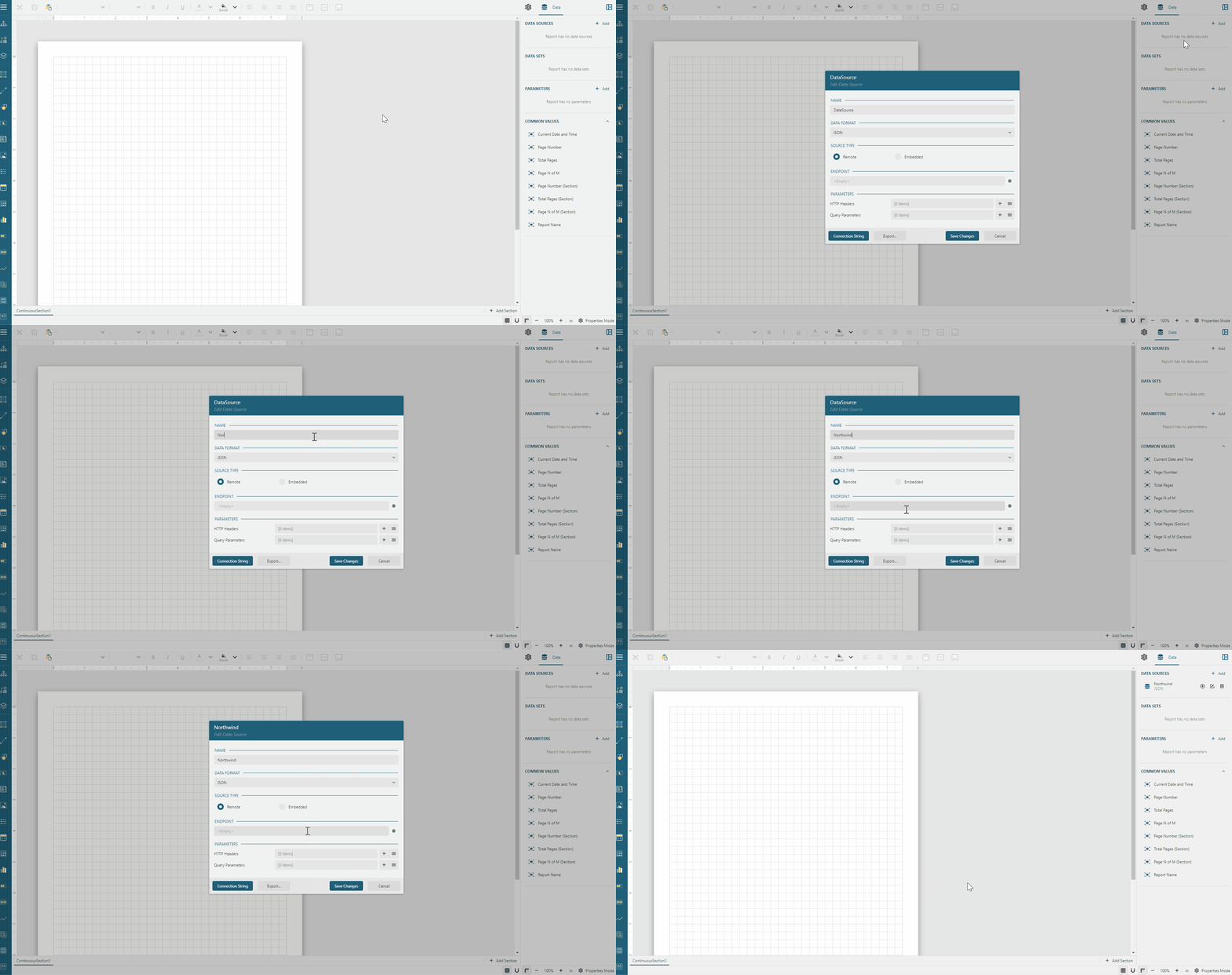
The Data panel encapsulates several functions.
It allows configuring Data Binding
It can be used to add, remove, and re-arrange the order of Report Parameters
It displays the list of global values that you can drag and drop into a report
Expand to watch using the data panel in action
Explore function
After configuring the data binding for your report, you can use the Explore feature to quickly create a data visualization for a data set.
Click the
Exploreicon next to a data set's name to generate a visualization from all of its fields: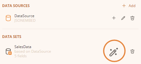
Alternatively, to visualize only a subset of fields, click the
Expandbutton next to the dataset name, click theSelect Fields...button that replaces it, choose the fields you want to visualize, then click theExplorebutton.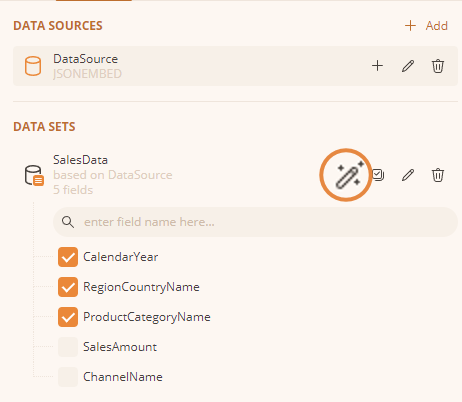
What happens next depends on whether AI assistance is configured for the report designer — either via the
ai-config.jsonfile when using the Standalone Report Designer, or, when the report designer is embedded in your own application, via the AI reporting capabilities that host application enables.AI assistance not configured: the designer falls back to the built-in
Instant Visuals, which analyze the data set's field names and types with a static algorithm and immediately suggest chart, table, and pivot table visualizations.AI assistance configured: the designer sends the data set's field names and types — never the underlying data values — to the configured AI provider, and shows a cancellable progress panel while the visualizations are generated:
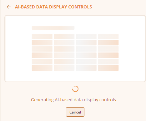
If the request to the AI provider fails, for example because of a connectivity or configuration problem, the designer asks whether to retry or fall back to
Instant Visualsinstead: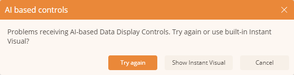
Once the visualizations are ready — whether generated by AI or by
Instant Visuals— they appear as a set of cards, each with a short description of what it shows. In the example below, the panel offers two tablixes and a bar chart summarizing sales data: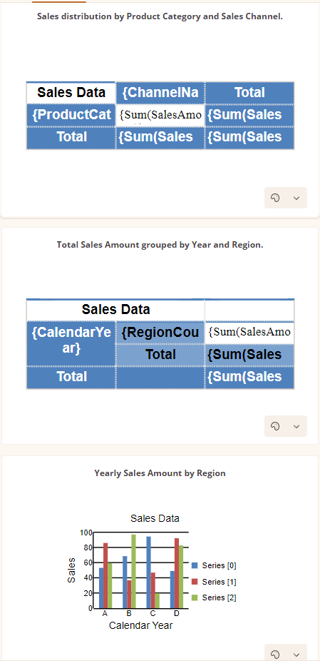
For each card, use the drop-down menu in its bottom-right corner to choose a color theme. Add a visualization to the report by clicking it, or by dragging and dropping it onto the report layout.## Expression editor
Expression editor
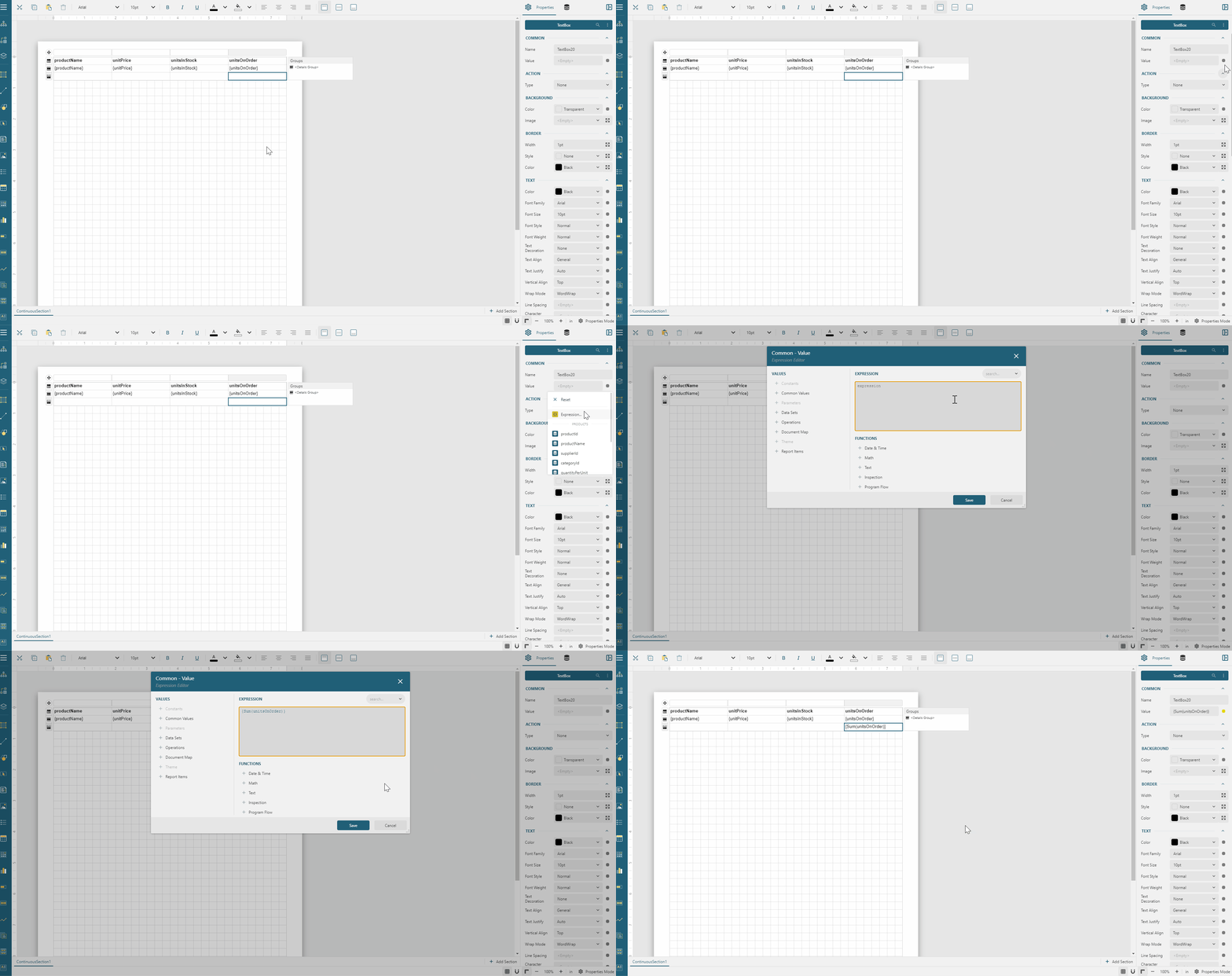
The Expression Editor is the dialog that easily composes an expression. You can open it using the drop-down menu that appears if you click the box on an expression-based property editor's right boundary. The left side of the expression editor enumerates available constants, functions, and references. Visit the expressions documentation for more information. Double click an item to add into a resulting expression that displays on the right side.
Expand to watch using the Expression Editor in action
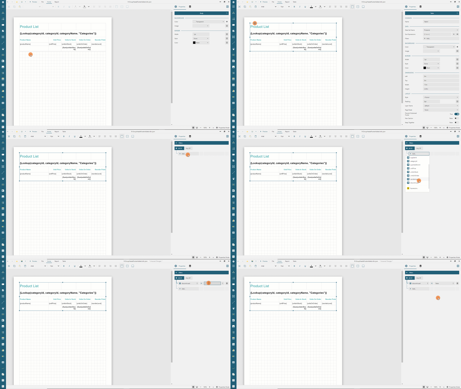
Filters editor
The Filters editor is the interface that allows you to easily configure conditions for excluding the data to be displayed in a data region or its part, such a table group. The Filters Editor opens when you click the editor of the Filters property that shows either the Add... text if no filters have been added yet, or the Edit... text otherwise.
Expand to watch using the Filters editor in action