
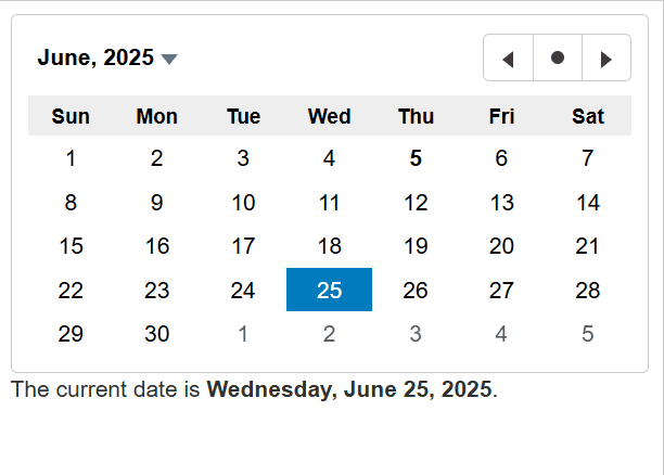
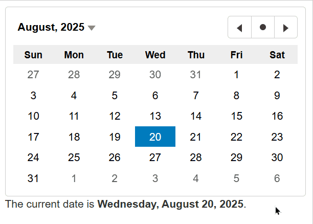
Calendar Overview
The Calendar control displays a one-month calendar and allows users to select a date. Use the value property to get or set the currently selected date.
By default, user can select a day in the Calendar control. This default behavior can be changed by using the selectionMode property which determines whether user is allowed to select days, months, or no values at all. Use the min and max properties to restrict the range of dates that user can select.
HTML
<input id="theCalendar" />Javascript
import * as wijmo from '@mescius/wijmo';
import * as input from '@mescius/wijmo.input';

function init() {
    // the calendar
    let theCalendar = new input.Calendar('#theCalendar', {
        valueChanged: () => showCurrentDate()
    });
}
You can use keyActionTab to modify the behavior of the Tab and Shift+Tab keys in the Calendar control, making it easier to navigate the Calendar using the keyboard.
import * as input from '@mescius/wijmo.input';

new input.Calendar('#theCalendar', {
    keyActionTab: input.CalendarTabKeyAction.All // all functional elements can receive focus
});
To pre-select dates via keyboard, you can enable focusMode, which allows date pre-selection without altering the Calendar's value. In this mode, a hover effect will be applied to the dates.
import * as input from '@mescius/wijmo.input';

new input.Calendar('#theCalendar', {
    focusMode: true // enable focus mode
});