
-
Spread Windows Forms Product Documentation
- Getting Started
-
Developer's Guide
- Understanding the Product
- Working with the Component
- Spreadsheet Objects
- Ribbon Control
- Sheets
- Rows and Columns
- Headers
- Cells
-
Cell Types
- Understanding Cell Type Basics
- Understanding How Cell Types Work
- Understanding How Cell Types Display and Format Data
- Understanding How Cell Type Affects Model Data
- Working with Editable Cell Types
-
Working with Graphical Cell Types
- Setting a Barcode Cell
- Setting a Button Cell
- Setting a Check Box Cell
- Setting a Color Picker Cell
- Setting a Combo Box Cell
- Setting a Hyperlink Cell
- Setting an Image Cell
- Setting a List Box Cell
- Setting a Multiple-Column Combo Box Cell
- Setting a Multiple Option Cell
- Setting a Progress Indicator Cell
- Setting a Slider Cell
- Understanding Additional Features of Cell Types
- Data Binding
- Customizing the Sheet Appearance
- Customizing Interaction in Cells
- Tables
- Pivot Table
- Understanding the Underlying Models
- Customizing Row or Column Interaction
- Formulas in Cells
- Sparklines
- Keyboard Interaction
- Events from User Actions
- File Operations
- Storing Excel Summary and View
- Printing
- Chart Control
- Enhanced Chart
- Customizing Drawing
- Touch Support with the Component
- Spread Designer Guide
- Assembly Reference
- Import and Export Reference
- Version Comparison Reference
Setting a Button Cell
You can display a button in a cell using the button cell. A button cell, by default displays a rectangular button with a default color; you can customize the text, color, and an image for that button as well as specify certain aspects of its behavior when clicked.
To create a cell that acts like a button, use the ButtonCellType class and the settings that are summarized here. You can create a button cell using the examples shown in this topic or in the topics for the individual members of the ButtonCellType class.
Customizing the Button Appearance
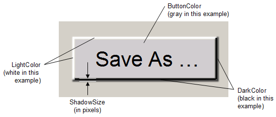
Button cells can display text, pictures, or both. If they display pictures, you can choose that a different picture is displayed when the button is pressed. You can customize the colors in button cells, including the color of the border, text, and background. In addition, button cells can display a three-dimensional appearance, and you can customize the colors of the highlight and shadow in the appearance. The following properties relate to the overall appearance of the button cell.
Property | Description |
|---|---|
Sets how the background is rendered. | |
Sets the color of the button. | |
Sets the secondary color used when drawing a gradient button. | |
Sets the color at the bottom and right edges of the button (that give it the three-dimensional appearance along with the light color). | |
Sets the drawing style of a gradient button. | |
Sets the color at the top and left edges of the button (that give it the three-dimensional appearance along with the dark color). | |
Sets an image that fills the surface of the button. Any GDI+ bitmap can be used, such as a BMP, GIF, or JPG file. If you are using a two-state button, this serves as the unpressed state. | |
Sets an image for the pressed state of the button. | |
Sets the thickness of the shadow, and the dark and light colors (that give it the three-dimensional appearance). | |
Sets whether the button functions as a toggle switch with two states. Each time you click the button, the button changes state. |
By default, the button has a single state, and changes its appearance only as long as you have the pointer over it with the mouse button pressed. For this setting, button cells behave like push buttons, which you can press by pressing your left mouse button, and which do not stay pressed when you release your mouse button. Alternatively, you can set the button to be a two-state button and then the button toggles between those two states when clicked. The button is clicked when the user clicks anywhere in that cell. The button stays pressed when you click it using your left mouse button. Buttons are False when they are not pressed, and True when they are pressed.
Customizing the Text Appearance
You can specify the text that is displayed in the button cell and you can specify the appearance of that text. You can specify the alignment of text alongside pictures in button cells as well as whether to wrap text to multiple lines.
The following properties relate to the text that is displayed in the button cell.
Property | Description |
|---|---|
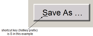
Sets whether to display the underline that indicates the access key (keyboard shortcut or hot key). | |
Sets the text that appears in the button. | |
Sets the alignment of the text with respect to a picture | |
Sets the color of the text in the button. | |
Sets the text of the button when it is pressed, if it is a two-state button. | |
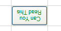
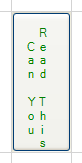
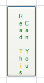
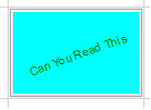
Sets the orientation of the text in the button. See the following table that shows examples of the various orientations. | |
Sets whether to wrap the text to multiple lines. |
Here are the results of different settings of the TextOrientation property.
Text Orientation | Example Button | Text Orientation | Example Button |
|---|---|---|---|
Text Horizontal |
| Text Horizontal Flipped |
|
Text Vertical |
| Text Vertical Flipped |
|
Text TopDown |
| Text TopDown RTL |
|
Text RotateCustom |
|


Beyond the properties of the button cell itself, you can also set a property in the FpSpread class that affects how buttons behave. The FpSpread class has a ButtonDrawMode property for button cells and combo box cells. This property allows you to always show a button, or show buttons in the current column, row, or cell.
Note that some graphical elements in certain cell types are affected by XP themes (visual styles). Setting the VisualStyles property of the Spread component to "off" can allow visual customizations of those graphical cell types to work as expected. For more information, refer to Using XP Themes with the Component.
For more information on the properties and methods of this cell type, refer to the ButtonCellType class.
For more information on the corresponding event when a user clicks on the button, refer to the FpSpread.ButtonClicked event.
Using the Properties Window
At design time, in the Properties window, select the Spread component.
Select the Sheets property.
Click the button to display the SheetView Collection Editor.
In the Members list, select the sheet in which the cells appear.
In the property list, select the Cells property and then click the button to display the Cell, Column, and Row Editor.
Select the cells for which you want to set the cell type.
In the property list, select the CellType property and choose the Button cell type.
Expand the list of properties under the CellType property. Select and set these specific properties as needed.
Click OK to close the Cell, Column, and Row Editor.
Click OK to close the SheetView Collection Editor.
Using Code
Define the button cell by creating an instance of the ButtonCellType class.
Specify the properties of the button by setting the properties of that instance, such as Text, TwoState, and ButtonColor.
Assign the button cell type to a cell or range of cells by setting the CellType property for a cell, column, row, or style to the ButtonCellType object.
Example
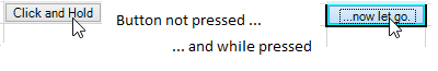
This example creates a button with text in a blue colored button. It defines the text to be different when the mouse pointer is held down. This example creates the button shown in the first part of this topic.
FarPoint.Win.Spread.CellType.ButtonCellType bttncell = new FarPoint.Win.Spread.CellType.ButtonCellType();
bttncell.ButtonColor = Color.Cyan;
bttncell.DarkColor = Color.DarkCyan;
bttncell.LightColor = Color.AliceBlue;
bttncell.TwoState = false;
bttncell.Text = "Click and Hold";
bttncell.TextDown = "...now let go.";
bttncell.ShadowSize = 3;
fpSpread1.Sheets[0].Cells[0,2].CellType = bttncell;
fpSpread1.Sheets[0].SetColumnWidth(2,90);
Dim bttncell As New FarPoint.Win.Spread.CellType.ButtonCellType()
bttncell.ButtonColor = Color.Cyan
bttncell.DarkColor = Color.DarkCyan
bttncell.LightColor = Color.AliceBlue
bttncell.TwoState = False
bttncell.Text = "Click and Hold"
bttncell.TextDown = "...now let go."
bttncell.ShadowSize = 3
fpSpread1.Sheets(0).Cells(0,2).CellType = bttncell
fpSpread1.Sheets(0).SetColumnWidth(2,90)Using the Spread Designer
Select the cell or cells in the work area.
In the property list, in the Misc category, select CellType. From the drop-down list, choose the Button cell type. Now expand the CellType property and various properties are available that are specific to this cell type. Select and set those properties as needed.
Or right-click on the cell or cells and select Cell Type. From the list, select Button. In the CellType editor, set the properties you need. Click Apply.
From the File menu choose Apply and Exit to apply your changes to the component and exit Spread Designer.
See Also
Setting a Multiple-Column Combo Box Cell
Setting a Multiple Option Cell
Setting a Progress Indicator Cell
Setting a Multiple-Column Combo Box Cell
Setting a Multiple Option Cell
Setting a Progress Indicator Cell
Setting a Multiple-Column Combo Box Cell
Setting a Multiple Option Cell