-
Spread for ASP.NET 18 Product Documentation
-
Developer's Guide
- Getting Started
- Understanding the Product
- Namespaces Overview
- Working with the Spread Designer
-
Customizing User Interaction
- Customizing Interaction with the Overall Component
- Working with AJAX
-
Customizing the Toolbars
- Customizing the Command Bar on the Component
- Customizing the Command Buttons
- Changing the Command Button Images
- Hiding a Specific Command Button
- Working with the SaveExcel button on the CommandBar
- Displaying the Sheet Names
- Customizing Page Navigation
- Customizing Page Navigation Buttons on the Client
- Customizing the Hierarchy Bar
- Customizing Interaction with Rows and Columns
- Managing Filtering of Rows of User Data
- Customizing Grouping of Rows of User Data
- Customizing Sorting of Rows of User Data
- Customizing Interaction with Cells
- Customizing Selections of Cells
- Managing Printing
- Customizing the Appearance
- Customizing with Cell Types
- Managing Data Binding
- Managing Data in the Component
- Managing Formulas
- Managing File Operations
- Using Sheet Models
- Maintaining State
- Working with the Chart Control
- Using Touch Support with the Component
- Assembly Reference
- Client-Side Scripting Reference
- Import and Export Reference
-
Developer's Guide
Displaying the Sheet Names
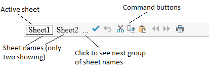
You can customize how and if to display the sheet names in the bar at the bottom of the component. Since a component may have more than one sheet, the tabs (or buttons) in the command bar contain the sheet names and provide a way to navigate to different sheets. These are called sheet name tabs. The default sheet names are Sheet0, Sheet1, etc. You can specify other names for the sheets and these appear in the sheet name tabs. By default, the component has only one sheet and so no sheet name tabs are displayed. When you add a sheet, as described in Adding a Sheet, the sheet name tabs are added to the command bar for display.
You can set how many sheet name tabs are displayed. If the number of tabs exceeds the value specified, an ellipses is displayed. Click the ellipses to display the next (or previous) set of sheet names. You can also set the increment for advancing the sheet names. Be sure not to set the increment bigger than the number displayed if you want to be able to see all the sheet name tabs. You can set which sheet number displays first. These are all properties of the TabInfo class.
!type=note
Note: The sheet changes when you click a different sheet name tab or when you click on the ellipses. When you click on the ellipses, the lowest number sheet in the set of sheet names is displayed.

Using Code
To define when the sheet name tabs are displayed, use the TabControlPolicy property of the TabInfo class and the settings of the TabControlPolicy enumeration.
Determine the various settings using the Tab property of the FpSpread component. Determine how many sheet name tabs to display using the VisibleCount property, how many to increment with the ScrollIncrement property, and which is the first visible sheet name with the FirstVisibleTab property of the TabInfo class.
Determine the appearance of the sheet name tabs, such as the background color, the text color, and the text of the sheet name using the properties of the TabInfo class for the Tab property of the component.
Example
In this example, set the sheet name tabs to always appear below the sheet at the bottom of the component and show only two sheet names (two tabs) and set the background color of the active tab to green.
FpSpread1.Sheets.Count = 3;
FpSpread1.Tab.TabControlPolicy = FarPoint.Web.Spread.TabControlPolicy.Always;
FpSpread1.Tab.VisibleCount = 2;
FpSpread1.Tab.ScrollIncrement = 2;
FpSpread1.Tab.FirstVisibleTab = 1;
FpSpread1.Tab.TextColor = Color.Yellow;
FpSpread1.Tab.ActiveTabBackColor = Color.Green;
FpSpread1.Tab[0] = "First";
FpSpread1.Tab[1] = "Second";
FpSpread1.Tab[2] = "Third";
FpSpread1.Tab.TabControlPolicy = FarPoint.Web.Spread.TabControlPolicy.Always
FpSpread1.Sheets.Count = 3
FpSpread1.Tab.VisibleCount = 2
FpSpread1.Tab.ScrollIncrement = 2
FpSpread1.Tab.FirstVisibleTab = 1
FpSpread1.Tab.ActiveTabBackColor = Color.Green
FpSpread1.Tab.TextColor = Color.Yellow
FpSpread1.Tab(0) = "First"
FpSpread1.Tab(1) = "Second"
FpSpread1.Tab(2) = "Third"Using the Spread Designer
Select the Settings menu.
Select the General icon under the Spread Settings section.
Select Tab and specify the policy settings.
Click OK.
Click Apply and Exit to close the Spread Designer.


