-
Spread for ASP.NET Product Documentation
-
Developer's Guide
- Getting Started
- Understanding the Product
- Namespaces Overview
- Working with the Spread Designer
- Customizing User Interaction
- Customizing the Appearance
- Customizing with Cell Types
- Managing Data Binding
- Managing Data in the Component
- Managing Formulas
- Managing File Operations
- Using Sheet Models
- Maintaining State
- Working with the Chart Control
- Using Touch Support with the Component
- Assembly Reference
- Client-Side Scripting Reference
- Import and Export Reference
-
Developer's Guide
Customizing the Appearance of Headers
You can customize the appearance of header cells. These tasks relate to customizing the appearance of header cells for rows or columns in the sheet:
Headers provide labels to identify the columns and rows. They appear at the top (for columns) and to the left (for rows) of the data cells and are formatted differently to be clearly seen. You may customize the appearance of header cells as you would any of the cells in the spreadsheet component. When you work with row headers and column headers, you can manipulate the objects using the short cuts in code (RowHeader and ColumnHeader classes), or you can directly manipulate the model. Most developers who are not changing anything drastically find it easy to manipulate the short cut objects.
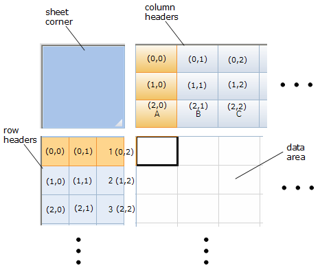
The figure below shows the parts of the headers and the coordinates of cells in headers that have multiple rows and columns.

For more information on the Cell and Cells objects, refer to the Assembly Reference.
For more information on models, refer to Using Sheet Models.
For information on footers, refer to Displaying a Footer for Columns or Groups.


