In This Topic
The appearance of charts can be customized by using several other chart properties provided by the Chart field. Few chart properties that are commonly used are as follows:
- Aggregate: This property allows you to create charts that automatically aggregate data values that have the same category using an aggregate function of your choice (sum, average, standard deviation, and so on). See
Creating Aggregate Charts for more details.
- DataColor: This property selects the color used to draw the bars, columns, areas, scatter symbols, and pie slices. If the chart contains multiple series, then the Chart field automatically generates different shades of the selected color for each series. If you want to select specific colors for each series, use the Palette property instead, and set its value to a semi-colon separated list containing the colors to use (for example "Red;Green;Blue").
- DataX, DataY: These properties allows you to set the fields and the plot data required to be displayed in the chart. See Plotting Data in Charts for more details.
- FormatX, FormatY: These properties determine the format used to display the values along each axis. For example, setting FormatY to "c" causes the Chart field to format the values along the Y axis as currency values. This is analogous to the Format property in regular report fields.
- XMin, XMax, YMin, YMax: These properties allow you to specify ranges for each axis. Setting any of them to -1 cause the Chart to calculate the range automatically. For example, if you set the YMax property to 100, then any values higher than 100 will be truncated and won't appear on the chart.
These properties apply to all chart types. There are some additional properties which are specific to the chart types.
The following properties apply only to Pie charts:
- ShowPercentages: Each pie slice has a legend that shows the X value for the slice. If the ShowPercentages property is set to true, the legend will also include a percentage value that indicates the size of the slice with respect to the pie. The percentage is formatted using the value specified by the FormatY property. For example, if you set FormatY to "p2", then the legends will include the X value and the percentage with two decimal points (for example "North Region (15.23%)").
- RadialLabels: This property specifies that instead of showing a legend on the right side of the chart, labels with connecting lines should be attached to each slice. This works well for pies with few slices (up to about ten).
The following properties apply to Radar charts:
- Start: Specifies the starting angle of these charts on a 360 degree circle. The angle is measured in the counter-clockwise direction. The measuring unit of the start angle is degrees if the Degrees property is set to true, otherwise it is radians.
- Degrees: Specifies the measuring unit of the starting angle for these charts. If this property is set to true, the measuring unit is degrees, otherwise it is radians.
- Filled: The area enclosed by the data points in the radar charts can be set to filled by setting this property to true.
- FlatGridLines: The radar charts by default have circular Y coordinate gridlines. Using FlatGridLines property, the gridlines can be set to flat Y coordinate gridlines.
The following properties apply to Polar charts:
- Start: Specifies the starting angle of these charts on a 360 degree circle. The angle is measured in the counter-clockwise direction. The measuring unit of the start angle is degrees if the Degrees property is set to true, otherwise it is radians.
- Degrees: Specifies the measuring unit of the starting angle for these charts. If this property is set to true, the measuring unit is degrees, otherwise it is radians.
- PiRatioAnnotations: If Degrees is set to False and the chart reflects radian values, then C1Chart provides the option of having the chart annotated with ratios of Pi rather than radians. Setting this property to true annotates the values on the polar chart in ratios of Pi.
The following properties apply only to Histogram charts, exposed by HistogramOptions:
- DisplayType: Specifies the method in which frequency data should be displayed for a particular series. This is useful for displaying different frequency data uniquely in a single chart group.
-
IntervalCreationMethod: This property is used to specify different interval boundaries in histogram charts. You can choose one of the following three methods from the IntervalCreationMethod property:
- Automatic: When the Automatic method is used, the chart calculates the upper and lower limits of the intervals using the maximum and minimum data values, and restricting the intervals to lie within 3 standard deviations of the data mean. The number of intervals is optional. Interval boundaries are calculated uniformly.
- SemiAutomatic: When the SemiAutomatic method is used, the upper and lower limits of the intervals are specified together with the number of intervals. Interval boundaries are calculated uniformly. The IntervalStart, IntervalWidth, and IntervalNumber properties are available when you select the SemiAutomatic method. The IntervalStart property gets or sets the numeric value of the beginning of the first interval.
- XDataBoundaries: When the XDataBoundaries method is used, the X values of the data series are used to explicitly set each interval boundary. The X values are sorted and duplicate values are eliminated. Each ascending value of the result is used determine the next interval boundary. Thus, the first and second resulting X values define the first interval and each successive X value specifies the end of the next interval. Note that specification of N intervals requires N+1 unique X values.
- IntervalNumber: Specifies the number of intervals for the histograms created by Automatic and SemiAutomatic methods.
- IntervalStart: Specifies the numeric value of the beginning of the first interval for the histograms created by SemiAutomatic method.
- IntervalWidth: Specifies the numeric value of width of the interval for the the histograms created by SemiAutomatic method.
- NormalDisplay: Specifies the properties that are used to display the Normal (Gaussian) curve for comparison with the histogram.
- NormalizationInterval: Specifies the normalization interval width for the histograms with non-uniform intervals. It preserves the shape of the histogram by normalizing the width such that each interval height represents the same frequency per unit width.
- Normalized: Specifies if each histogram series interval is normalized.
The Chart field is actually a wrapper for a C1Chart control, which provides all the charting services and has an extremely rich object model of its own. If you want to customize the Chart field even further, you can use the ChartControl property to access the inner C1Chart object using scripts.
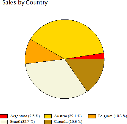
For example, the Chart field does not have a property to control the position of the legend. But the C1Chart control does, and you can access this property through the ChartControl property. For example, the script below causes the chart legend to be positioned below the chart instead of on the right:
' place legend below the chart

chartField.ChartControl.Legend.Compass = "South"
If you assign this script to the report's OnLoad property, the chart will look like the image below:

The other properties used to create these chart are as follows:
ChartType = Pie
FormatY = "p1"
ShowPercentage = true
Palette = "Red;Gold;Orange;Beige;DarkGoldenrod;Goldenrod;"
