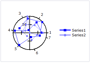
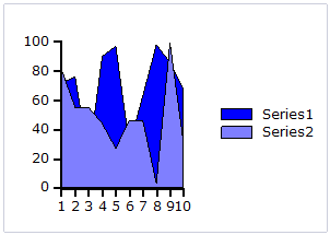
The Chart Field in Report for WinForms allows you to insert various types of charts using ChartTypeEnum. There are ten chart types that are supported in C1Report: Area, Bar (horizontal bars), Column (vertical columns), Scatter (X-Y values), Line, Pie, Step, Histogram, Radar, and Polar. The chart types can be easily selected using the ChartType property in the Properties pane of the C1ReportDesigner.
Area chart: An Area chart draws each series as connected points of data, filled below the points. Each series is drawn on top of the preceding series.
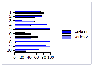
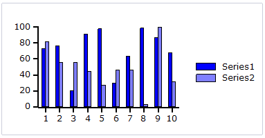
Bar and Column charts: A Bar chart or a Column chart represents each series in the form of bars of the same color and width, whose length is determined by its value. Each new series is plotted in the form of bars next to the bars of the preceding series. A Bar or Column chart draws each series as a bar in a cluster. The number of clusters is the number of points in the data. Each cluster displays the nth data point in each series. When the bars are arranged horizontally, the chart is called a bar chart and when the bars are arranged vertically, the chart is called column chart.
The following image represents a Bar chart:
The following image represents a Column chart:
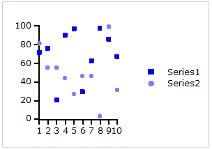
Scatter chart: A Scatter chart uses two values to represent each data point. This type of chart is often used to support statistical techniques that quantify the relationship between the variables (typically Linear Regression Analysis).
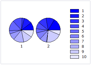
Pie chart: A Pie chart draws each series as a slice in a pie. The number of pies is the number of points in the data. Each pie displays the nth data point in each series. You can also customize Pie charts for displaying legends and labels; see Chart Properties for more information.
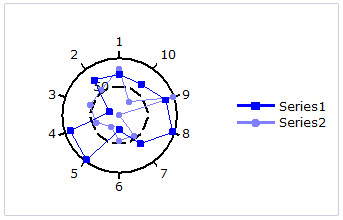
Radar chart: A Radar chart draws the y value in each data set along a radar line (the x value is ignored except for labels). If the data has n unique points, then the chart plane is divided into n equal angle segments, and a radar line is drawn (representing each point) at n/360 degree increments. By default, the radar line representing the first point is drawn vertically (at 90 degrees). Radar charts can be further customized; see Chart Properties for more information.
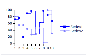
Step chart: A Step chart is a form of XY plot chart that draws series as connected points of data. These charts are often used when Y values change by discret amounts, at specific values of X with a sudden change of value. A simple, everyday example would be a plot of a checkbook balance with time. As each deposit is made, and each check is written, the balance (Y value) of the check register changes suddenly, rather than gradually, as time passes (X value). During the time that no deposits are made, or checks written, the balance (Y value) remains constant as time passes.
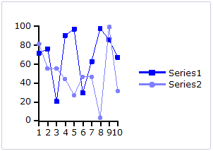
Line chart: A Line chart draws each series as connected points of data. It is the most effective way of denoting changes in values between different groups of data. These charts are commonly used to show trends and performance over time.
Histogram chart: A Histogram chart takes a collection of raw data values and plots the frequency distribution. It is frequently used with grouped data, which is generated by measuring a collection of raw data and plotting the number of data values that fall within defined intervals. Note that raw values are not used to generate data for a histogram, but are used to generate a frequency instead. While showing similarities to bar charts, it is important to note that histograms are used with quantitative variables whereas bar charts are commonly used with qualitative variables.
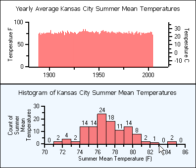
While the histogram and bar charts' appearances relate, their functionality does not. A bar chart is created from data points whereas a Histogram is created from the frequency distribution of the data. The charts following illustrate the difference between a bar chart and a histogram chart. Both of the charts use exactly the same Y data. The bar chart (top) shows each average mean temperature for each year in which it occurred. The histogram chart (bottom) using the same input temperature data automatically tabulates the number of temperatures that fall within each interval and draws the resulting histogram. For convenience, chart labels with the count in each interval have been added at the top of each interval.
A histogram is beneficial for pinpointing prominent features of the distribution of data for a quantitative variable. The important features for a quantitative variable include the following:
Polar chart: A Polar chart draws the x and y coordinates in each series as (theta,r), where theta is amount of rotation from the origin and r is the distance from the origin. Theta may be specified in either degrees (default) or radians. Since the X-axis is a circle, the X-axis maximum and minimum values are fixed. The series can be drawn independently, or stacked. Polar charts can be further customized; see Chart Properties for more information.
