Page Header
By default, the header appears at the top of the AccordionPage. Initially, it contains a header text, appearing in the center, and the expand/collapse icon which appears on the right side of the header. Besides, the header can also display a header icon and a close button, if required. Let us discuss in detail about the same in the following sections.
Header Text
The header element contains default text initially. However, you can change the text to be displayed in the AccordionPage header using HeaderText property of the C1AccordionPage class.
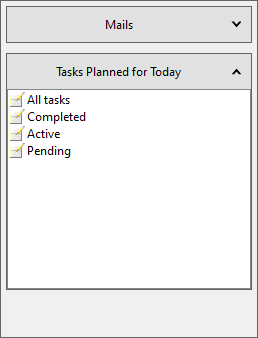
The following image showcases Accordion pages with custom header text.

To add desired text to the page header, set the HeaderText property to a string, say "Tasks planned for Today", as illustrated in the following example. This example uses the code from Quick Start.
//get the Accordion Page
var accordionPage2 = c1Accordion1.Pages[1];
////seting text for second page
accordionPage2.HeaderText = "Tasks Planned for Today";
Page Icon
There might be a scenario where you would want to display a page icon in the AccordionPage header to enhance the appearance of the page header. In such situation, you can display AccordionPage icon using Icon property of the C1AccordionPage class.
The following image displays page icons in the AccordionPage headers.
![]()
To set AccordionPage icon, use the following code. In this example, we have added images in the application to be displayed as icons. This example uses the code from Quick Start.
//get the Accordion Page
var accordionPage2 = c1Accordion1.Pages[1];
var accordionPage1 = c1Accordion1.Pages[0];
//set icon on page
accordionPage1.Icon = new C1BitmapIcon { Source = Resources.Email };
accordionPage2.Icon = new C1BitmapIcon { Source = Resources.tasks };
Alternatively, if you want to hide the page icon from the AccordionPage header, you can set ShowIcon property of the C1AccordionPageSettings to false.
Close Button
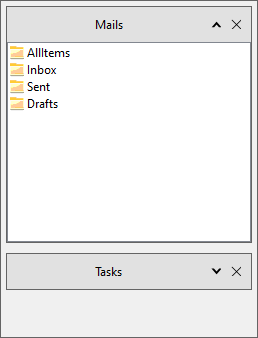
Accordion allows you to display the close button in the AccordionPage header which can be used to close a page. It provides ShowCloseButton property in the C1AccordionPageSettings class to determine whether the close button should be displayed in the page header. Setting the ShowCloseButton property to true displays close button in all the headers as showcased in the following image.

To display close button in AccordionPage header, use the following code. This example uses the code from Quick Start.
//show close icon on the pages
c1Accordion1.PageSettings.ShowCloseButton = true;
Word Wrap
Word wrap can be used when there is too much data to be displayed in a limited space. Wrapping data gives you an advantage to display large amount of data in multiple lines. You might find word wrap useful where you need to write long strings. Accordion supports word wrap for text in the page headers through the WordWrap property.
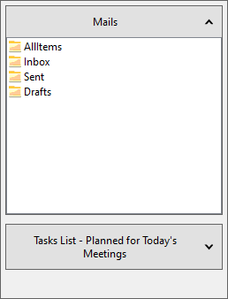
The following image displays word wrap performed on the header text of one of the Accordion pages.

To wrap a long string in page header, say ""Tasks List - Planned for Today's Meetings", use the following code.
//allow wordwrapping in header text
c1Accordion1.Styles.Pages.Header.HeaderText.WordWrap = true;


