Chart Field (Legacy)
FlexReport provides the Legacy Chart field, and it uses the C1.Win.C1Chart and C1.Win.C1Chart3D assemblies to render chart fields consisting of 2D and 3D chart types, respectively.
In order to view the Chart ![]()
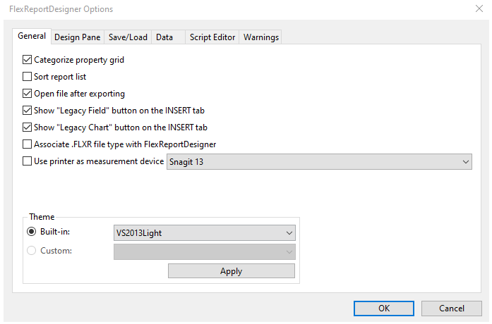
buttons in the Insert tab, select the check-boxes against Show "Legacy Chart" button on the INSERT tab from the FlexReportDesigner Options on the General tab.
For more information on 2DCharts and 3DCharts, see 2DChart documentation and 3DChart documentation, respectively.
Supported Chart Types
The Chart Field in FlexReport allows you to insert various types of charts using Chart.Chart2DGroup.ChartType and Chart.Chart3DGroup.ChartType. The chart types that are supported in FlexReport are - Area, Bar (horizontal bars), Column (vertical columns), Doughnut, Scatter (X-Y values), Line, Pie, Step, Stock, Histogram, Radar, Polar, and 3D charts-Cone, Cylinder, and Pyramid. The chart types can be easily selected using the ChartType property in the Properties window of the FlexReportDesigner.
Area Chart
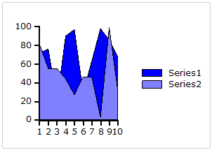
An Area chart draws each series as connected points of data, filled below the points. Each series is drawn on top of the preceding series.
Bar and Column Charts
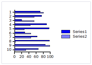
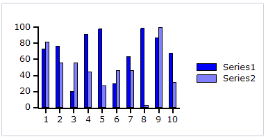
A Bar chart or a Column chart represents each series in the form of bars of the same color and width, whose length is determined by its value. Each new series is plotted in the form of bars next to the bars of the preceding series. A Bar or Column chart draws each series as a bar in a cluster. The number of clusters is the number of points in the data. Each cluster displays the nth data point in each series. When the bars are arranged horizontally, the chart is called a bar chart and when the bars are arranged vertically, the chart is called column chart.
The following image represents a Bar chart:
The following image represents a Column chart:
Bubble Chart
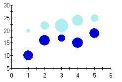
A Bubble chart combines two independent values to supply both the point y value and the point sizes. Bubble charts are used to represent an additional data value at each point by changing its size. The Y array elements determine the Cartesian position (as in a XY-Plot chart), and the Y1 element values determine the size of the bubble at each point. The size of the points can be encoded according to area or diameter.
Scatter Chart
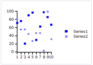
A Scatter chart uses two values to represent each data point. This type of chart is often used to support statistical techniques that quantify the relationship between the variables (typically Linear Regression Analysis).
Pie Chart
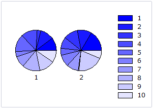
A Pie chart draws each series as a slice in a pie. The number of pies is the number of points in the data. Each pie displays the nth data point in each series. You can also customize Pie charts for displaying legends and labels.
Doughnut Chart
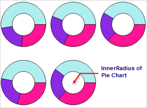
A doughnut chart is a pie chart with a non-zero radius and is identical in function to a pie chart, but can be used to increase aesthetic appeal, particularly when shown with 3D effects. As with all pie charts, each doughnut shows each series as a fraction of the whole at each data point. If multiple data points are specified, then multiple doughnuts appear in the chart.
A doughnut chart can be created by setting the InnerRadius property of a pie chart to a non-zero value. The InnerRadius value represents the percentage of the full pie radius. The InnerRadius property can be accessed in the pie object of each Chart group.
Radar Chart
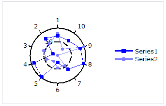
A Radar chart draws the y value in each data set along a radar line (the x value is ignored except for labels). If the data has n unique points, then the chart plane is divided into n equal angle segments, and a radar line is drawn (representing each point) at n/360 degree increments. By default, the radar line representing the first point is drawn vertically (at 90 degrees). Radar charts can be further customized.
Step Chart
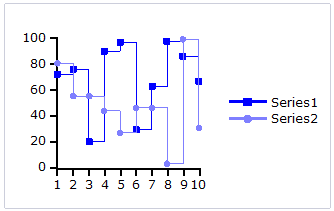
A Step chart is a form of XY plot chart that draws series as connected points of data. These charts are often used when Y values change by discrete amounts, at specific values of X with a sudden change of value. A simple, everyday example would be a plot of a checkbook balance with time. As each deposit is made, and each check is written, the balance (Y value) of the check register changes suddenly, rather than gradually, as time passes (X value). During the time that no deposits are made, or checks written, the balance (Y value) remains constant as time passes.
Line Chart
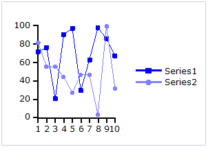
A Line chart draws each series as connected points of data. It is the most effective way of denoting changes in values between different groups of data. These charts are commonly used to show trends and performance over time.
Stock Chart
Stock charts used in financial applications to show the opening, closing, high and low prices of a given stock. The types of stock charts are as follows:
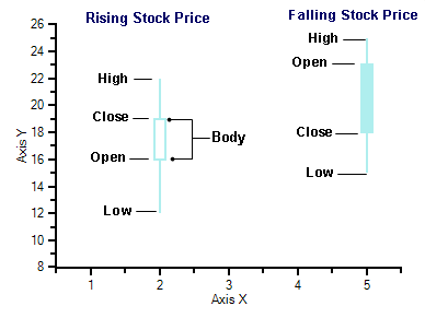
Candle: A Candle chart is a special type of HiLoOpenClose chart that is used to show the relationship between the open and close as well as the high and low. Like, HiLoOpenClose charts, Candle charts use the same price data (high, low, open, and close values) except they include a thick candle-like body that uses the color and size of the body to reveal additional information about the relationship between the open and close values. For example, long transparent candles show buying pressure and long filled candles show selling pressure.
The Candle chart is made up of the following elements: candle, wick, and tail. The candle or the body (the solid bar between the opening and closing values) represents the change in stock price from opening to closing. The thin lines, wick and tail, above and below the candle depict the high/low range. A hollow candle or transparent candle indicates a rising stock price (close was higher than open). In a hollow candle, the bottom of the body represents the opening price and the top of the body represents the closing price. A filled candle indicates a falling stock price (open was higher than close). In a filled candle the top of the body represents the opening price and the bottom of the body represents the closing price.
C1Chart creates the Candle chart with using the Y value for the High, Y1 for the low, Y2 for the open, and Y3 for the close. C1Chart automatically fills the falling candle with the value of the line color.
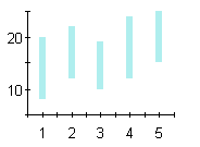
HiLo: A HiLo chart combines two independent values to supply high and low data for each point in a series. HiLo charts are used primarily in financial applications to show the high and low price for a given stock. The elements of the Y and Y1 arrays in each series of a HiLo chart represent the "high" value, and the "low" value.
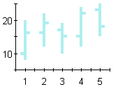
HiLoOpenClose: HiLoOpenClose charts are similar to HiLo charts except that they combine four independent values to supply high, low, open, and close data for a point in a series. In addition to showing the high and low value of a stock, the Y2 and Y3 array elements represent the stock's opening and closing price, respectively.
Histogram Chart
A Histogram chart takes a collection of raw data values and plots the frequency distribution. It is frequently used with grouped data, which is generated by measuring a collection of raw data and plotting the number of data values that fall within defined intervals. Note that raw values are not used to generate data for a histogram, but are used to generate a frequency instead. While showing similarities to bar charts, it is important to note that histograms are used with quantitative variables whereas bar charts are commonly used with qualitative variables.
While the histogram and bar charts' appearances relate, their functionality does not. A bar chart is created from data points whereas a Histogram is created from the frequency distribution of the data. The charts following illustrate the difference between a bar chart and a histogram chart. Both of the charts use exactly the same Y data. The bar chart (top) shows each average mean temperature for each year in which it occurred. The histogram chart (bottom) using the same input temperature data automatically tabulates the number of temperatures that fall within each interval and draws the resulting histogram. For convenience, chart labels with the count in each interval have been added at the top of each interval.
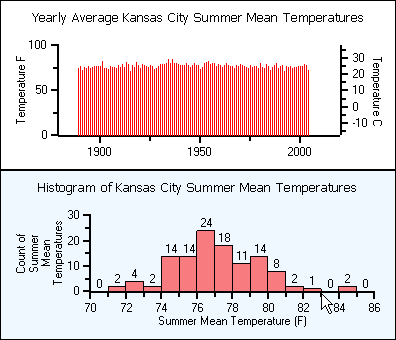
A histogram is beneficial for pinpointing prominent features of the distribution of data for a quantitative variable. The important features for a quantitative variable include the following:
It reveals the typical average value.
The data yields a general shape. The data values can be distributed symmetrically around the middle or they can be skewed.
If there are distant values from the group of data it shows them as outlier values.
The data values can be near or far to the typical value.
The distribution may result in a single peak or multiple peaks and valleys.
To select the chart type as Histogram, go to ChartGroups|Group0 and set the ChartType to Histogram.
Polar Chart
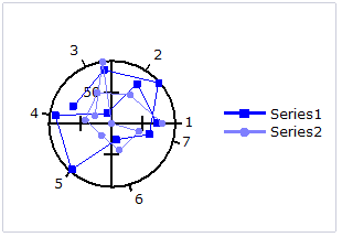
A Polar chart draws the x and y coordinates in each series as (theta,r), where theta is amount of rotation from the origin and r is the distance from the origin. Theta may be specified in either degrees (default) or radians. Since the X-axis is a circle, the X-axis maximum and minimum values are fixed. The series can be drawn independently, or stacked.
3D Chart
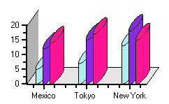
Cylinder chart: A Cylinder chart is a variation of the Bar and Column charts. It represents the bars or columns as cylinders. The Cylinder chart creates long circular boxes of the same base on both ends. Like all bar and column charts, the Cylinder bar chart is appropriate for comparing individual items or groups of items.
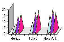
Cone chart: A Cone chart is a variation of the 3D Bar and Column charts. It represents the bars or columns as cones. The cone chart essentially is a rotated triangle. It has a flat circular base and one curved side topped by a higher point.
Pyramid chart: A Pyramid chart is a variation the 3D-Bar and Column charts. It represents the bars or columns as pyramids. The Pyramid chart is similar to the cone chart except for their base. Pyramid charts are often used for geographical purposes.
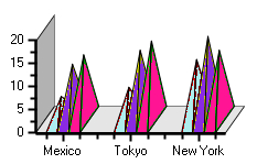
Chart Designer
The Chart field in FlexReport provides design-time support through design-time editors and collection editors that simplify working with the charts.
The design-time editors for Chart field are as follows:
Chart Properties
Chart Data Source
Chart Visual Effects
These editors can be invoked by right-clicking the chart field and selecting the required editor.
Chart Properties
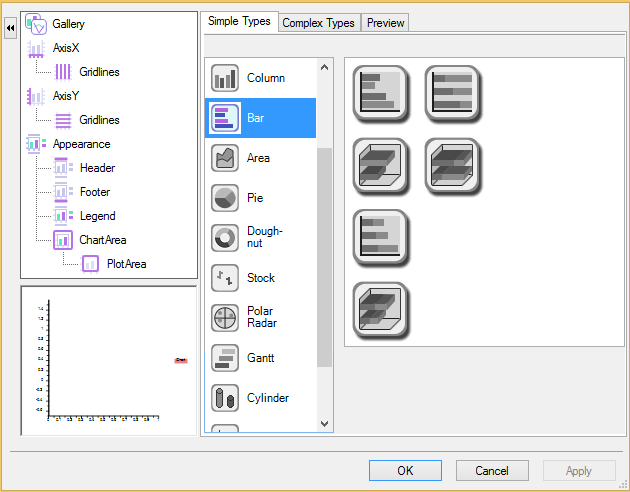
It provides an easy and interactive way to create and modify a new or existing chart. It contains the options to select the type of chart and . However, it also includes additional property settings for the x and y axis along with appearance settings for the header, footer, legend, chart area, and plot area of the chart. The Chart Properties dialog box provides more options to address specific details with the design of the chart you are developing. It consists of following elements:
Gallery Item: The Gallery item in the left pane of the Chart Properties dialog box provides options for choosing a chart type and/or a sub-type of a chart. To see a description of all chart type selections, see Chart Types. You can choose from a variety of simple chart types or you could click on complex types to add more functionality to your chart.
Simple Types Tab: In the Simple Types tab you can choose from one of many simple chart types and then you can select a specialized chart located in list box next to the simple chart types.
Complex Types Tab: In the Complex Types tab you can specify whether you want to chart one or two chart groups. Also, you can select the type of chart you would like to create in the drop-down box for each group. For each group, you have the option to make the groups stacked and/or 3D.
Note: If you don't select a chart type for data [Group1] then the elements for data [Group1] will not appear in the list box in the left pane of the Chart Properties dialog box.
Chart Data Source
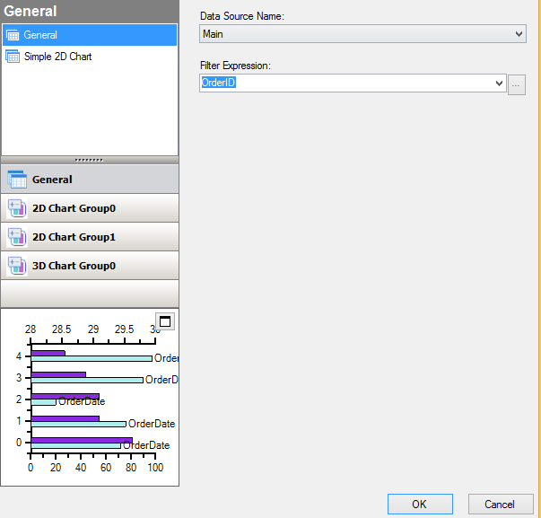
The Chart Data editor lets you bind the chart by setting data through Chart Data-add or remove data series in your chart, specify the label and color of each data series, and stack your data by checking the Show stacked data check box.
Chart Visual Effects
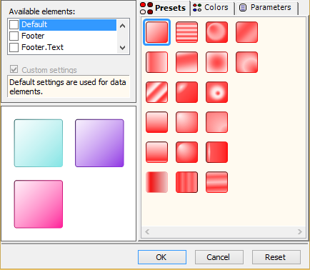
Visual Effects is a tool used for visually enhancing the Chart2D control's elements such as the data series, header, and footer. Any existing project can use the new features provided by this tool. The chart's appearance can dramatically improve in a few simple steps using the Visual Effects designer.
The collection editors for Chart field are as follows:
ValueLabel Collection Editor: This collection editor can be assessed through the Property pane-ChartArea|AxisX|ValueLabels. For more information, see the documentation on ValueLabel CollectionEditor.
ChartDataSeries Collection Editor: This collection editor can be assessed through the Property pane-ChartGroups|Group0|ChartData|CategoryGroups. For more information, see the documentation on ChartDataSeries CollectionEditor.
ChartLabel Collection Editor: This collection editor can be assessed through the Property pane-ChartLabels|DefaultLabelStyle|LabelsCollection. For more information, see the documentation on LabelCollection Editor.
ChartVisualEffectsStyle Collection Editor: This collection editor can be assessed through the Property pane-VisualEffects|Styles. For more information, see the documentation on VisualEffectsStyle Collection Editor.
Plot Data in Data-Bound Charts
The steps to plot a simple 2D chart are as follows:
Open the FlexReport Designer application.
Create a new report by navigating through the C1FlexReport wizard or open an existing report definition.
Add Legacy Chart field to the Detail section.
Note: To add Legacy Chart field to your report, you need to add it to the INSERT tab. In order to do that, go to File|Options in the designer and select Show "Legacy Chart" button on the INSERT tab.
Right-click the chart field, select Chart Properties>Simple Types>Bar.
Right-click the chart field and select Chart Data Source.
Click Simple 2D Chart and check the Generate simple 2D chart checkbox.
Specify X and Y values of the chart.
For example, the chart shown is created using C1NWind.mdb database and Products table, with following properties set:
Chart Type as 'Bar'
X and Y values of the chart as 'CategoryID' and 'UnitPrice', respectively.
Add series label as follows:
Select 2D Chart Group0, and then Series Values.
Specify Series Label as ''CategoryID vs UnitPrice'.
Add legend as follows:
Go to the Properties window.
In the Legend|Text, set the legend name as 'Legend' and Legend|Visible to True.
Add Titles to the chart as follows:
Go to Properties window.
Select Titles|Header, set the header text as 'Header' and Titles|Header|Visible to True.
Select Titles|Footer, set the footer text as 'Footer' to add header and footer to the chart.
You can also add axis titles in the chart, add back color and border to chart area, and more. For more information on using properties for customizing charts, see 2DChart documentation.
Three dimensional data can be represented in the form of 3D Surface, 3D Bar, and many more by using 3D Chart types. To plot 3D charts from 2D charts, you can change the VisualizationType property to Chart3D. For more information on plotting 3D charts, see 3DChart documentation.
Plot Data in Unbound Charts
FlexReport allows you to add data to the charts without binding the charts to a data source. You can plot series on chart and display it by setting an array of X and Y values directly in unbound mode. Let us add an unbound 2D chart by performing the following steps:
In the FlexReport Designer application, create a new report by navigating through the FlexReport wizard or open an existing report definition.
Add Chart field to the Detail section.
Note: To add Legacy Chart field to your report, you need to add it to the INSERT tab. In order to do that, go to File|Options in the designer and select Show "Legacy Chart" button on the INSERT tab.
In Properties window, expand ChartGroups|Group0|ChartType and select a type of chart from the ChartType dropdown. In our case, we have selected Bar chart type.
Navigate to ChartGroups|Group0|ChartData and click the ellipsis button next to UnboundSeriesList property.
In the ChartUnboundDataSeries Collection Editor, add any number of series you want to plot in chart. Here, we have added two series.
Select one of the series and click the ellipsis button next to SeriesData property.
In the editor for series data, enter your data.
Click OK to close the editors.
Click the Preview button to switch to Preview mode to view the report.
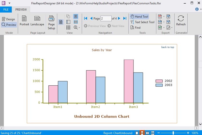
For 3D unbound chart, perform the following steps:
Add Chart field to the Detail section.
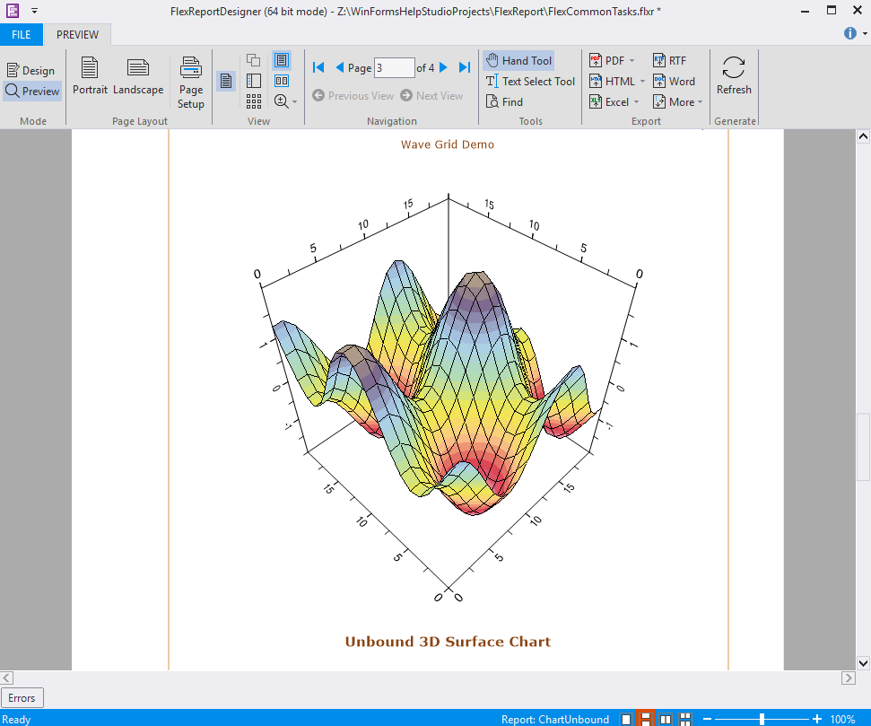
In Properties window, expand ChartGroups|Group0|ChartType and select a type of chart from the ChartType dropdown. In our case, we have selected Surface chart type.
Navigate to ChartGroups|Group0|ChartData|UnboundData|GridSet.
Set the ColumnCount and RowCount properties to the desired value, if required. In our case, both ColumnCount and RowCount properties are set to 0.
Click the ellipsis button next to the GridData property.
In Single Array Editor, enter data and close it.
Click the Preview button to switch to Preview mode to view the report.
Multiple Series Chart
Sometimes you need to create charts that have multiple data sets or multiple series. To create such charts, the values for each series are required to be set.
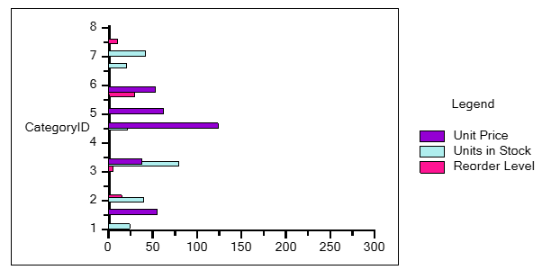
Consider an example of Products table from C1Nwind.mdb database, where you want to view Unit Price, Units in Stock, and Reorder Level corresponding to the Category IDs. The steps to achieve this scenario are as follows:
Right-click the Chart field and select Chart Data Source .
Click 2DChartGroup0 and then click Series Values.
Click the plus glyph and specify Series Label of your choice and Values from the drop-down list. You can also add colors to the series from the Fill option in Style tab. In this case, the data specified for our multiple-series chart is as follows:
Series Label
Values
Style | Fill
Unit Price
UnitPrice
Blue Voilet
Units in Stock
UnitsinStock
Pale Turquoise
Reorder Level
ReorderLevel
Deep Pink
To create Legend:
Right-click Legacy Chart field.
Select Chart Properties.
Navigate to Appearance | Legend.
Select the Visible checkbox and write “Legend” as Text.
Grouped Reports
FlexReport for allows you to create reports with multiple groups. For example, instead of listing all products in a single flat report, you could group products by category. Each group has a header and a footer section that allow you to display information about the group, including titles and subtotals, for example.
If you add a chart to a group header, the chart will display only the data for the current group. By contrast, adding a chart to the report header or footer would include all the data in the report.
To illustrate this, here is a diagram depicting a report definition as shown in the report designer and showing the effect of adding a Chart field to the report header and to a group header:
Report Header section A chart field here would generateonly one chart for the entire report.The chart would show all the datain the report's data source. |
|---|
Page Header section |
Group Header section (CategoryName) A chart field here would generateone chart for each CategoryName value. Each chart would show all the datafor the current CategoryName. |
Detail section |
Group Footer section (CategoryName) |
Page Footer section |
Report Footer section |
Continuing with the example mentioned above, lets visualize the report data for each category through chart.
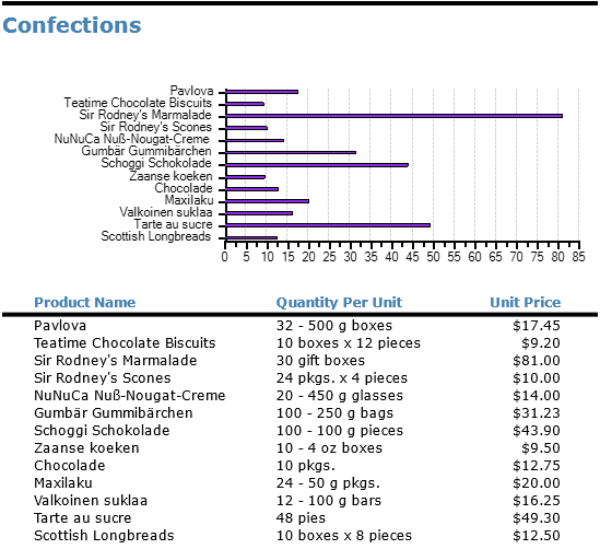
Add a Legacy Chart field to the Group Header section (Category Name) and create the chart as explained in the Plot Data in Charts section. Specify X and Y values of the chart as ProductName and UnitPrice and specify Value in Series Values as UnitPrice.
The images below show screenshots of the report described above with the group headers, the charts they contain, and a few detail records to illustrate:
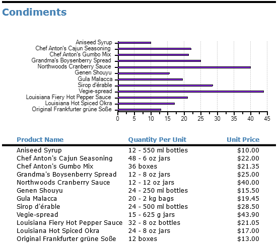
The chart above shows unit prices for products in the "Condiments" category. The chart below shows unit prices for products in the "Confections" category.
