
ActiveReportJS Designer Themes
Built-in Themes
The ActiveReportsJS download package, CDN distribution, and @mescius/activereportsjs npm package include the following CSS files that set up the appearance of the ActiveReportsJS Designer component:
ar-js-ui.css: Common styles used for both Viewer and Designer components.
ar-js-designer.css: Styles specific to the Designer component, including several predefined themes:
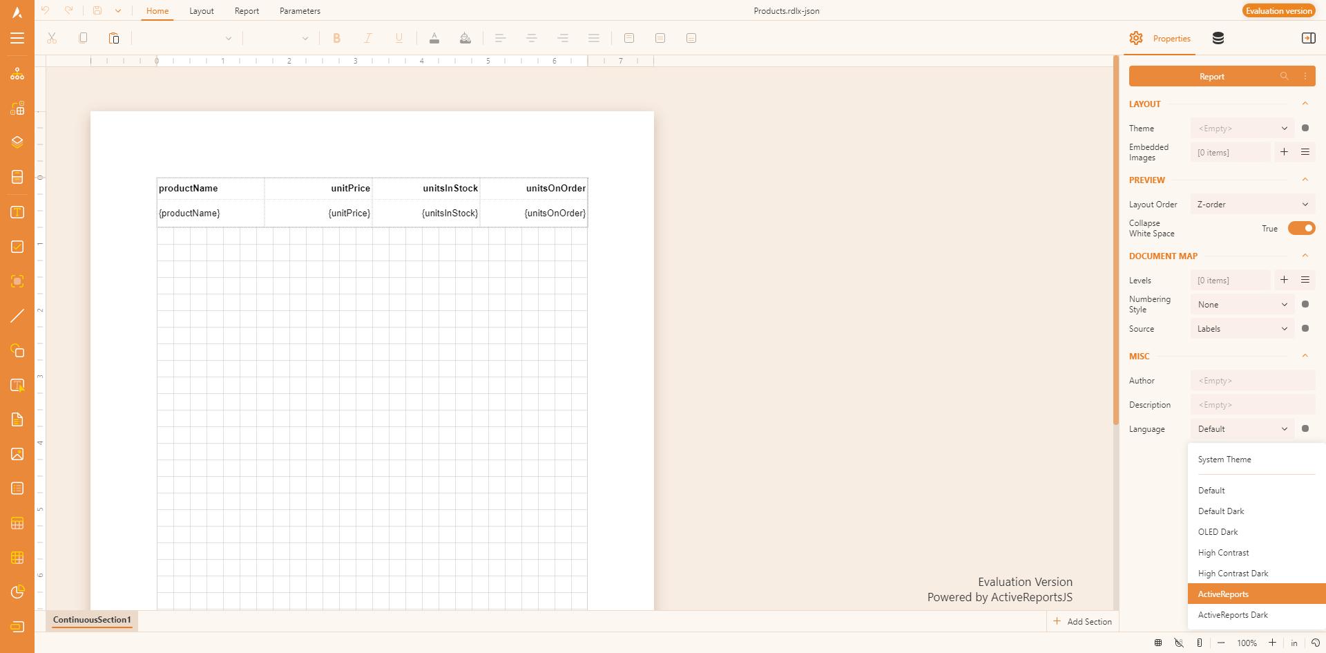
SystemDefaultDefaultDarkDarkOledHighContrastHighContrastDarkActiveReportsActiveReportsDark
You can attach these styles to a page or component that hosts the ActiveReportsJS Report Designer via the <link> tag:
<link
  rel="stylesheet"
  href="https://cdn.mescius.com/activereportsjs/5.latest/styles/ar-js-ui.css"
  type="text/css"
/>
<link
  rel="stylesheet"
  href="https://cdn.mescius.com/activereportsjs/5.latest/styles/ar-js-designer.css"
  type="text/css"
/>
Alternatively, you can include these styles via a CSS loader if it's supported in your application:
import "@mescius/activereportsjs/styles/ar-js-ui.css";
import "@mescius/activereportsjs/styles/ar-js-designer.css";
Setting the Report Designer Component Theme
Pure JavaScript
To set the Report Designer component theme in a pure JavaScript application, use the DesignerConfig object passed to the component constructor:
// Define the configuration object for the designer
var designerConfig = {
    themeConfig: {
        initialTheme: 'ActiveReports' // Set the initial theme
    }
};
// Initialize the Report Designer with the specified configuration
var designer = new MESCIUS.ActiveReportsJS.ReportDesigner.Designer("#designer-host", designerConfig);
React Applications
To set the theme for the React Report Designer component you can use the onInit property that should resolve to a function that retrieves the DesignerConfig object, for example:
import React from "react";
import { Designer } from "@mescius/activereportsjs-react";

// Function to initialize the designer with a specific theme
function onInit() {
  return {
      themeConfig: {initialTheme: 'ActiveReports'},
  };
}

// Main App component rendering the designer
function App() {
  return (
      <Designer onInit={onInit} />
  );
}

export default App;
Angular Applications
Similarly, the Angular Report Designer component exposes the onInit input property that should resolve to a function that retrieves the DesignerConfig object, for example:
import { Component } from '@angular/core';

@Component({
  selector: 'app-root',
  template:
    '<div id="designer-host"><gc-activereports-designer [onInit]="onInit"> </gc-activereports-designer></div>'
})
export class AppComponent {
  // Function to initialize the designer with a specific theme
  onInit = function onInit() {
    return {
      themeConfig: {initialTheme: 'ActiveReports'}
    }
  }
}
Vue Applications
Similarly, the Vue Report Designer accepts the reference to the onInit function:
<template>
  <div id="designer-host">
    <ReportDesigner
      :onInit="onInit"
    ></ReportDesigner>
  </div>
</template>

<script lang="ts">
import { Designer } from "@mescius/activereportsjs-vue";

export default {
  name: "App",
  components: {
    ReportDesigner: Designer,
  },
  methods: {
    // Function to initialize the designer with a specific theme
    onInit() {
      return {
        themeConfig: {initialTheme: 'ActiveReports'}
      };
    },
  },
};
</script>
Svelte Applications
The Svelte Report Designer exposes the onInit property that should resolve to a function that returns the DesignerConfig object:
<script lang="ts">
  import {Designer} from "@mescius/activereportsjs-svelte";
  // Function to initialize the designer with a specific theme
  function onInit() {
      return {
          themeConfig: {initialTheme: 'ActiveReports'}
      }
  }
</script>

<div id="designer-host">
  <Designer bind:this={designerInst} onInit={onInit}></Designer>
</div>
Configuring the Report Designer Component Theme Picker
The Report Designer Component UI shows the theme picker on the right-bottom corner:
In addition to the initalTheme property of the themeConfig, you could also use themeSelector property that allows to configure the theme selector:
var designerConfig = {
    themeConfig: {
        initialTheme: 'ActiveReports', // Set the initial theme
        themeSelector: {
            isEnabled: true, // Enable the theme selector
            availableThemes: ['ActiveReports', 'System', 'Default'] // List of available themes for selection
        }
    }
};
var designer = new MESCIUS.ActiveReportsJS.ReportDesigner.Designer("#designer-host", designerConfig);
Feedback
Submit and View Feedback For