
Report Designer Theming
Introduction
ActiveReportsJS provides flexible theming options for the Report Designer component, allowing seamless customization to match your application's design. The theming capabilities include:
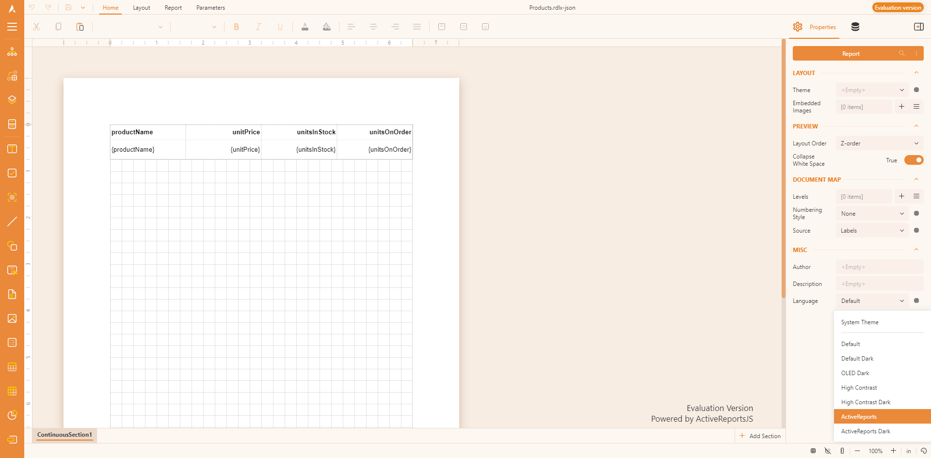
Built-in Color Themes – Predefined themes that adjust the designer's appearance.
Theme Selector – A built-in control in the viewer toolbar that allows users to switch between available themes.
API for Customization – A set of APIs to create custom themes, programmatically set the designer theme, and configure the theme selector.
These features enable a consistent and personalized user experience while integrating the Report Designer into different UI styles.
Initial Setup
To enable theming in the Report Designer, you need to include the required stylesheets in your application. The following CSS files are available through the ActiveReportsJS download package, CDN distribution, and the @mescius/activereportsjs npm package:
ar-js-ui.css– Common styles shared between theReport ViewerandReport Designercomponents.ar-js-designer.css– Designer-specific styles, including multiple predefined themes:System– Adapts to the user’s system theme settings (light or dark mode) automatically.Default– A clean and modern light theme designed for standard readability and usability.DefaultDark– A dark version of the Default theme, reducing eye strain in low-light environments.DarkOled– A deep black OLED-friendly theme designed to maximize contrast and save power on OLED displays.HighContrast– A light high-contrast theme for improved visibility and accessibility.HighContrastDark– A dark high-contrast theme for users who require high readability in dark mode.ActiveReports– A classic ActiveReports-inspired theme with a familiar UI style.ActiveReportsDark– A dark version of the ActiveReports theme for a more subdued, eye-friendly interface.
For applications using a CDN, add the following <link> tags to include the styles:
<link
  rel="stylesheet" href="https://cdn.mescius.com/activereportsjs/6.latest/styles/ar-js-ui.css"
  type="text/css"
/>
<link
  rel="stylesheet" href="https://cdn.mescius.com/activereportsjs/6.latest/styles/ar-js-designer.css"
  type="text/css"
/>
If your application supports module-based CSS imports, you can include the styles directly in your code:
import "@mescius/activereportsjs/styles/ar-js-ui.css";
import "@mescius/activereportsjs/styles/ar-js-designer.css";
Using themeConfig API
The themeConfig property of the Report Designer configuration allows you to:
Set the initial theme.
Enable or disable the theme selector.
Define which themes are available in the theme selector. For Pure JavaScript applications, use the
themeConfigproperty in the second argument of theMESCIUS.ActiveReportsJS.ReportDesigner.Designerconstructor:
var designer = new MESCIUS.ActiveReportsJS.ReportDesigner.Designer("#designer-host", {
    themeConfig: {
        // Set the initial theme
        initialTheme: 'ActiveReports',
        themeSelector: {
            // Enable or disable the theme selector
            isEnabled: true,
            // Define available themes in the selector
            availableThemes: [`ActiveReports`, `ActiveReportsDark`]
        }
    }
});
For React, Angular, Vue, and Svelte, you can use the onInit property that should resolve to a function that retrieves the DesignerConfig object, for example:
Example: Using themeConfig in React.
import React from "react";
import { Designer} from "@mescius/activereportsjs-react";

function onInit() {
    return {
        themeConfig: {
            initialTheme : 'ActiveReports',
            themeSelector: {
                isEnabled: true,
                availableThemes: ['ActiveReports', 'System', 'Default']
            }
    };
}

function App() {
 return (
   <div id="designer-host">
        <Designer onInit={onInit} />
   </div>
 );
}

export default App;
Creating Custom Theme
In addition to using predefined themes, you can build a custom one using the ActiveReportsJS API.
First off, you need to define theme colors by constructing the object that contains the following properties:
Property | Type | Description |
|---|---|---|
|
| A unique name for the theme. |
|
| Defines whether the theme is a light or dark theme. |
|
| The primary background color of the Viewer. |
|
| The background color of panels inside the Viewer. |
|
| The main accent color, either a single color or a set of shades. |
|
| A secondary accent color for additional UI elements. |
|
| Neutral tones for balancing UI contrast. |
|
| Color used for error messages or indicators. |
|
| Color used for warnings or alerts. |
|
| Specifies the font used throughout the Viewer. |
The primary, secondary, neutral, error, and warning properties can be defined in two ways:
Single color (string) – A single HEX, RGB, or named color. for example:
primary: "#0084ff"Shaded colors (object) – Defines multiple shades for different UI elements
    primary: {
        veryLight: "#d1e8ff",
        light: "#a3d4ff",
        lighter: "#75bfff",
        lightMedium: "#47abff",
        medium: "#1a97ff",
        base: "#0084ff",
        darkMedium: "#0072db",
        darker: "#005fb7",
        dark: "#004c93",
        veryDark: "#00396f"
    }
Here is the full example of defining a custom theme
const myCustomTheme = {
    name: "CustomBlue",
    type: "light", // "light" or "dark"
    backgroundMain: "#f0f4f8", // Main background color
    backgroundPanels: "#d9e2ec", // Panel background color
    primary: {
        veryLight: "#d1e8ff",
        light: "#a3d4ff",
        lighter: "#75bfff",
        lightMedium: "#47abff",
        medium: "#1a97ff",
        base: "#0084ff", // Primary base color
        darkMedium: "#0072db",
        darker: "#005fb7",
        dark: "#004c93",
        veryDark: "#00396f"
    },
    secondary: "#ffcc00", // Can be a single color or shades
    neutral: {
        base: '#6b7280',
        light: '#d1d5db',
        dark: '#374151',
        veryLight: '#d1d5db',
        lighter: '#d1d5db',
        lightMedium: '#d1d5db',
        medium: '#6b7280',
        darkMedium: '#374151',
        darker: '#374151',
        veryDark: '#374151',
    },
    error: "#e63946", // Error color
    warning: "#ff9f1c", // Warning color
    fontFamily: "Arial, sans-serif" // Custom font
};
Then you can use the custom theme object for either the theme property value, or for the item in the availableThemes array. You can also use the custom theme name for the initialTheme property of the themeConfig object.