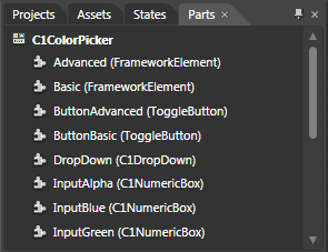
In Microsoft Expression Blend, you can view and edit template parts by creating a new template (for example, click the C1ColorPicker control to select it and choose Object | Edit Template | Edit a Copy). Once you've created a new template, the parts of the template will appear in the Parts window:

Note that you may have to select the ControlTemplate for its parts to be visible in the Parts window.
In the Parts window, you can double-click any element to create that part in the template. Once you have done so, the part will appear in the template and the element's icon in the Parts window will change to indicate selection:
![]()
Template parts available in the C1ColorPicker control include:
|
Name |
Type |
Description |
|
Advanced |
Provides a framework of common APIs for objects that participate in WPF layout. Also defines APIs related to data binding, object tree, and object lifetime feature areas in WPF. |
|
|
Basic |
Provides a framework of common APIs for objects that participate in WPF layout. Also defines APIs related to data binding, object tree, and object lifetime feature areas in WPF. |
|
|
ButtonAdvanced |
Base class for controls that can switch states, such as CheckBox and RadioButton. |
|
|
ButtonBasic |
Base class for controls that can switch states, such as CheckBox and RadioButton. |
|
|
DropDown |
Defines a flexible grid area that consists of columns and rows. |
|
|
InputAlpha |
C1NumericBox |
The C1NumericBox control is a numeric editor that allows you to display and edit numeric values in many formats. |
|
InputBlue |
C1NumericBox |
The C1NumericBox control is a numeric editor that allows you to display and edit numeric values in many formats. |
|
InputGreen |
C1NumericBox |
The C1NumericBox control is a numeric editor that allows you to display and edit numeric values in many formats. |
|
InputHue |
C1NumericBox |
The C1NumericBox control is a numeric editor that allows you to display and edit numeric values in many formats. |
|
InputLuminance |
C1NumericBox |
The C1NumericBox control is a numeric editor that allows you to display and edit numeric values in many formats. |
|
InputRed |
C1NumericBox |
The C1NumericBox control is a numeric editor that allows you to display and edit numeric values in many formats. |
|
InputSaturation |
C1NumericBox |
The C1NumericBox control is a numeric editor that allows you to display and edit numeric values in many formats. |
|
InputWeb |
Represents a control that can be used to display single-format, multi-line text. |
|
|
OkButton |
Represents a button control. |
|
|
Preview |
Draws a rectangle shape, which can have a stroke and a fill. |
|
|
RecentColors |
Defines a flexible grid area that consists of columns and rows. |
|
|
RecentColorsHeader |
Provides a framework of common APIs for objects that participate in WPF layout. Also defines APIs related to data binding, object tree, and object lifetime feature areas in WPF. |
|
|
Root |
Provides a framework of common APIs for objects that participate in WPF layout. Also defines APIs related to data binding, object tree, and object lifetime feature areas in WPF. |
|
|
Spectrum |
C1SpectrumColorPicker |
Represents a sliding color picker. |
|
StandardColors |
Defines a flexible grid area that consists of columns and rows. |
|
|
ThemeColorsHeader |
Defines a flexible grid area that consists of columns and rows. |
|
|
ThemeColorsValues |
Defines a flexible grid area that consists of columns and rows. |