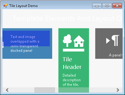
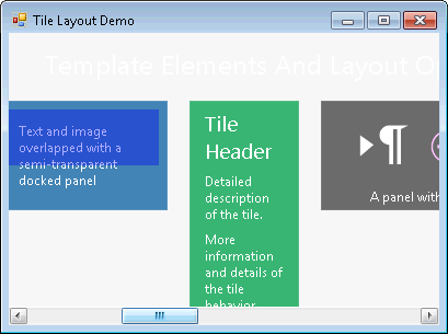
The Tiles in the TileControl are scrollable by default.
C1TileControls scrollbar appearance can be determined by the ScrollBarStyle property.
The following table represents the two difference scroll bar styles to choose from when you set its ScrollBarStyle property:
| Value | Description |
|---|---|
|
Default |
Specifies the default scrollbar for the C1TileControl. |
|
System |
Specifies the System scrollbar for the C1TileControl. |
When you hover over the default scrollbar, the bar changes color. The default scrollbar appears like the following:

When you hover over the system scrollbar, the bar changes color. The system scrollbar appears like the following:

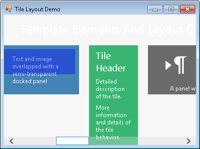
The color of the scrollbar thumb border and the scrollbar thumb interior can be specified using the SBThumbBorderColor and SBThumbInnerColor properties respectively. The negative or zero offset of the scrollable area can be determined using the ScrollOffset property.
The following image illustrates the effects of the SBThumbBorderColor and SBThumbInnerColor properties. The SBThumbBorderColor is set to SteelBlue and the SBThumbInnerColor is set to AliceBlue.
