
QuickStart
This quick start guide explains how to add two Microsoft stylized C1SuperTooltips and a C1SuperLabel control to your form.
.NET Framework
Step 1 of 4: Adding a C1SuperLabel to a Project
Start by adding a C1SuperLabel control to your project and adding some HTML code for it.
To add a C1SuperLabel to a project, complete the following steps:
Create a new .NET project and add two button controls to the form.
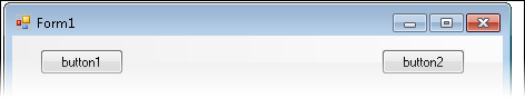
Right-click the Button1 control and select Properties to view the Properties window.
Enter "View C1SuperLabel" next to the Text property and resize the button so the text is visible.
Select Button2 and enter "Hide C1SuperLabel" next to its Text property. Resize the button so the text is visible.
Add the SuperTooltip for WinForms components to the Toolbox.
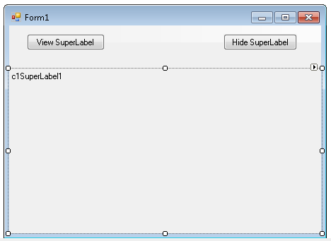
Double-click the C1SuperLabel control in the Toolbox to add it to your form so it looks like the following:
Click the ellipsis button next to C1SuperLabel's Text property in the Properties window. The C1SuperLabel Editor appears.
Click here for the HTML code to add in the text box.
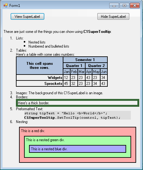
These are just some of the things you can show using C1SuperTooltip:
<ol> <li>Lists:</li> <ul> <li>Nested lists</li> <li>Numbered and bulleted lists</li> </ul> <li>Tables:<p>Here's a table with some sales numbers:</p> <table border='1' bordercolor='black' cellpadding='2' cellspacing='0' style='border:solid 1 black;'> <tr bgcolor='LightSteelBlue'> <th style="width:150px; text-align: center;" rowspan='3'> <p>This cell spans<br />three rows.</p> </th> <th align='center' colspan='6'>Semester 1</th> </tr> <tr bgcolor='LightSteelBlue'> <th align='center' colspan='3'>Quarter 1</th> <th align='center' colspan='3'>Quarter 2</th> </tr> <tr bgcolor='LightSteelBlue'> <td align='center'>Jan</td> <td align='center'>Feb</td> <td align='center'>Mar</td> <td align='center'>Apr</td> <td align='center'>May</td> <td align='center'>Jun</td> </tr> <tr> <td align='right' style='width: 150px'><strong>Widgets</strong></td> <td>12</td> <td>23</td> <td>23</td> <td>43</td> <td>23</td> <td>34</td> </tr> <tr> <td align='right' style='width: 150px'><strong>Sprockets</strong></td> <td>45</td> <td>32</td> <td>23</td> <td>23</td> <td>34</td> <td>43</td> </tr> </table> </li> <li>Images: The background of this C1SuperLabel is an image. </li> <li>Borders:<p style='border: #336633 thick'>Here's a thick border.</p> </li> <li>Preformatted Text: <pre style="background-color:#dddddd; margin:0 20pt 0 20pt;"> string tipText = "Hello <b>World</b>"; <b>C1SuperTooltip</b>.SetToolTip(control, tipText); </pre> </li> <li>Nesting: <div style="background-color:#ffaaaa;border:solid thin black;margin:10px;padding:4px"> This is a red div. <div style="background-color:#aaffaa;border:solid thin black;margin:10px;padding:4px"> This is a nested green div. <div style="background-color:#aaaaff;border:solid thin black;margin:10px;padding:4px"> This is a nested blue div. </div> </div> </div> </li> </ol>In the Properties window, click the drop-down arrow next to the BackColor property, select the Web tab, and select White.
Add an image to the C1SuperLabel control:
Click the ellipsis button next to the BackgroundImage property. The Select Resource dialog box appears.
Select Local resource and click the Import button. The Open dialog box appears.
Locate and select the TipBackground.png or another graphic of your choice and then click Open. The TipBackground.png image is installed, by default, with the SuperTooltip for WinForms samples and is located in Documents\ComponentOne Samples\WinForms.
Click OK.
Click the drop-down arrow next to the BackgroundImageLayout property and select Stretch.
Set the Visible property to False.
Step 2 of 4: Creating a stylized C1SuperTooltip for a Control
Next, create a Microsoft stylized C1SuperTooltip using the Office tab in the C1SuperTooltip Editor. To do this, complete the following steps:
Double-click the C1SuperTooltip control in the Toolbox to add it to your form.
First, we will add an image to the ToolTip's image collection. We are using a small Help graphic to be used as the Subimage in our ToolTip.
Select C1SuperTooltip1 and click the ellipsis button next to the Images property in the Properties window. The Edit Image Collection editor appears.
Click the Add button, and find and select the desired image file.
Once the image is added to the collection, click OK. We will specify this image in the ToolTip a little later.
Right-click the Button1 control and select Properties to view the Properties window.
Click the ellipsis button next to the ToolTip on C1SuperTooltip1 property and the C1SuperTooltip Editor appears.
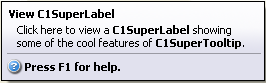
On the Office tab, enter View C1SuperLabel in the Title text box.
Enter the following text in the Body Text text box:
Click here to view a C1SuperLabel showing some of the cool features of C1SuperTooltip.Notice a preview of the C1SuperTooltip appears in the Preview window.
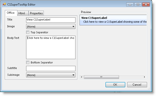
To make the ToolTip appear on multiple lines, place the cursor after the word showing in the Body Text and press ENTER.
You can also format the body text from within the Office tab. Select and right-click C1SuperLabel, and then choose Bold from the context menu or click Ctrl+B on the keyboard. Do the same for C1SuperTooltip.
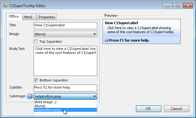
Check the Bottom Separator check box.
Enter the following text in the Subtitle text box:
Press F1 for more help.Click the Subimage drop-down arrow and select the image you added to the collection in the previous step 2.
Note that C1SuperTooltip automatically creates the HTML used to format your ToolTip so you don't have to. To view the HTML code, click the Html tab. We will create a ToolTip using only HTML code in the Creating a C1SuperTooltip with HTML Code topic of this quick start.
Click the Properties tab in the editor.
Click the drop-down arrow next to the BackgroundGradient property and choose Vista.
Click OK to close the C1SuperTooltip Editor.
Step 3 of 4: Creating a C1SuperTooltip with HTML Code
Then create a C1SuperTooltip in the C1SuperTooltip Editor using only HTML code. Complete the following steps:
Select the Button2 control.
Click the ellipsis button next to the ToolTip on C1SuperTooltip1 property to open the C1SuperTooltip Editor.
Click the Html tab and enter the following HTML markup:
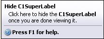
<table><tr>
<parm></parm>

<th><parm>Hide C1SuperLabel</parm></th>

</table>

<parm></parm>

<div style='margin:1 12'><parm>
Click here to hide the <b>C1SuperLabel</b><br>once you are done viewing it.

</parm></div>

<parm><hr noshade size=1 style='margin:2' color=Darker></parm>

<table><tr>

<th><parm><img src='HelpButton.png'></parm></th>

<th><parm>Press F1 for help.</parm></th>


</table>
Click OK to close the C1SuperTooltip Editor. Note that the ToolTip will appear similar to the following:

Step 4 of 4: Adding Code for the Buttons and Running the Project
Once you have created the C1SuperLabel and C1SuperTooltips, you can add code for the buttons on the form and run the project. To do this, complete the following steps:
Double-click Button1 and add the following code to the Button1_Click event:
To write code in Visual Basic
C1SuperLabel1.Visible = TrueTo write code in C#
c1SuperLabel1.Visible = true;Double-click Button2 and add the following code to the Button2_Click event:
To write code in Visual Basic
C1SuperLabel1.Visible = FalseTo write code in C#
c1SuperLabel1.Visible = False;Run the project and mouse over Button1. Notice the ToolTip is having Vista stylized C1SuperTooltip:
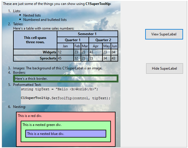
Click View C1SuperLabel. The C1SuperLabel appears.
Mouse over Button2. The Vista-style C1SuperTooltip looks like this:
The text in the ToolTip for Button2 was applied through HTML markup, but you will notice the C1SuperTooltip Vista background style appears in both ToolTips. Any properties you set via the C1SuperTooltip Editor will be the same in all ToolTips for controls associated with that C1SuperTooltip.
Click Hide C1SuperLabel, and the C1SuperLabel is hidden.
.NET
To create a simple WinForms application in .NET for SuperTooltip control, complete the following steps:
Create a new Windows Forms application.
In Solution Explorer, right-click Dependencies and choose Manage NuGet Packages. Add C1.Win and C1.Win.SuperTooltip .NET packages.
Add two buttons by amending these changes in their properties.
Button
Button.Name Property
Button.Text Property
1
btn_viewLabel
View SuperLabel
2
btn_hideLabel
Hide SuperLabel
Switch to code editor and initialize the C1SuperLabel object.
// Initialize C1SuperLabel object
C1SuperLabel superLabel;
Add SuperLabel programmatically:
//  Adding super label programmatically
superLabel = new C1SuperLabel();
this.Controls.Add(superLabel);
Add the string HtmlTextin the resource file SuperLabelResource.resx.These are just some of the things you can show using C1SuperTooltip:
<ol> <li>Lists:</li> <ul> <li>Nested lists</li> <li>Numbered and bulleted lists</li> </ul> <li>Tables:<p>Here's a table with some sales numbers:</p> <table border='1' bordercolor='black' cellpadding='2' cellspacing='0' style='border:solid 1 black;'> <tr bgcolor='LightSteelBlue'> <th style="width:150px; text-align: center;" rowspan='3'> <p>This cell spans<br />three rows.</p> </th> <th align='center' colspan='6'>Semester 1</th> </tr> <tr bgcolor='LightSteelBlue'> <th align='center' colspan='3'>Quarter 1</th> <th align='center' colspan='3'>Quarter 2</th> </tr> <tr bgcolor='LightSteelBlue'> <td align='center'>Jan</td> <td align='center'>Feb</td> <td align='center'>Mar</td> <td align='center'>Apr</td> <td align='center'>May</td> <td align='center'>Jun</td> </tr> <tr> <td align='right' style='width: 150px'><strong>Widgets</strong></td> <td>12</td> <td>23</td> <td>23</td> <td>43</td> <td>23</td> <td>34</td> </tr> <tr> <td align='right' style='width: 150px'><strong>Sprockets</strong></td> <td>45</td> <td>32</td> <td>23</td> <td>23</td> <td>34</td> <td>43</td> </tr> </table> </li> <li>Images: The background of this C1SuperLabel is an image. </li> <li>Borders:<p style='border: #336633 thick'>Here's a thick border.</p> </li> <li>Preformatted Text: <pre style="background-color:#dddddd; margin:0 20pt 0 20pt;"> string tipText = "Hello <b>World</b>"; <b>C1SuperTooltip</b>.SetToolTip(control, tipText); </pre> </li> <li>Nesting: <div style="background-color:#ffaaaa;border:solid thin black;margin:10px;padding:4px"> This is a red div. <div style="background-color:#aaffaa;border:solid thin black;margin:10px;padding:4px"> This is a nested green div. <div style="background-color:#aaaaff;border:solid thin black;margin:10px;padding:4px"> This is a nested blue div. </div> </div> </div> </li> </ol>Add background image to the SuperLabel.
// Adding background image
superLabel.BackgroundImage = SuperLabelResource.BackgroundImage;
superLabel.BackgroundImageLayout = C1.Win.SuperTooltip.BackgroundImageLayout.Stretch;
Add Vista-style SuperTooltip using the BackgroundGradient and Images properties of C1SuperTooltipBase class. Choose the background gradient using the BackgroundGradient enumeration:
// **Stylized super tool tip **
// Adding Image to super tooltip.
C1SuperTooltip superTooltip = new C1SuperTooltip();
superTooltip.Images.Add(new ImageEntry("HelpIcon", SuperLabelResource.HelpIcon));
superTooltip.BackgroundGradient = BackgroundGradient.Vista;
Call the ShowLabelClick and the HideLabelClick events, and add the codes as below:
// show super label.
private void ShowLabelClick(object sender, EventArgs e)
{
    superLabel.AutoSize = true;
    superLabel.Visible = true;
}
// Hide superlabel
private void HideLabelClick(object sender, EventArgs e)
{
    superLabel.Visible = false;
}
Bind the Label_Click event handlers to the button Click events. So, both the button_Click handler and the Label_Click handler are called when the button is clicked.
btn_viewLabel.Click += ShowLabelClick;
btn_hideLabel.Click += HideLabelClick;
Add tooltip to button1 and button2 using SetToolTip method of C1SuperTooltip class:
// Show button tooltip
superTooltip.SetToolTip(btn_viewLabel, "<table> " +
    "<tr><td><b>View C1SuperLabel</b><td></tr>" +
    "<tr><td>Click here to view a C1SuperLabel showing<br> some of the cool features of C1SuperTooltip.<hr></td></tr>" +
    "<tr>" +
    "<td><img src ='res://icons8-help-48.png' height='15' width='15'/>" +
    "<b>Press F1 for more help.</b></td>" +
    "</tr>" +
    "</table>");
// hide button tooltip
superTooltip.SetToolTip(btn_hideLabel, "<table> " +
    "<tr><td><b>Hide C1SuperLabel</b><td></tr>" +
    "<tr><td>Click here to hide the <b>C1SuperLabel</b><br>once you are done viewing it.<hr></td></tr>" +
    "<tr>" +
    "<td><img src ='res://icons8-help-48.png' height='15' width='15'/>" +
    "<b>Press F1 for more help.</b></td>" +
    "</tr>" +
    "</table>");
Note: The latest WinForms .NET Edition does not include rich design-time support yet. We will enhance it in future releases.