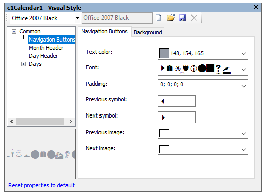
Through the Navigation Buttons node of the Visual Style dialog box, you can set properties for the navigation buttons.

The following properties are available through the Navigation Buttons node:
| Tab | Property | Description |
|---|---|---|
| Navigation Buttons | Text color | Sets the text color for the navigation buttons. |
| Font | Sets the font for the Previous and Next buttons. | |
| Padding | Sets the padding around the Previous and Next buttons. | |
| Previous symbol | Sets the symbol to appear for the Previous button, based on the Font for the navigation buttons. | |
| Next symbol | Sets the symbol to appear for the Next button, based on the Font for the navigation buttons. | |
| Previous image | Sets the image to appear for the Previous button. | |
| Next image | Sets the image to appear for the Next button. | |
| Background | Background color | Sets the background color for the Previous and Next buttons. |
| Gradient color | Sets the background gradient color. | |
| Gradient | Sets the background gradient mode. | |
| Gamma correction | Applies gamma correction to the background gradient when checked. | |
| Gradient center | Sets the center of the gradient background. | |
| Gradient blend | Sets the Drawing.Drawing2D.Blend used to paint the background gradient. | |
| Image | Sets the background image. |