Setting C1SliderExtender's DragFill Behavior
In This Topic
C1SliderExtender allows you to create a stylable range element that can be dragged between the two handles.
-
Create a new ASP.NET Web application.
-
In your Web application, add a standard Panel control to the main content of your page and set the ID as hSlider.
-
Set the CssClass of your Panel control as hSlider. This will allow you to add CSS styling to the C1SliderExtender.
-
In Source View, drag a C1SliderExtender control to the page.
-
Select View | Properties from the Visual Studio menu and find the C1SliderExtender in the drop-down list at the top of the Properties window.
-
Locate the C1SliderExtender.DragFill property and set it to true.
-
Locate the C1SliderExtender.Range property and set it to true.
-
Set the C1SliderExtender.Value property to 2 and the C1SliderExtender.Values property to 3, 105.
-
Add the following CSS styling to the first set of <asp:Content> tags to set the width and height of the control. This will make it easier to see the DragFill behavior.
<style type="text/css">
.hSlider
{
width: 300px;
height: 100px;
}
.header2
{
margin-bottom: 10px;
}
</style>
-
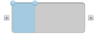
Press F5 to run your application. The C1SliderExtender control should resemble the following image: