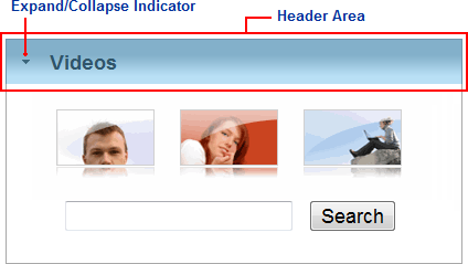
The C1Expander's header area appears at the top of the control and initially appears blank. You can add content, including text, HTML content, images, and other controls, to the header area of the C1Expander using the header template. Elements in the header area of the control can be added and moved on the control at design time through a simple drag-and-drop operation.
The following image labels the header area of the C1Expander control:

Note the expand/collapse indicator that appears and indicates the header's expand and collapse direction.
You can use the following element to customize the header area of the C1Expander control:
Header
You can add content to the header area of the control at design time. To add content, simply click in the header area of the control and begin typing, or add images or controls to the header area as you would normally.
When you add content to the C1Expander's header and switch to Source view you will notice that your content appears inside <Header> tags inside the <cc1:C1Expander> tags:
<cc1:C1Expander ID="C1Expander1" runat="server">
    <Header>
        Header
    </Header>
    <Content>
        Content
    </Content>
</cc1:C1Expander>