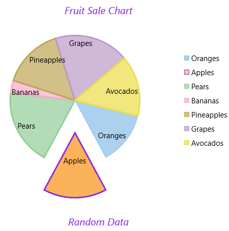
The key features of FlexPie are as follows:
Header and Footer
Legend
Selection
Label Position
Exploding and Donut Pie Charts

Header and Footer are used to set a title and footer text. You can add a header to the FlexPie control by setting the Header property of FlexChartBase. Besides a header, you can add a footer to the control by setting the Footer property of FlexChartBase.
FlexPie enables you to specify the position where you want to display the Legend by using the LegendPosition property of FlexChartBase. This property provides options:
You can choose what element of FlexPie is selected when you click anywhere on the control by setting the SelectionMode property. This property provides options:
After setting the SelectionMode property to Point, you can change the position of the selected pie slice by setting the SelectedItemPosition property. And also, you can move the selected pie slice away from the center of FlexPie by setting the SelectedItemOffset property.
You can select the position of the PieDataLabel.Position with respect to FlexPie, using the following options:
See the following Xaml for setting the these properties:
| XAML |
Copy Code
|
|---|---|
<Chart:C1FlexPie x:Name="pieChart" Width="auto" Height="auto" Header="Fruit Sale Chart" Xaml:C1NagScreen.Nag="True" Footer="Random Data" SelectedItemPosition="Bottom" SelectedItemOffset="0.5" SelectionMode="Point" LegendPosition="Right" > <Chart:C1FlexPie.DataLabel> <Chart:PieDataLabel Position="Inside"/> </Chart:C1FlexPie.DataLabel> <Chart:C1FlexPie.FooterStyle> <Chart:ChartStyle FontSize="20" Stroke="BlueViolet" FontStyle="Italic"/> </Chart:C1FlexPie.FooterStyle> <Chart:C1FlexPie.HeaderStyle> <Chart:ChartStyle FontSize="20" Stroke="BlueViolet" FontStyle="Italic"/> </Chart:C1FlexPie.HeaderStyle> <Chart:C1FlexPie.SelectionStyle> <Chart:ChartStyle StrokeThickness="3" Stroke="BlueViolet" /> </Chart:C1FlexPie.SelectionStyle> </Chart:C1FlexPie> |
|
The following sections discuss hot to create Exploded and Doughnut Pie Charts.