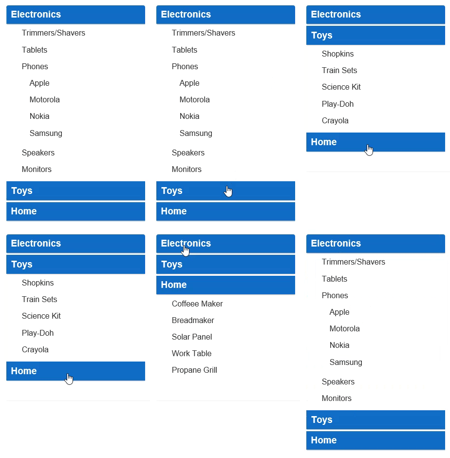
An accordion menu is a vertically stacked list of headers that can be clicked to reveal or hide content associated with them. They are commonly used for navigation. The main advantage of using accordion is that it reduces page scrolling and allows the user to hide content that makes the web appear less complicated.
In this sample, we will use CSS to customize the header display and to hide the collapse/expand glyphs. You need to make sure that AutoCollapse property is set to true (the default), so non-active panels are automatically collapsed.

The example uses CssClass property to display the TreeView control as an accordion. The below example code uses Property model added in the QuickStart section.
Create a new ASP.NET MVC application. Once you have created the application, a Content folder is created in the Solution Explorer after adding the view to the application. To add a custom style sheet in your application, follow these steps:
app.css) and click OK.| app.css |
Copy Code
|
|---|---|
/* accordion tree styles */ /* hide collapse/expand glyphs */ .accordion-tree.wj-treeview .wj-nodelist .wj-node:before { display: none; } /* level 0 nodes (headers) */ .accordion-tree.wj-treeview .wj-nodelist > .wj-node { font-size: 120%; font-weight: bold; padding: 6px 10px; color: white; background: #106cc8; margin-bottom: 4px; box-shadow: 0 1px 3px rgba(0,0,0,0.12), 0 1px 2px rgba(0,0,0,0.24); } /* level 1 nodes (navigation items) */ .accordion-tree.wj-treeview .wj-nodelist > .wj-nodelist > .wj-node { font-size: inherit; font-weight: normal; padding: 4px 1em; color: inherit; background: inherit; box-shadow: none; } .accordion-tree.wj-treeview .wj-nodelist { padding-bottom: 6px; } |
|
Accordion.cshtml
| Razor |
Copy Code
|
|---|---|
@using <ApplicationName.Models> @model Property[] @(Html.C1().TreeView().CssClass("accordion-tree") .Bind(Model).Id("accordion") .IsContentHtml(true) .Width(300) .AutoCollapse(true) .DisplayMemberPath("Header") .ChildItemsPath("Items")) |
|