# Searching in AutoComplete
Learn how to use the search feature of Wijmo's AutoComplete in this tutorial
## Content
By default, the **AutoComplete** control searches for matches against the property specified by the **displayMemberPath** property. You can extend the search to other properties by setting the **searchMemberPath** property to a comma-delimited list of properties to search on.
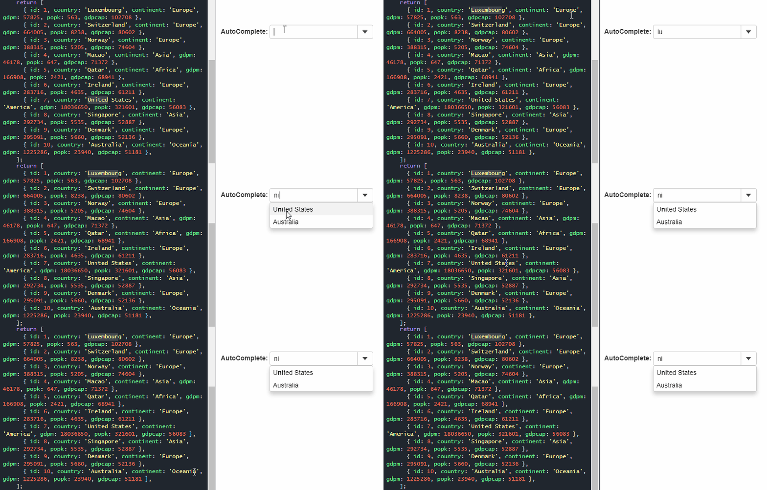
For example, AutoComplete shown in the image below is configured to search for country and continent names. So, on typing "ni", it returns "United States" and "Australia" as result. Here, "United States", the country name itself contains the typed string "ni", while "Australia" is displayed in the result because name of its continent "Oceania" contains the search string.
##### HTML
```html
```
##### Javascript
```javascript
import * as input from '@mescius/wijmo.input';
import { getData } from './data';
function init() {
let theAutoComplete = new input.AutoComplete('#theAutoComplete', {
displayMemberPath: 'country',
itemsSource: getData()
});
}
```
The **AutoComplete** control starts searching for matches 500ms after the user types at least two characters into the control, and stops searching after finding six matches. You can change these defaults by changing the values of the **delay**, **minLength**, and **maxItems** properties.
## Search During IME Composition
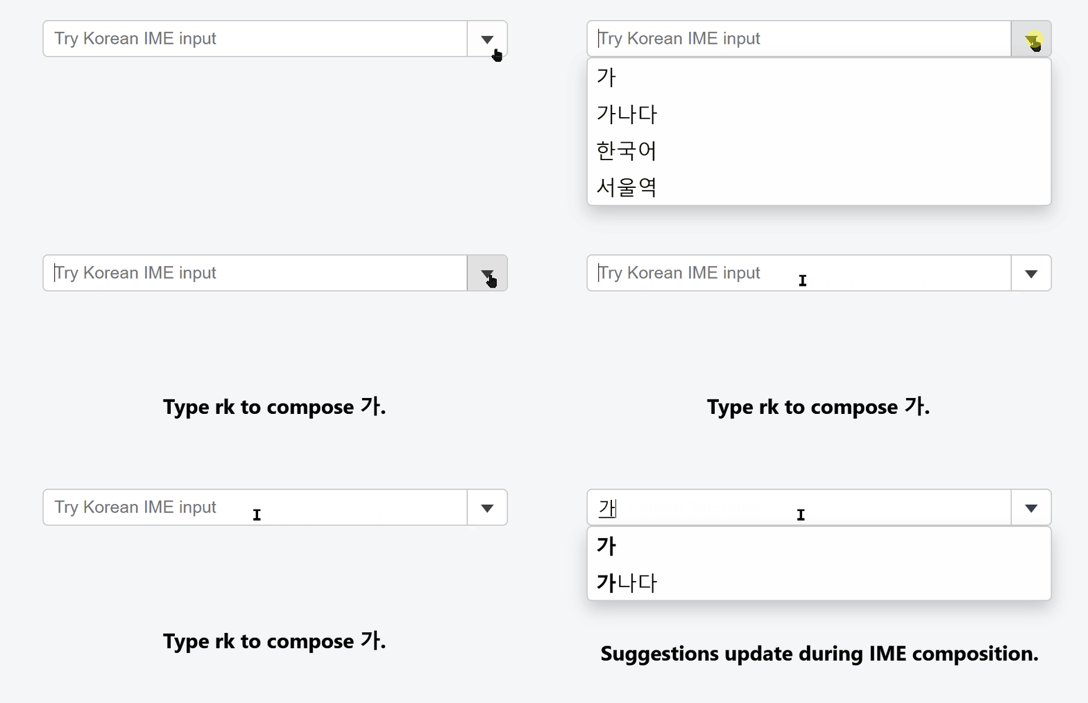
By default, **AutoComplete** starts searching only after IME composition is committed. While the user is composing text (for example, in Korean, Japanese, or Chinese), filtering does not occur until the input is finalized.
Set **searchDuringComposition** to `true` to allow filtering while composition is still active.
>type=note
> The control continues to honor `minLength`, `delay`, and `maxItems`.
```javascript
import * as input from '@mescius/wijmo.input';
const ac = new input.AutoComplete('#theAutoComplete', {
itemsSource: ['가', '가나다', '한국어', '서울역'],
minLength: 1,
searchDuringComposition: true
});
```
* Default value: `false`
* Supported in **AutoComplete** and **MultiAutoComplete**
See the API Reference for details on `searchDuringComposition`.
## Custom Search
The default search algorithm for the **AutoComplete** control searches for the items that contain the user input. The default search algorithm can be customized using the **itemsSourceFunction** property.
For example, instead of looking for the items that contain the user input, it can look for items that start with it. In the result achieved through the code below, typing "it" returns only "Italy" and not "United States".
#### Javascript
```javascript
import * as input from '@mescius/wijmo.input';
import { getData } from './data';
function init() {
// AutoComplete with custom search
let theAutoCompleteCustom = new input.AutoComplete('#theAutoCompleteCustom', {
displayMemberPath: 'country',
itemsSourceFunction: (query, max, callback) => {
// empty query? no results
if (!query) {
callback(null);
return;
}
//
// find items that start with the user input
let allItems = getData(), queryItems = [], rx = new RegExp('^' + query, 'i');
//
for (let i = 0; i < allItems.length && queryItems.length < max; i++) {
if (rx.test(allItems[i].country)) {
queryItems.push(allItems[i]);
}
}
callback(queryItems);
}
});
}
```
## Custom Style
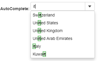
By default, the **AutoComplete** control highlights matches by applying the **wj-autocomplete-match** class to matching spans in the drop-down list. Wijmo's css defines a rule that makes those elements bold.
If you want to use a different style to highlight the matches, you can use CSS to customize the rules applied to the wj-autocomplete-match class.
For example, following CSS highlights the search text with a background color and border.
##### CSS
```css
.wj-autocomplete-match {
border: 1px solid green;
background: #e0ffe0;
}
```
## Custom Filter
By default, the **AutoComplete** control uses its built-in text matching logic to determine which items are included in the drop-down list.
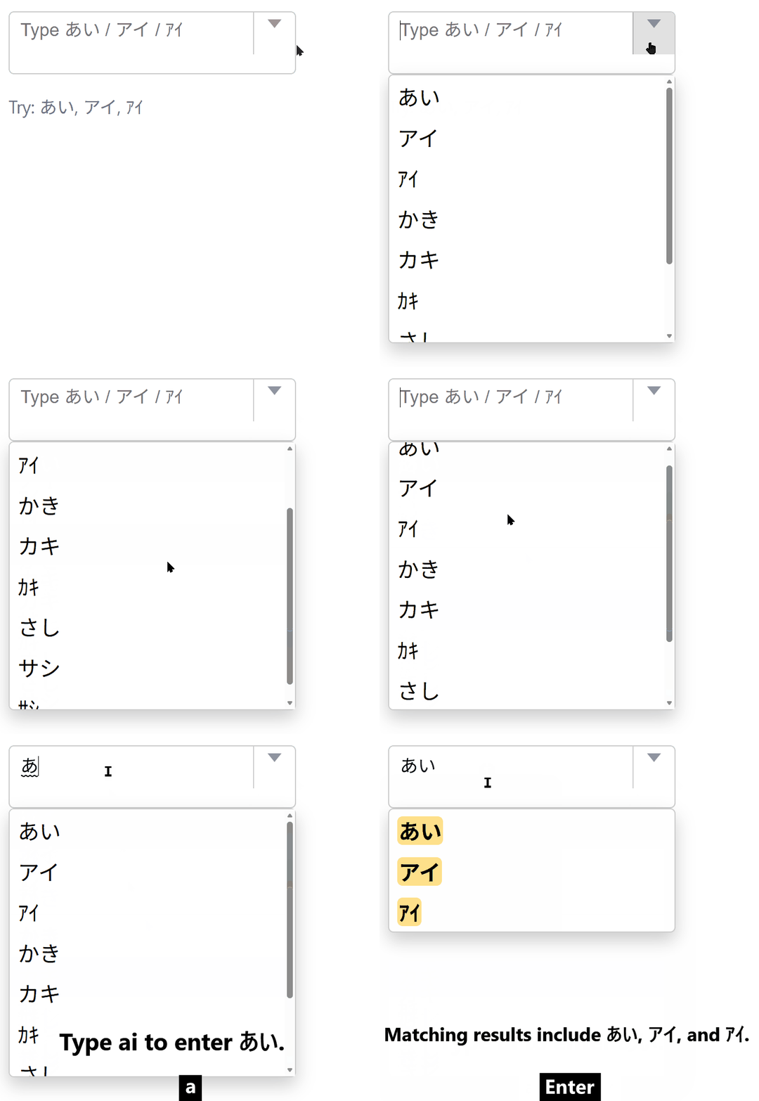
To override this behavior, set the `customFilter` property. When provided, this callback determines whether each item matches the current query.
This is useful when different text forms should be treated as equivalent, such as matching hiragana, katakana, or half-width kana.
```javascript
import * as input from '@mescius/wijmo.input';
const ac = new input.AutoComplete('#theAutoComplete', {
itemsSource: items,
displayMemberPath: 'name',
customFilter: (_item, query, text) => {
return text.toLowerCase().includes(query.toLowerCase());
}
});
```
When `customFilter` is set:
* Built-in matching options such as `caseSensitiveSearch`, `beginsWithSearch`, and `isContentHtml` are ignored.
* The control continues to honor `minLength`, `delay`, and `maxItems`.
* Returning `true` includes the item in the result list.
* Returning `false`, `null`, `undefined`, or any falsy value excludes the item.
* If the callback throws an exception, the item is treated as not matched.
If `itemsSourceFunction` is used to control the drop-down content, `customFilter` has no effect.
This property is supported by:
* AutoComplete
* MultiAutoComplete
* MultiSelect
* MultiSelectListBox
## Custom Highlight
Use the `customHighlight` property to control how filtered items are rendered in the drop-down list.
This callback receives `(item, query, text)` and returns an HTML string used to render the item.
The example below highlights the first matched range in the item text.
```javascript
import * as wjCore from '@mescius/wijmo';
import * as input from '@mescius/wijmo.input';
const ac = new input.AutoComplete('#theAutoComplete', {
itemsSource: items,
displayMemberPath: 'name',
customHighlight: (_item, query, text) => {
const safeText = wjCore.escapeHtml(text);
if (!query) {
return safeText;
}
const source = text.toLowerCase();
const target = query.toLowerCase();
const start = source.indexOf(target);
if (start < 0) {
return safeText;
}
const end = start + query.length;
return [
wjCore.escapeHtml(text.slice(0, start)),
'',
wjCore.escapeHtml(text.slice(start, end)),
'',
wjCore.escapeHtml(text.slice(end))
].join('');
}
});
```
When `customHighlight` is set:
* It controls only rendering.
* It does not affect filtering logic.
Always escape user-provided or dynamic content (for example, using `escapeHtml`) before returning HTML to prevent XSS.
For custom normalization scenarios, use the same normalization logic in both `customFilter` and `customHighlight` to ensure consistent matching and highlighting.