Using Touch Support with Drop-Down Elements
In This Topic
You can use touch gestures in drop-down cells, calendars, and other elements in the control.
The following items are drop-down elements or windows:
- FilterDropDown (Gadget)
- FilterDropDown (FilterBar's DropDown)
- DropDownList (ComboCellType)
- DropDownCalendar (DateTimeCellType)
- DropDownCalendar (GcDateTimeCellType)
- DropDownEdit (GcTextCellType)
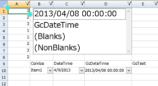
Set the TouchDropDownScale property to change the scale of the elements in the drop-down window. The default value is 1.5. The following drop-down filter has a scale of 2.
Note: If the TouchDropDownScale property is set to 0, all drop-down windows are zoomed in mouse or touch mode. If the TouchDropDownScale property is set to a valid value (1f to 4f), then padding is increased for touch support based on the property value.
Using Code
Set the TouchDropDownScale property to change the scale of the drop-down window.
| CS |
Copy Code |
|---|---|
fpSpread1.TouchDropDownScale = 1.0F; fpSpread1.TouchSelectionGripperBackColor = Color.Aqua; fpSpread1.TouchSelectionGripperLineColor = Color.BurlyWood; fpSpread1.TouchSelectionGripperThickness = 2; | |
| VB |
Copy Code |
|---|---|
fpSpread1.TouchDropDownScale = 1.0F fpSpread1.TouchSelectionGripperBackColor = Color.Aqua fpSpread1.TouchSelectionGripperLineColor = Color.BurlyWood fpSpread1.TouchSelectionGripperThickness = 2 | |
See Also