# Creating and Customizing Cell Borders
Learn how to customize cell borders and improve the appearance of cells with this comprehensive guide. Find detailed instructions for setting borders for cells, columns, rows, and sheets.
## Content
You can customize the appearance of the cells by setting borders for a cell or range of cells. You can also set a border for a column, row, sheet, or range of cells, the effect being the same as assigning the same border object to each individual cell. A border can be displayed on the left, right, top, or bottom, or around all four sides of a cell or cell range.
The [SheetView](/spreadnet/api/latest/online-win/FarPoint.Win.Spread/FarPoint.Win.Spread.SheetView.html) class also provides the [SetOutlineBorder](/spreadnet/api/latest/online-win/FarPoint.Win.Spread/FarPoint.Win.Spread.SheetView.SetOutlineBorder.html) method to set a border around the outside of a cell range, where it sets individual borders in each cell in the perimeter of the range. It also provides the [SetInsideBorder](/spreadnet/api/latest/online-win/FarPoint.Win.Spread/FarPoint.Win.Spread.SheetView.SetInsideBorder.html) method to set the borders inside a cell range.
## Border Display
The cell borders are drawn from left to right and top to bottom in the sheet. You can set a cell border by using the Cell [Border](/spreadnet/api/latest/online-win/FarPoint.Win.Spread/FarPoint.Win.Spread.Cell.Border.html) property, Column [Border](/spreadnet/api/latest/online-win/FarPoint.Win.Spread/FarPoint.Win.Spread.Column.Border.html) property, or Row [Border](/spreadnet/api/latest/online-win/FarPoint.Win.Spread/FarPoint.Win.Spread.Row.Border.html) property. By default, no border is displayed.
The cell borders of the left and top edges are painted depending on the setting of the [BorderCollapse](/spreadnet/api/latest/online-win/FarPoint.Win.Spread/FarPoint.Win.Spread.FpSpread.BorderCollapse.html) property.
* **BorderCollapse.Separate** (Default) paints the left and top edges of the cell border just inside the grid lines.
Thus, the left and top cell border edges are displayed in the left and top rows.
* **BorderCollapse.Collapse** paints the left and top edges of the cell border over the grid lines to the left and top of the cell.
* **BorderCollapse.Enhanced** paints the left and top edges of the cell border the same as in Excel.
The left column and top row (of a viewport, row header, column header, or sheet corner) are positioned so that those grid lines are just outside of the viewable area and thus those cell border edges are just outside of the viewable area (that is, those cell border edges are not displayed). Keep this in mind if you choose not to display a border for the Spread component or headers for the sheet, as the result might be visually confusing. The right and bottom edges of the cell border are always painted over the grid lines to the right and bottom of the cell, regardless of the **BorderCollapse** setting. For more information, see the [Overlapping Borders](/spreadnet/docs/latest/online-win/overview/spwin-devguide/spwin-setappearance/spwin-appearcell/spwin-cellborder#overlapping-borders) section in this topic.
> !type=note
> **Note:** If two adjacent borders have a different style or color, the last one drawn has precedence and is the one that is displayed. Cell borders reflect the precedence used by the sheet to determine the characteristics for sheet elements. For more information, see the list of precedence in the description of [Object Parentage](/spreadnet/docs/latest/online-win/overview/spwin-devguide/spwin-ssojbects/spwin-knowobjparentage).
## Border Styles
A border can be displayed as any of the built-in styles shown in the following table or customized borders that you define.
| **Style** | **Example** | **Description** | **FarPoint.Win Class Name** |
| ----- | ------- | ----------- | ----------------------- |
| Beveled |  | Has three-dimensional appearance if the highlight and shadow are set to different colors. | [BevelBorder](/spreadnet/api/latest/online-win/FarPoint.Win/FarPoint.Win.BevelBorder.html) |
| Complex |  | Each side of the cell can display a different color and type of border, with border patterns such as dashed or dotted. (See [Creating a Complex Border with Multiple Lines](/spreadnet/docs/latest/online-win/overview/spwin-devguide/spwin-setappearance/spwin-appearcell/spwin-cellborder/spwin-cellbordercomplex).) | [ComplexBorder](/spreadnet/api/latest/online-win/FarPoint.Win/FarPoint.Win.ComplexBorder.html) |
| Compound |  | Has two beveled borders, which can be separated by a frame | [CompoundBorder](/spreadnet/api/latest/online-win/FarPoint.Win/FarPoint.Win.CompoundBorder.html) |
| Double-line |  | Has two parallel lines. | [DoubleLineBorder](/spreadnet/api/latest/online-win/FarPoint.Win/FarPoint.Win.DoubleLineBorder.html) |
| Single-line border |  | Has a simple, single line. | [LineBorder](/spreadnet/api/latest/online-win/FarPoint.Win/FarPoint.Win.LineBorder.html) |
| Rounded-edge, single-line |  | Has a single line but the corners are rounded. | [RoundedLineBorder](/spreadnet/api/latest/online-win/FarPoint.Win/FarPoint.Win.RoundedLineBorder.html) |
You can specify more than one style and color for the same cell, column, row, or block of cells. Different border styles let you set different options. For example, the complex border lets you set different styles of border display for each side of the cell. For each of these border styles, you can turn off the display of the border on any side of the cell.
The following example code creates a bevel border and then sets a cell’s border to be the bevel border.
```csharp
// Create the bevel border.
FarPoint.Win.BevelBorder bevelbrdr = new FarPoint.Win.BevelBorder(FarPoint.Win.BevelBorderType.Raised, Color.Cyan, Color.DarkCyan);
// Set the bevel border to the cell B3 border.
fpSpread1.Sheets[0].Cells[4, 3].Border = bevelbrdr;
```
```vbnet
' Create the bevel border.
Dim bevelbrdr As New FarPoint.Win.BevelBorder(FarPoint.Win.BevelBorderType.Raised, Color.Cyan, Color.DarkCyan)
' Set the bevel border to the cell B3 border.
fpSpread1.Sheets(0).Cells(4, 3).Border = bevelbrdr
```
> !type=note
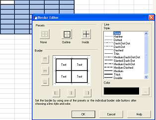
> **Note:** For information on customizing borders using the Spread Designer, refer to the description of the [Border Editor](/spreadnet/docs/latest/online-win/overview/spwin-designerguide/spwin-spd-editors/SDBorderEditor) in the Spread Designer Guide.
## Overlapping Borders
Cell borders are applied around the edge of each cell, and can overlap other cell borders. Whether borders overlap is determined by the setting of the [BorderCollapse](/spreadnet/api/latest/online-win/FarPoint.Win.Spread/FarPoint.Win.Spread.FpSpread.BorderCollapse.html) property of the [FpSpread](/spreadnet/api/latest/online-win/FarPoint.Win.Spread/FarPoint.Win.Spread.FpSpread.html) class.
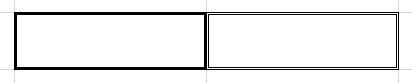
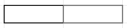
The following table shows all the [BorderCollapse](/spreadnet/api/latest/online-win/FarPoint.Win.Spread/FarPoint.Win.Spread.BorderCollapse.html) enumeration options.
| **Borders** | **Description** |
| ------- | ----------- |
| Separate borders | Displays borders for adjacent cells as separate borders detached from each other.
 |
| Collapsed borders | Displays borders for adjacent cells as collapsed into a single border.
 |
| Enhanced borders | Displays borders for adjacent cells as merged into a single cell. Enables the imported XLSX with complex merged cells and cell borders to look exactly as in Excel.
 |
> !type=note
> **Note:** The following should be noted when using the BorderCollapse.Enhanced option:
>
> * It works with flat style mode (no LegacyBehaviors.Style) only. If LegacyBehaviors.Style is used, it will work the same as BorderCollapse.Collapse.
> * Diagonal lines are not supported currently.
If two adjacent cells have different settings, and the property is set to have the cell borders overlap, the cell that is to the right or to the bottom has precedence. Each subsequent cell's border properties take precedence over the cell drawn before it.
Cell borders only overlap the amount of the grid line width. Therefore, if two 3 pixel borders overlap, and the grid line is 1 pixel, the overlapped borders are 5 pixels wide.
```csharp
// Adjacent cells as separate borders detached from each other
fpSpread1.BorderCollapse = FarPoint.Win.Spread.BorderCollapse.Separate;
// Adjacent cells as collapsed into a single border
fpSpread1.BorderCollapse = FarPoint.Win.Spread.BorderCollapse.Collapse;
// Adjacent cells as merged into a single cell
fpSpread1.BorderCollapse = FarPoint.Win.Spread.BorderCollapse.Enhanced;
```
```vbnet
'Adjacent cells as separate borders detached from each other
FpSpread1.BorderCollapse = FarPoint.Win.Spread.BorderCollapse.Separate
'Adjacent cells as collapsed into a single border
FpSpread1.BorderCollapse = FarPoint.Win.Spread.BorderCollapse.Collapse
'Adjacent cells as merged into a single cell
FpSpread1.BorderCollapse = FarPoint.Win.Spread.BorderCollapse.Enhanced
```
## Difference with Grid Lines
Borders are different from grid lines in that they create a border around a cell or range of cells rather than distinguishing rows and columns. Borders are drawn over the grid lines.
If you display cell borders for all the cells in a sheet, you might want to turn off the grid line display by setting the grid line type of the [HorizontalGridLine](/spreadnet/api/latest/online-win/FarPoint.Win.Spread/FarPoint.Win.Spread.SheetView.HorizontalGridLine.html) and [VerticalGridLine](/spreadnet/api/latest/online-win/FarPoint.Win.Spread/FarPoint.Win.Spread.SheetView.VerticalGridLine.html) properties of the sheet to None. For more information on grid lines refer to [Displaying Grid Lines on a Sheet](/spreadnet/docs/latest/online-win/overview/spwin-devguide/spwin-setappearance/spwin-appearcell/spwin-sheetgridcolor).
## Using the Properties Window
1. At design time, in the **Properties** window, select the Spread component.
2. Select the **Sheets** property.
3. Click the button to display the **SheetView Collection Editor**.
4. Click the sheet for which you want to set cell borders.
5. Select the **Cells** property and then click the button to display the **Cell, Column, and Row Editor**.
6. Select the cell or cells for which you want to set the border.
7. In the property list, set the **Border** property.
8. If you want to customize the border you have set, double-click the **Border** property to display the border properties for the border style you have selected.
9. Set the border properties for your border.
10. Click **OK** to close the **Cell, Column, and Row Editor**.
11. Click **OK** to close the **SheetView Collection Editor**.
## Using a Shortcut
1. Create a new border object of the type of border you want to create (BevelBorder, ComplexBorder, and so on).
2. Set the **Cells** shortcut object **Border** property to the new border object you created.
## Using the Spread Designer
1. Select the sheet tab for the sheet for which you want to set a cell border.
2. Select the cell or range of cells for which you want to set the border.
3. Right-click and select **Borders**, or in the property list (in the **Misc** category), set the **Border** property.
4. If you want to customize the border you have set, double-click the **Border** property to display the border properties for the border style you have selected.
5. Set the border properties for your border.
6. From the **File** menu choose **Apply and Exit** to apply your changes to the component and exit Spread Designer.
## See Also
[Customizing the Outline of the Component](/spreadnet/docs/latest/online-win/overview/spwin-devguide/spwin-setappearance/spwin-appearcell/spwin-appearcontrolborder)
[Displaying Grid Lines on a Sheet](/spreadnet/docs/latest/online-win/overview/spwin-devguide/spwin-setappearance/spwin-appearcell/spwin-sheetgridcolor)