# Bind Data Source
This topic explains how to bind data from the data source in Data Charts.
## Content
A Data Chart must be connected to a data source before it can visualize data. In SpreadJS, data is typically managed through the Data Manager, where tables are defined and maintained.
To display data in a Data Chart, you:
1. Bind the chart to a table.
2. Map table fields to chart encodings.
This topic explains how to configure data binding and how encodings control data visualization.
## Bind a Chart to a Table
Each Data Chart binds to a table by setting the `tableName` property in the chart configuration.
```javascript
dataChart.setChartConfig({
tableName: 'Sales',
plots: [...]
});
```
The table must exist in the Data Manager.
Data Charts can also bind data from multiple related tables. When using multiple tables:
* Relationships must be defined in the Data Manager.
* Fields from related tables can be referenced using `tableName.fieldName`.
## Encodings
Encodings define how data fields are mapped to visual elements in the chart.
Each plot defines its encodings under:
```javascript
plots[n].encodings
```
Encodings control:
* What values are aggregated
* How data is grouped
* How colors, tooltips, and filters are applied
Encodings are organized into:
* Value Encoding
* Category Encoding
* Trellis Binding
* Details Encoding
* Color Encoding
* Other Encodings
### Value Encoding
Value encoding defines which numeric fields are visualized as measures (typically along the Y-axis).
#### Single-Field Value Encoding
The most common scenario binds one field per value entry:
```javascript
encodings: {
values: [
{
field: "Sales",
aggregate: GC.Spread.Sheets.DataCharts.Aggregate.sum
}
]
}
```
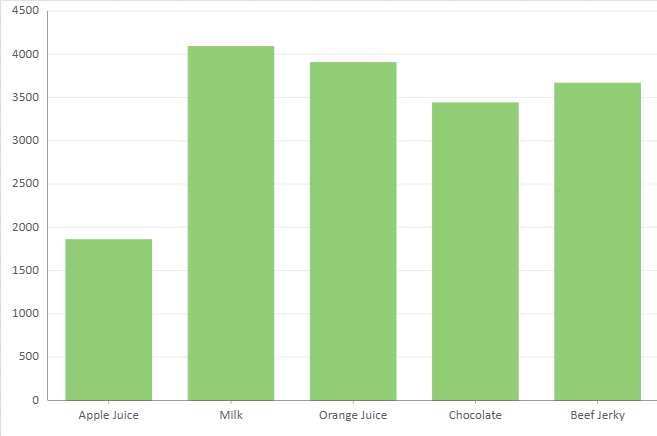
When multiple value fields are defined:
* Each field is treated as a separate series.
* The legend is automatically generated from the value fields.
Some chart types (such as Pie and Donut) support only a single value field.
#### Multi-Field Value Encoding
**Supported chart types**
* Range value encoding:
* Range Column
* Range Bar
* Range Area
* Stock value encoding:
* Candlestick
* OHLC
Some chart types require multiple data fields to represent a single logical value.
Examples:
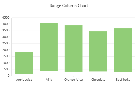
* Range charts require lower and upper values.
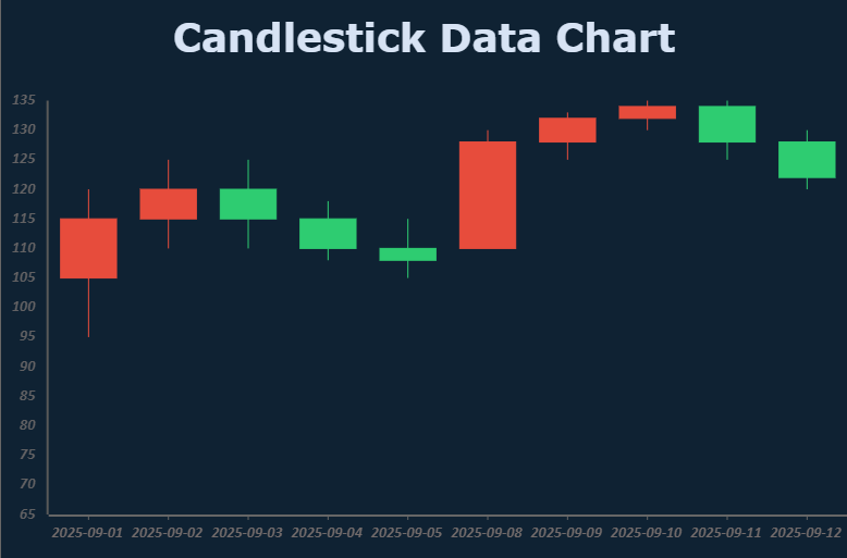
* Candlestick and OHLC charts require open, high, low, and close values.
For these charts, multiple fields are grouped under a single value entry using a `vectors` structure.
**Range Chart Example**
```javascript
encodings: {
values: [{
vectors: {
lower: { field: "Return" },
upper: { field: "Sales" }
},
aggregate: GC.Spread.Sheets.DataCharts.Aggregate.sum
}],
category: { field: "Product" }
}
```
**Stock Chart Example**
```javascript
encodings: {
values: [{
vectors: {
open: { field: "open" },
high: { field: "high" },
low: { field: "low" },
close: { field: "close" }
}
}],
category: { field: "date" }
}
```
In this structure:
* Each named vector binds to a specific field.
* All required vectors must be provided for the chart type.
Existing configurations that use separate value entries continue to work, but the vector structure is recommended for clarity and consistency.
>type=note
> **Note:**
> For chart types that require vectors, all required fields must be provided. If a required vector field is missing, the chart will not render correctly.
### Category Encoding
Category encoding defines how data is grouped along a dimension (typically the X-axis).
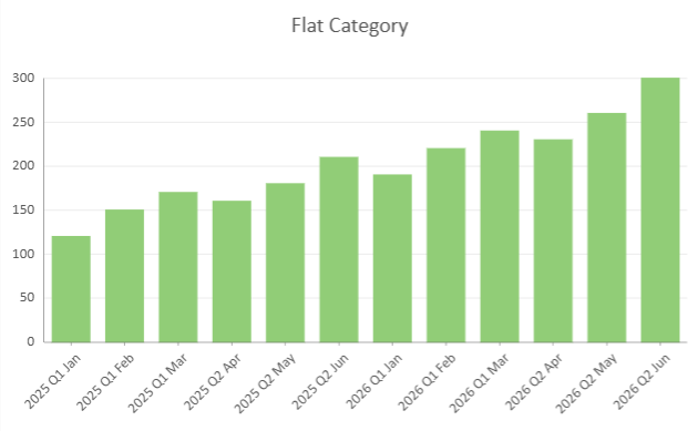
#### Flat Category
A flat category binds a single field:
```javascript
encodings: {
category: {
field: "timePeriod"
}
}
```
#### Date Category Encoding
When a Date field is bound to Category, you can use `dateMode` to control how Date values are grouped.
If `dateMode` is not specified, or if it is set to `null` or `undefined`, the chart uses the original Date values. This is the raw date behavior.
You can set `dateMode` to group Date values by a specific time unit, such as year, quarter, month, day, hour, minute, or second.
```javascript
encodings: {
category: {
field: "orderDate",
dateMode: GC.Spread.Sheets.DataCharts.DateMode.month
}
}
```
In this example, Date values from the orderDate field are grouped by month.
Setting dateMode changes how Date values are grouped. It does not automatically change the axis scale. By default, a Date field bound to Category uses an ordinal axis, where each grouped Date value is treated as a category. To render the Date values on a continuous time axis, configure the category axis to use a Date scale.
>type=note
> Date category encoding is supported by chart types that support category binding, such as Column, Bar, Line, Area, Waterfall, Candlestick, and OHLC charts.
> Pie and Donut charts do not support Date category encoding.
#### Hierarchical Category
Hierarchical Category allows multiple grouping levels within a single plot.
This is useful when working with naturally nested data, such as:
* Year → Quarter → Month
* Region → Country → City
You define hierarchy levels using nested `child` objects.
**Example**
```javascript
encodings: {
values: [{
field: "Sales",
aggregate: GC.Spread.Sheets.DataCharts.Aggregate.sum
}],
category: {
field: "Year",
child: {
field: "Quarter",
child: {
field: "Month"
}
}
}
}
```
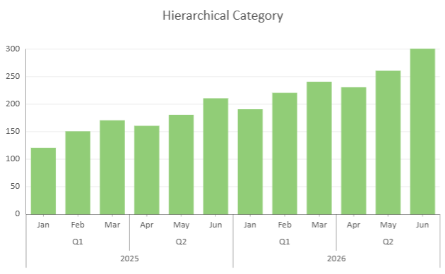
Key characteristics:
* Nesting order defines grouping order.
* Each level refines the grouping of its parent.
* All levels share the same aggregation rules.
* If no `child` is defined, the category behaves as a flat category.
When hierarchical categories include Date fields, each Date level can define its own `dateMode`.
```javascript
encodings: {
category: {
field: "orderDate",
dateMode: GC.Spread.Sheets.DataCharts.DateMode.year,
child: {
field: "orderDate",
dateMode: GC.Spread.Sheets.DataCharts.DateMode.month
}
}
}
```
Multi-level Date categories define a grouping hierarchy. Each level is evaluated independently.
| Supported Chart Types | Unsupported Chart Types |
| --------------------- | ----------------------- |
| - Column
- Range Column
- Stacked Column
- Percent Stacked Column
- Bar
- Range Bar
- Stacked Bar
- Percent Stacked Bar
- Area
- Range Area
- Stacked Area
- Percent Stacked Area
- Line
- Candlestick
- OHLC
| - Pie
- Donut
- Radar
- Polar charts
- Treemap
- Funnel
- Scatter
- Bubble
|
>type=note
> **Note:**
> All hierarchy levels are rendered simultaneously. Hierarchical Category does not provide expand, collapse, or drill-down behavior.
### Trellis Binding
Trellis Binding, also known as small multiples, partitions one dataset into multiple chart panels based on one or more categorical fields. Each panel displays the same chart type and visual configuration, but shows a subset of the data for a specific row or column value.
Use trellis binding when you want to compare the same measure across dimensions such as region, product category, department, or time period.
Trellis Binding uses the `row` and `column` encodings:
* `row` creates trellis panels organized by rows.
* `column` creates trellis panels organized by columns.
* `row` and `column` can be used together to create a grid of panels.
Trellis Binding is supported by all Data Chart types. Axis rendering behavior varies by chart type.
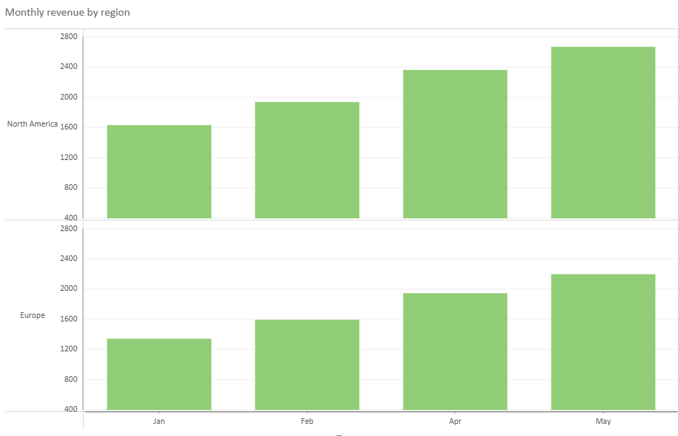
#### Row Binding
Row binding creates a separate trellis row for each unique value in the bound field.
```javascript
encodings: {
values: [{ field: "Profit" }],
category: { field: "Product" },
row: { field: "Region" }
}
```
#### Column Binding
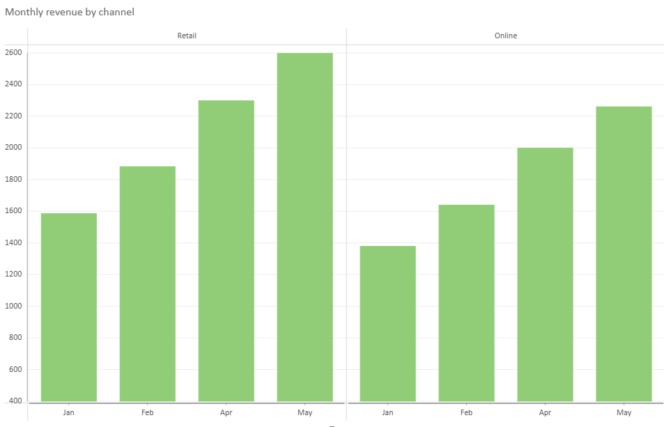
Column binding creates a separate trellis column for each unique value in the bound field.
```javascript
encodings: {
values: [{ field: "Profit" }],
category: { field: "Product" },
column: { field: "Channel" }
}
```
#### Row and Column Binding
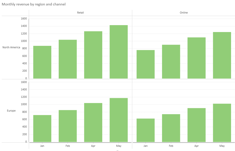
You can use row and column bindings together to create a two-dimensional trellis layout.
```javascript
encodings: {
values: [{ field: "Profit" }],
category: { field: "Product" },
row: { field: "Region" },
column: { field: "Channel" }
}
```
#### Multi-Level Trellis Binding
Trellis row and column bindings support hierarchical fields by using nested `child` objects. Each level further partitions the trellis layout.
```javascript
encodings: {
values: [{ field: "Profit" }],
category: { field: "Product" },
row: {
field: "Region",
child: {
field: "City"
}
},
column: {
field: "Quarter",
child: {
field: "Month"
}
}
}
```
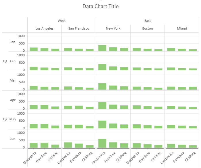
#### Trellis Layout Options
By default, Cartesian trellis charts use shared axes outside the trellis cells. You can set `includeAxesInCells` to `true` to render axes inside each trellis cell.
```javascript
config: {
trellis: {
includeAxesInCells: true
}
}
```
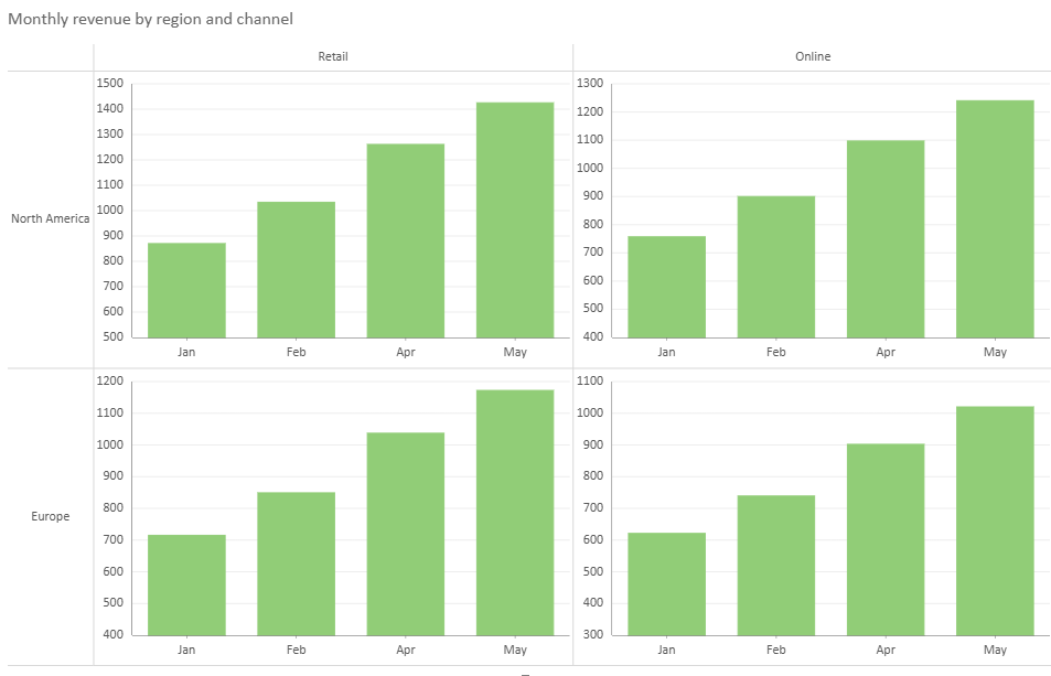
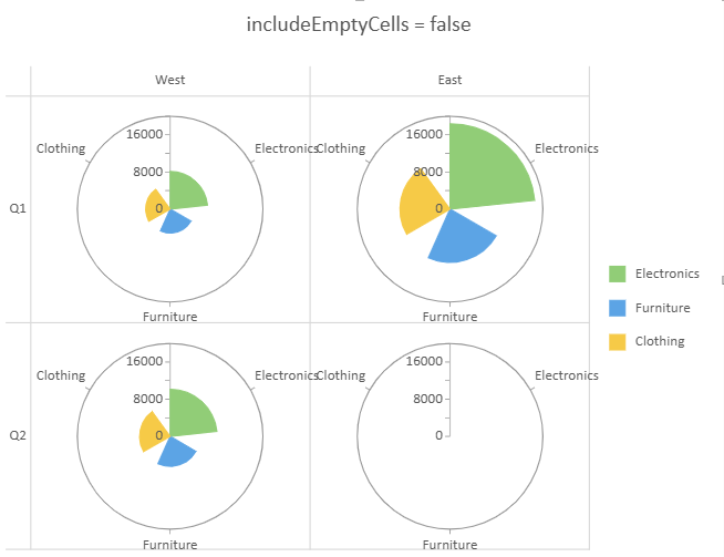
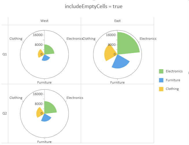
When axes are rendered inside cells, empty trellis cells can be controlled with `includeEmptyCells`.
By default, `includeEmptyCells` is `false`, and an empty trellis cell still renders its plot area and axes.
When `includeEmptyCells` is set to `true`, trellis cells without data are not rendered and appear empty.
```javascript
config: {
trellis: {
includeEmptyCells: true
}
}
```
Trellis charts use a shared legend for the entire trellis layout. Tooltips include trellis row and column field values to identify the cell context. For bar and column chart families, bar height or column width is kept consistent across trellis cells for comparison.
### Detail Encoding
Detail encoding divides data into additional groups within the current chart structure. It is used to slice the data, but it does not assign colors to data points.
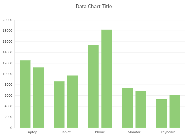
```javascript
encodings: {
values: [{ field: "Sales" }],
category: { field: "Product" },
details: [{ field: "Region" }]
}
```
Most chart types that support detail encoding allow one detail field. Sunburst and Treemap charts support multiple detail fields, where the field order defines the hierarchy from outer level to inner level.
```auto
encodings: {
values: [{ field: "Sales" }],
details: [
{ field: "Category" },
{ field: 'Subcategory' },
{ field: 'Product' }
]
}
```
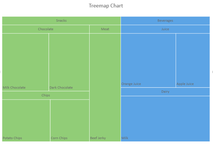
If multiple detail fields are configured for a chart type that supports only one detail field, only the first detail field takes effect.
>type=note
> To show different detail groups with different colors, configure color encoding explicitly. Detail encoding alone does not generate a color legend.
### Color Encoding
Color encoding determines how colors are assigned to data points and how color legend items are generated.
A Data Chart does not assign colors based on detail encoding automatically. If no color encoding is specified, the chart does not apply the previous built-in color strategy and no color legend is generated.
Color encoding supports the following field types, depending on the chart type:
* String fields
* Numeric fields
* Value Names
#### String Fields
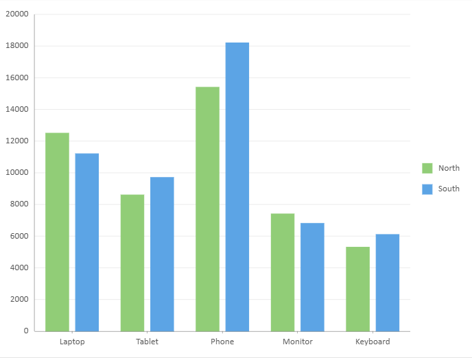
For most chart types, a string field used for color encoding must already be used in Category or Details. This ensures that the data has already been sliced before colors are assigned.
```javascript
encodings: {
values: [{ field: "Sales" }],
category: { field: "Product" },
details: [{ field: "Region" }],
color: { field: "Region" }
}
```
#### Numeric Fields
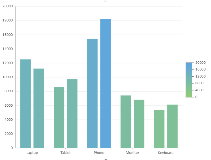
For chart types that support numeric color encoding, a numeric field creates a gradient color legend.
```javascript
encodings: {
values: [{ field: "Sales" }],
category: { field: "Product" },
color: {
field: "Sales",
aggregate: GC.Spread.Sheets.DataCharts.Aggregate.sum
}
}
```
When the color field is numeric, aggregation can be applied to the color field. If the color field is not numeric, the aggregation setting does not take effect.
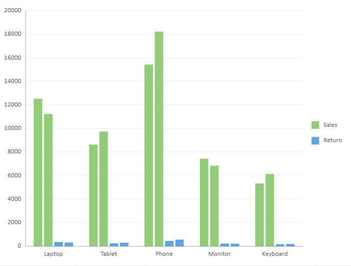
#### Value Names
Use Value Names when a chart has multiple value fields and each value field should be represented by a separate color.
```javascript
encodings: {
values: [
{ field: "Sales" },
{ field: "Return" }
],
category: { field: "Product" },
color: {
field: GC.Spread.Sheets.DataCharts.EncodingField.valueName
}
}
```
When Value Names is used for color encoding, each value field generates a color legend item.
### Chart Type Differences for Detail and Color Encoding
Detail and color encoding behavior can vary by chart type.
* Area and Line charts apply color at the series level. They do not support using Category fields as color fields, and they do not support numeric color encoding.
* Radar and Filled Radar charts follow the same color encoding restrictions as Area and Line charts.
* Scatter and Bubble charts do not support detail encoding. Any string field can be used for color encoding, but Value Names color encoding is not supported.
* Sunburst and Treemap charts support multiple detail fields for hierarchical data.
* Funnel charts do not support detail encoding.
### Other Encodings
* **size** \- Applies a continuous size scale\. Supported only by bubble charts\.
* **tooltip** \- Specifies which fields are displayed in tooltips\.
* **filter** \- Applies filtering to source data before aggregation\. Supports numeric and string filtering and nested logical conditions\.
## Compatibility
Data Charts now require encodings to be configured explicitly.
If no color encoding is specified, colors are not assigned by the previous built-in color strategy, and no color legend is generated.
For existing `.sjs` or `.ssjson` files, compatibility handling is applied automatically based on the file version.
For code-based configurations, you can pass `true` as the second parameter of `setChartConfig` to infer missing encodings for compatibility with previous behavior.
```javascript
dataChart.setChartConfig(config, true);
```
For details about the method signature, refer to the [API reference](/spreadjs/api/v19/classes/GC.Spread.Sheets.DataCharts.DataChart#setchartconfig).
## Using Code
DataCharts bind to tables managed by the SpreadJS Data Manager.
Before configuring a chart, you must:
1. Initialize the Data Manager
2. Register tables
3. (Optional) Define relationships between tables
### Step 1 – Initialize the Data Manager
```javascript
const dataManager = spread.dataManager();
```
### Step 2 – Register Tables
Register all required tables before creating charts.
```javascript
// Sales table
const salesTable = createSalesTable(dataManager);
await salesTable.fetch();
// Orders table
const ordersTable = createOrders(dataManager);
await ordersTable.fetch();
// Order details table
const orderDetailsTable = createOrderDetails(dataManager);
await orderDetailsTable.fetch();
// Hierarchical sales table (used for hierarchical category examples)
const hierarchySalesTable = createHierarchySalesTable(dataManager);
await hierarchySalesTable.fetch();
```
### Step 3 – Define Table Relationships (Optional)
When binding multiple tables, a relationship must be defined between them.
```javascript
dataManager.addRelationship(
ordersTable, "orderId",
"orderDetailsTable",
orderDetailsTable, "OrderId",
"ordersTable"
);
```
### Step 4 – Basic Data Binding Example
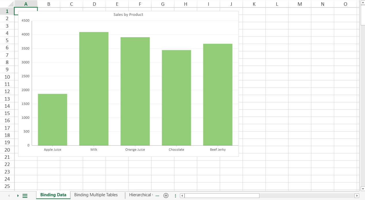
The following example binds a Column chart to the `Sales` table.
```javascript
const sheet = spread.getSheet(0);
sheet.name("Binding Data");
const dataChart = sheet.dataCharts.add('data-chart', 10, 10, 600, 400);
dataChart.setChartConfig({
tableName: 'Sales',
plots: [{
type: GC.Spread.Sheets.DataCharts.DataChartType.column,
encodings: {
values: [{
field: "Sales",
aggregate: GC.Spread.Sheets.DataCharts.Aggregate.sum
}],
category: {
field: "Product"
}
}
}],
config: {
header: {
title: "Sales by Product"
}
}
});
```
### Step 5 – Binding Multiple Tables
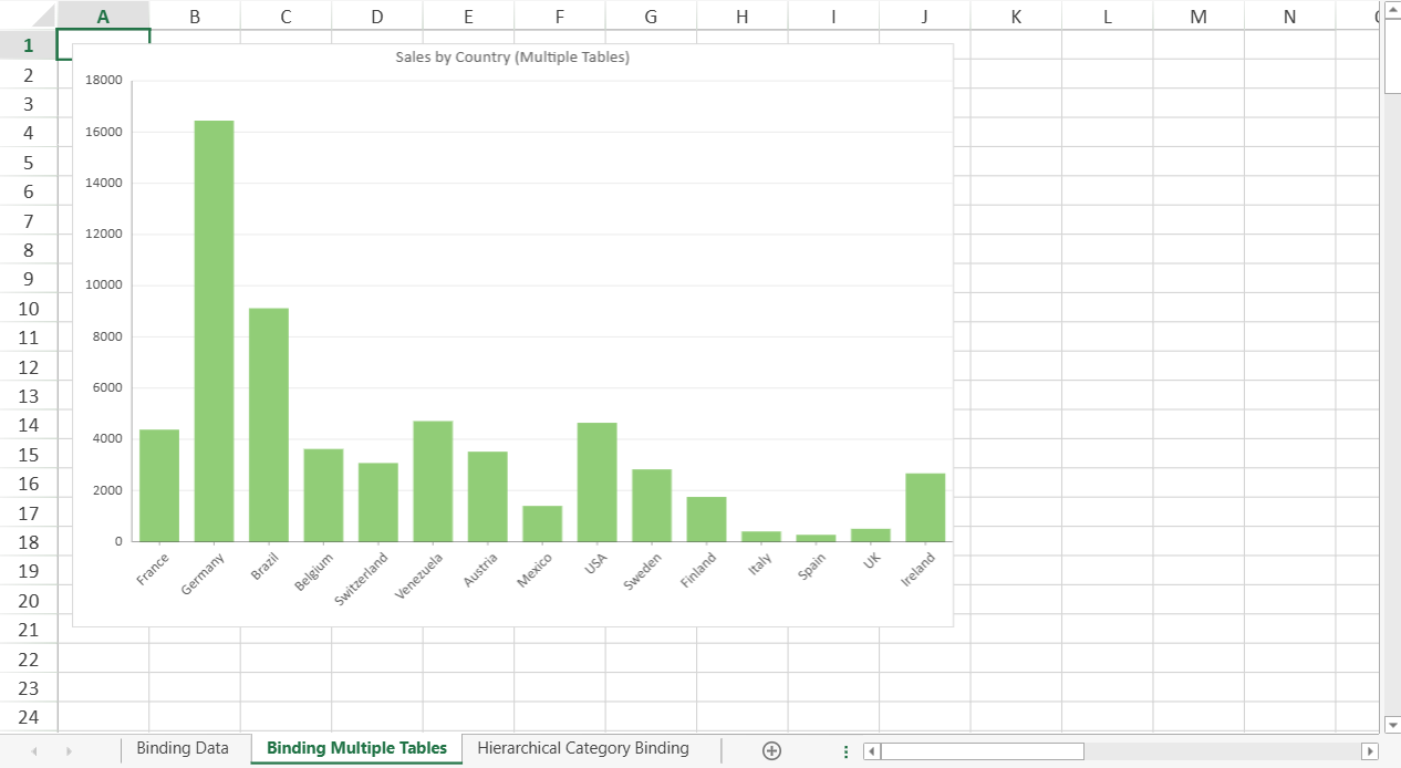
When a relationship exists, fields from related tables can be referenced using a path expression.
The following example binds a chart to the `Orders` table and aggregates data from the related `orderDetailsTable`.
```javascript
let sheet2 = spread.getSheet(1);
sheet2.name("Binding Multiple Tables");
const dataChart2 = sheet2.dataCharts.add('data-chart-2', 10, 10, 600, 400);
dataChart2.setChartConfig({
tableName: 'Orders',
plots: [{
type: GC.Spread.Sheets.DataCharts.DataChartType.column,
encodings: {
values: [{
field: 'orderDetailsTable.Sales'
}],
category: {
field: 'shipCountry'
}
}
}],
config: {
header: {
title: "Sales by Country (Multiple Tables)"
}
}
});
```
### Step 6 – Hierarchical Category Binding
DataCharts support multi-level category grouping by defining nested `child` fields within the `category` encoding.
The following example binds a Column chart using a hierarchical category structure (Year → Quarter → Month).
```javascript
let sheet3 = spread.getSheet(2);
sheet3.name("Hierarchical Category Binding");
const dataChart3 = sheet3.dataCharts.add('data-chart-3', 10, 10, 600, 400);
dataChart3.setChartConfig({
tableName: 'HierarchySales',
plots: [{
type: GC.Spread.Sheets.DataCharts.DataChartType.column,
encodings: {
values: [{
field: 'sales'
}],
category: {
field: "year",
child: {
field: "quarter",
child: {
field: "month"
}
}
}
}
}],
config: {
header: {
title: "Hierarchical Column Chart"
}
}
});
```
### Complete Example
The implementations of the following functions are not shown in this topic:
* `createSalesTable`
* `createOrders`
* `createOrderDetails`
* `createHierarchySalesTable`
Download the complete runnable example, including all table creation utilities:
[BindDataSourceExample.js](https://cdn.mescius.io/document-site-files/attachments/b2223940-43c2-44cf-8eda-f5ab9acd84f0/BindDataSourceExample-20260729.eca72d.js)