# Combo Charts
## Content
The **Combo Chart** provides a flexible visualization tool that combines multiple chart types (e.g., column, line, area) into a single, unified chart. This allows users to represent and compare different types of data—such as quantities, trends, or percentages—within one graphical display.
## Supported Chart Combinations
The following table lists which chart types can be combined in a single Combo Chart.
| **Primary Chart Type** | **Can Be Combined With** | **Example Combination(s)** |
| ------------------ | -------------------- | ---------------------- |
| Column | Column, Area, Line, Candlestick, OHLC | 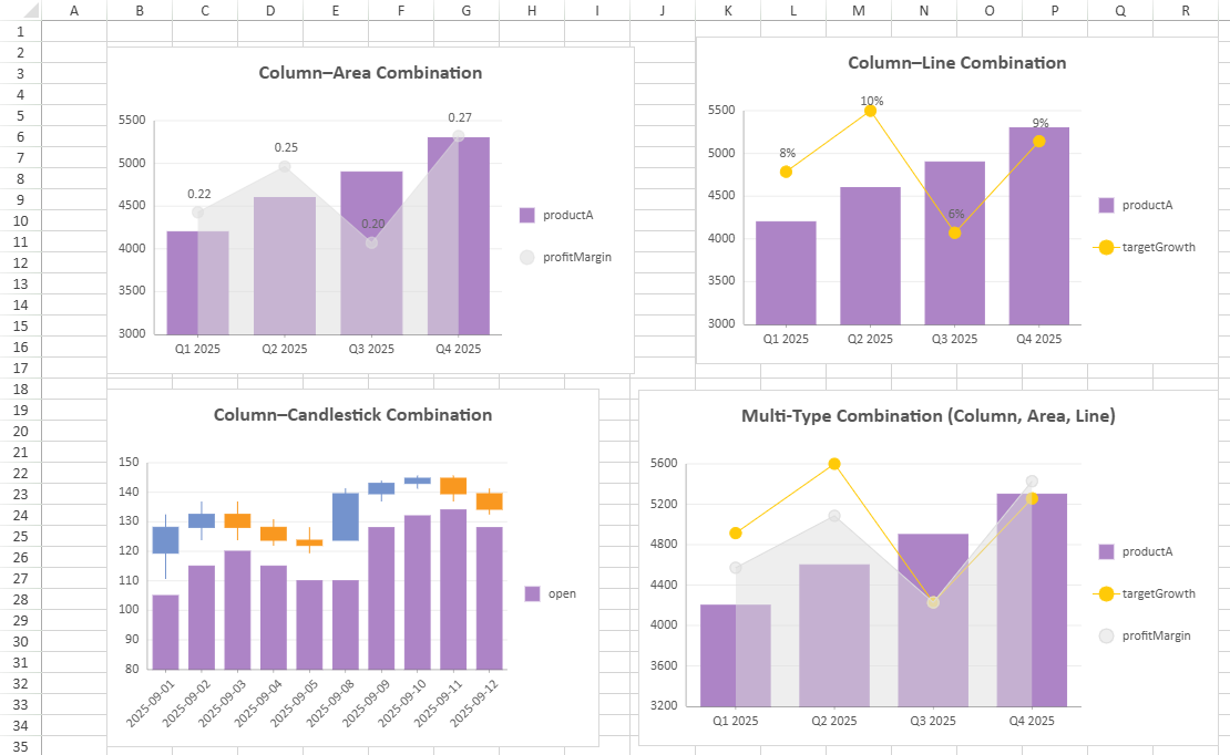 |
| Bar | Bar | - |
| Area | Column, Area, Line, Candlestick, OHLC | 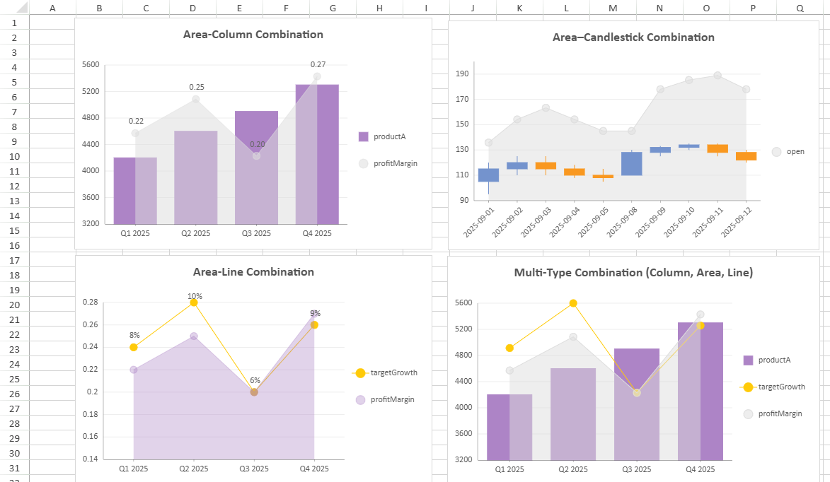 |
| Line | Column, Area, Line, Candlestick, OHLC | 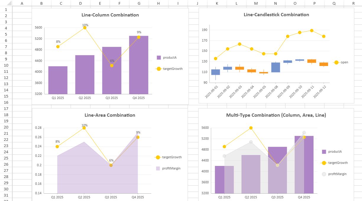 |
| Pie | - | - |
| Radar | Radar | - |
| Scatter | Scatter | - |
| Treemap | - | - |
| Funnel | - | - |
| Waterfall | - | - |
| Candlestick, OHLC | Column, Area, Line, Candlestick, OHLC | 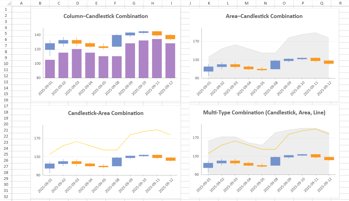 |
>type=note
> **Notes**:
>
> * A Combo Chart **supports** **a maximum of 4 subplots.**
> * Some chart variations (for example, Range Column, Stacked Column and Percent Stacked Column) share the same combination rules.
> * Examples combining the same chart type are not listed here. For displaying multiple series of the same type, it’s generally better to use a chart with multiple value fields rather than a combo chart configuration.
## Combo Chart Configuration
The table below summarizes property scope and synchronization behavior of Combo Chart.
Some settings are synchronized across all plots (marked as *Common*), while others can be customized independently per plot (marked as *Independent*).
| **Property** | **Scope** | **Notes** |
| -------- | ----- | ----- |
| Chart Name | Independent | Sets the **unique chart name** of the current plot. |
| Chart Type | Independent | - |
| Category | Common | All plots in a Combo Chart **share the same category encoding field**. |
| Value | Independent | *A*t least one is needed. |
| Chart Style | Independent | - |
| Data Labels | Independent | - |
| Tool Tip | Independent | - |
| Animation | Independent | - |
| Legend | Independent | - |
| Appearance | Common | Affects the overall Combo Chart background and border appearance. |
| Title | Common | Shared chart title synchronized across all plots. |
| Layout | Common | Controls the Combo Chart’s position, width, and height within the sheet. |
| Category Axis | Common | - Only one category X-axis panel exists.
- All plots must use this single category axis.
|
| Value Axis | Independent/Common | - Can be configured independently or shared across plots.
- Each plot can be bound to an independent value axis.
- Each axis supports its own scale and display settings.
|
>type=note
> **Notes:**
>
> * Only one dataset can be used in a single Combo Chart.
> * All plots share the same category axis; category changes affect every plot.
> * Global appearance changes (appearance, title, layout, category axis) synchronize across plots.
>type=info
> **Tips:**
>
> * Overlapping visual layers may cause plotted lines or points to obscure columns. Adjust transparency or order as needed.
> * Use separate value axes when plots represent metrics with different scales to improve readability.
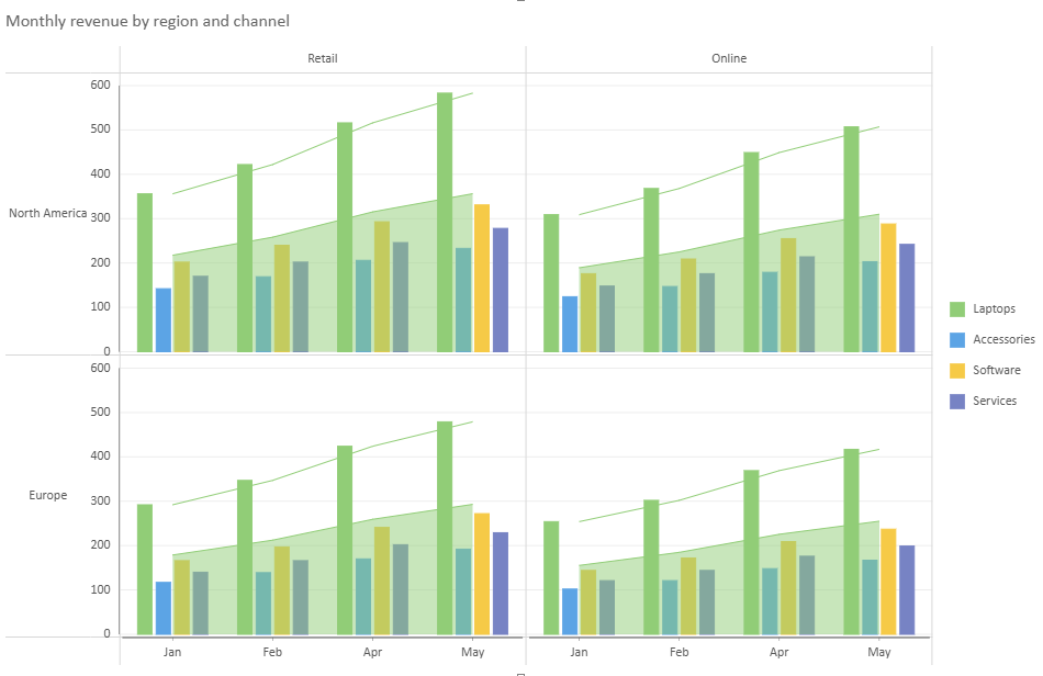
**About Trellis Binding in Combo Chart**
Combo Charts support Trellis Binding. When using trellis binding in a Combo Chart, all plots should use the same `row`, `column`, and `trellis` configuration.
If different trellis settings are specified for different plots through the API, the trellis settings from the first plot are used, and subsequent trellis settings are ignored.
**About Legend in Combo Chart**
You can customize the legend for each plot individually, and the display order of legends **follows the order in which the plots are created.**
>type=note
> **Notes:**
>
> * Only plots with **valid legend bindings** will produce visible legends.
> * When multiple legends use the same position, their maximum size settings are resolved together for layout. For legends positioned on the left or right, the effective `maxWidth` is the smallest value among those legends. For legends positioned at the top or bottom, the effective `maxHeight` is the largest value among those legends.
```javascript
// Example: plot1 and plot2 use independent legned settings.
{
plotAreas: [{
legends: [
{ type: "Color", position: "Bottom" }, // plot1
{ type: "Color", position: "Top" } // plot2
]
}]
}
```
**About Value Axes in Combo Chart**
A combo chart supports multiple value axes so that data series with different value ranges can be displayed within the same chart.
**Axis Binding Rules**
* Each plot must be linked to at least one value axis.
* Up to four axes (Y1–Y4) are available.
* By default, all value fields share a common axis (Y1).
* The binding order cannot be manually specified. Axes are automatically assigned in the sequence Y1 to Y4, which does not affect the chart output.
* Unused axes remain hidden from the chart.
**Axis Customization**
* Each axis can be configured independently.
The following examples illustrate how to configure shared and independent value axes in a combo chart.
```javascript
// Example 1: plot1 and plot2 share the same value axis
{
axes: [{
plots: ["plot1", "plot2"],
type: "Y"
}]
}
// Example 2: plot1 and plot2 use independent value axes
{
axes: [{
plots: ["plot1"],
type: "Y"
}, {
plots: ["plot2"],
type: "Y"
}]
}
```
## Example: Three‑Plot Combo Chart
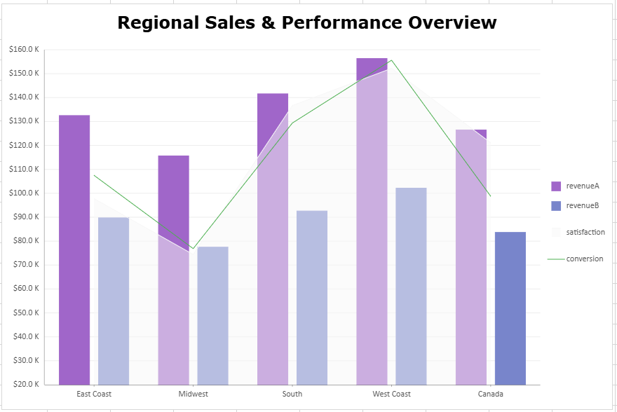
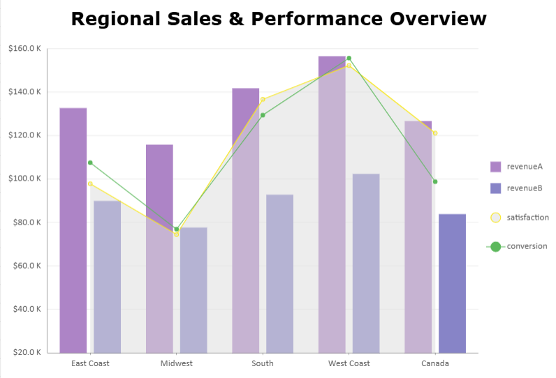
This combo chart combines a column plot with an area plot for customer satisfaction and a line plot for conversion rate.
It demonstrates how up to three plots can be visualized together, balancing both value‑based and percentage‑based metrics across regions.
```javascript
const sheet = spread.getActiveSheet();
sheet.name("Combo Chart");
const dataManager = spread.dataManager();
function createSalesTable(dataManager) {
return dataManager.addTable("Sales", {
data: [
{
region: "East Coast",
revenueA: 132489,
revenueB: 89732,
satisfaction: 0.84,
conversion: 0.056
},
{
region: "Midwest",
revenueA: 115621,
revenueB: 77484,
satisfaction: 0.81,
conversion: 0.049
},
{
region: "South",
revenueA: 141570,
revenueB: 92596,
satisfaction: 0.89,
conversion: 0.061
},
{
region: "West Coast",
revenueA: 156343,
revenueB: 102152,
satisfaction: 0.91,
conversion: 0.067
},
{
region: "Canada",
revenueA: 126481,
revenueB: 83646,
satisfaction: 0.87,
conversion: 0.054
}
],
});
}
const SalesTable = createSalesTable(dataManager);
await SalesTable.fetch();
// Create combo data charts
const dataChart = sheet.dataCharts.add('data-chart', 10, 10, 600, 400);
dataChart.setChartConfig({
tableName: 'Sales',
plots: [{
name: "Product A & B Revenue",
type: GC.Spread.Sheets.DataCharts.DataChartType.column,
encodings: {
values: [
{ field: "revenueA" },
{ field: "revenueB" }
],
category: {
field: "region"
}
},
config: {
palette: ['#A066C9', '#7885CB']
}
}, {
name: "Customer Satisfaction",
type: GC.Spread.Sheets.DataCharts.DataChartType.area,
encodings: {
values: [{
field: "satisfaction"
}]
},
config: {
palette: ['#F7F7F7']
}
}, {
name: "Conversion Rate",
type: GC.Spread.Sheets.DataCharts.DataChartType.line,
encodings: {
values: [{
field: "conversion"
}]
},
config: {
palette: ['#4CAF50'] //#E5C103
}
}],
config: {
header: {
title: "Regional Sales & Performance Overview",
padding: {
left: 10,
right: 10,
top: 10,
bottom: 10,
},
textStyle: {
color: 'black',
fontSize: 24,
fontFamily: 'Verdana',
fontWeight: 'Bold'
}
},
plotAreas: [{
axes: [{
plots: ["Product A & B Revenue"],
type: GC.Spread.Sheets.DataCharts.AxisType.y,
format: {
type: GC.Spread.Sheets.DataCharts.FormatType.thousands,
value: "$0.0 K"
}
}, {
plots: ["Customer Satisfaction"],
type: GC.Spread.Sheets.DataCharts.AxisType.y,
position: GC.Spread.Sheets.DataCharts.AxisPosition.none
}, {
plots: ["Conversion Rate"],
type: GC.Spread.Sheets.DataCharts.AxisType.y,
position: GC.Spread.Sheets.DataCharts.AxisPosition.none
}]
}]
}
});
```