# TableSheet Rules
An explanation of the TableSheet data rules in SpreadJS, including conditional formatting, data validation, and style rules
## Content
TableSheet supports different data rules to help emphasize and visualize variations in the data as well as control the type of data entered in a TableSheet.
## Conditional Formatting and Data Validation
TableSheet supports data-bound conditional formatting and data validation in the TableSheet view.
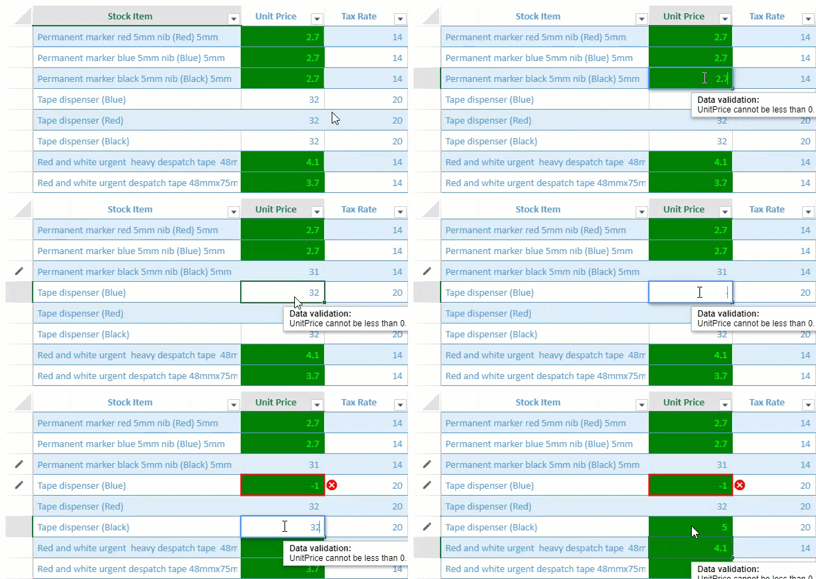
You can specify the *conditionalFormat* and *validator* properties when defining the view column info. These properties accept different types of rule option arrays which are listed in the table below.
The following conditional format and data validation types are supported in the TableSheet.
| **Property** | **Types** |
| -------- | ----- |
| Conditional Format | `AverageRule`
`CellValueRule`
`DataBarRule`
`DateOccuringRule`
`DuplicateRule`
`FormulaRule`
`IconSetRule`
`SpecificTextRule`
`ThreeScaleRule`
`Top10Rule`
`TwoScaleRule`
`UniqueRule` |
| Data Validator | `DateValidator`
`FormulaListValidator`
`FormulaValidator`
`ListValidator`
`NumberValidator`
`TextLengthValidator`
`TimeValidator` |
The following code sample shows how to apply conditional formatting and data validation in a TableSheet.
```javascript
// formula to apply Conditional Formatting
var formulaRule = {
ruleType: "formulaRule",
formula: "@<10",
style: {
backColor: "green",
foreColor: "lime"
}
};
// create a data validator
var positiveNumberValidator = {
type: "formula",
formula: '@>0',
inputTitle: 'Data validation:',
inputMessage: 'UnitPrice cannot be less than 0.',
highlightStyle: {
type: 'icon',
color: "red",
position: 'outsideRight',
}
};
//bind a view to the tablesheet
myTable.fetch().then(function () {
var view = myTable.addView("myView", [
{ value: "stockItem", width: 300, caption: "Stock Item" },
{ value: "unitPrice", width: 120, caption: "Unit Price", conditionalFormats: [formulaRule], validator: positiveNumberValidator }, // apply conditional formating and data validation here
{ value: "taxRate", width: 120, caption: "Tax Rate" },
{ value: "=([@unitPrice] * [@taxRate])/100 + [@unitPrice]", caption: "Total Price", width: 150 }
]);
sheet.setDataView(view);
});
```
## Style Rules
Style Rules are styles that are applied when a condition is met. You can add a state rule and formula rule using the **addStyleRule** method from GC.Data.View class or you can define *viewOptions* parameter of the **addView** method that also enables you to add a view to the Data Manager table using the **GC.Data.RowColumnStates** enumerations. You can also choose *viewport* or *colHeader* as view area to implement the style rule.
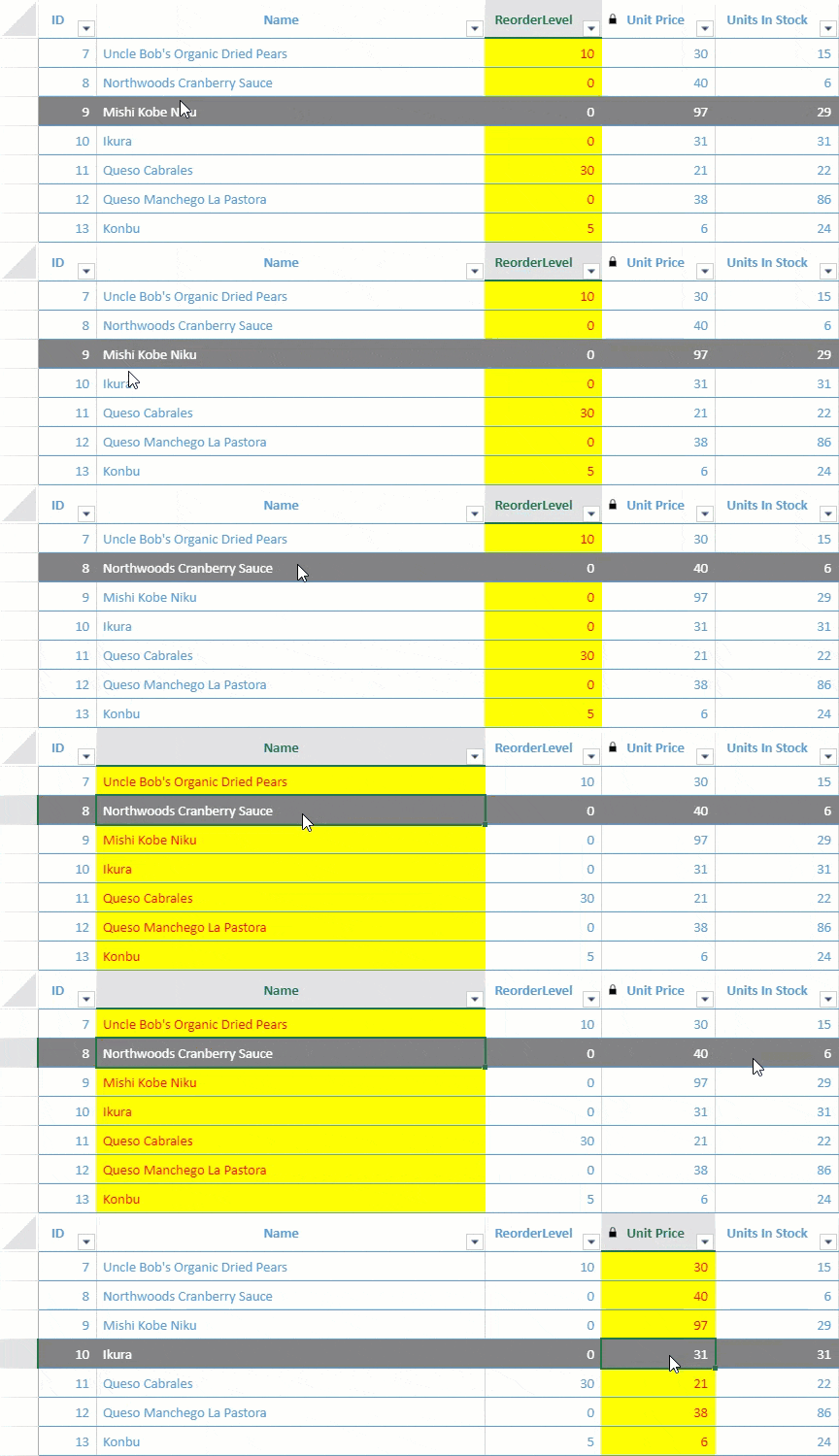
* **State Rule** – Apply style when a row or column state is triggered. For example, if you want to highlight a row with a gray back color whenever the mouse hovers over it, or highlight the selected column as illustrated in the image below:
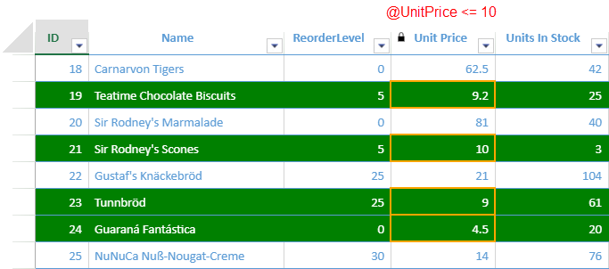
* **Formula Rule** – Apply style to specific values that meet certain conditions. For example, if you want to highlight the lower price of a product, set formulas like "[@UnitPrice]<10" with a different fore color as shown in the image below:
The following code sample shows how to apply both the state rule and formula rule in a TableSheet.
```javascript
// Setting formula rule
var formulaRule = {
ruleType: "formulaRule",
formula: "@<=10",
style: {
borderLeft: { color: "orange", style: "medium" },
borderRight: { color: "orange", style: "medium" },
borderTop: { color: "orange", style: "medium" },
borderBottom: { color: "orange", style: "medium" }
}
};
//bind a view to the tablesheet
var myView = productTable.addView("myView", [
{ value: "Id", caption: "ID" },
{ value: "ProductName", caption: "Name", width: 400 },
{ value: "ReorderLevel", caption: "ReorderLevel", width: 120 },
{ value: "UnitPrice", caption: "Unit Price", width: 100, readonly: true, conditionalFormats: [formulaRule] },
{ value: "UnitsInStock", caption: "Units In Stock", width: 100 },
{ value: "UnitsOnOrder", caption: "Units On Order", width: 100 }
]);
// Adding rules through addStyleRule method
myView.addStyleRule("lowPrice", { backColor: "green", foreColor: "white" }, {
formula: "[@UnitPrice] <= 10"
});
myView.addStyleRule("HoverStyle", { backColor: "gray", foreColor: "white" }, {
area: GC.Data.ViewArea.colHeader,
direction: GC.Data.StateRuleDirection.row,
state: GC.Data.RowColumnStates.hover
});
myView.addStyleRule("SelectedStyle", { backColor: "yellow", foreColor: "red" }, {
area: GC.Data.ViewArea.colHeader,
direction: GC.Data.StateRuleDirection.column,
state: GC.Data.RowColumnStates.selected
})
myView.fetch().then(function () {
sheet.setDataView(myView);
});
```
**Types of States**
The following table lists all the available row and column state enumeration options in **GC.Data.RowColumnStates**.
| **Enumeration Values** | **Description** |
| ------------------ | ----------- |
| active | When the row or the column is in focus, its state includes the "active" state. |
| dirty | When cell value is changed, cell row and column state include "dirty" state. |
| hover | When mouse hovers on the row and the column, its state includes "hover" state. |
| inserted | When inserted a row, its state includes "inserted" state. This state is only supported for row. |
| pin | When pin a row/column, its state includes "pin" state. |
| primaryKey | When the column has primary key, its state includes "primaryKey" state. This state is only supported for column. |
| readonly | When the column is locked, its state includes "readonly" state. This state only support for column. |
| required | When the value of the column is required, its state includes "required" state. This state is only supported for column. |
| selected | When the cell is in the selection range, the cell row and column state include the "selected" state. |
| updated | When updated a row, its state includes "updated" state. This state is only supported for row. |
Using SpreadJS, you can also update or remove the default rules.
The following code sample shows how to **update** the **readonly** state icon.
```javascript
// update the icon of the readonly state
view.addStyleRule("readonly", {
decoration: {
icons: [
{
src: 'readonly.png'
}
]
}
}, {
area: GC.Data.ViewArea.colHeader,
direction: GC.Data.StateRuleDirection.column,
state: GC.Data.RowColumnStates.readonly
});
```
The following code sample shows how to remove the style rule **readonly** icon.
```javascript
// Remove the readonly state icon
view.removeStyleRule("readonly");
```
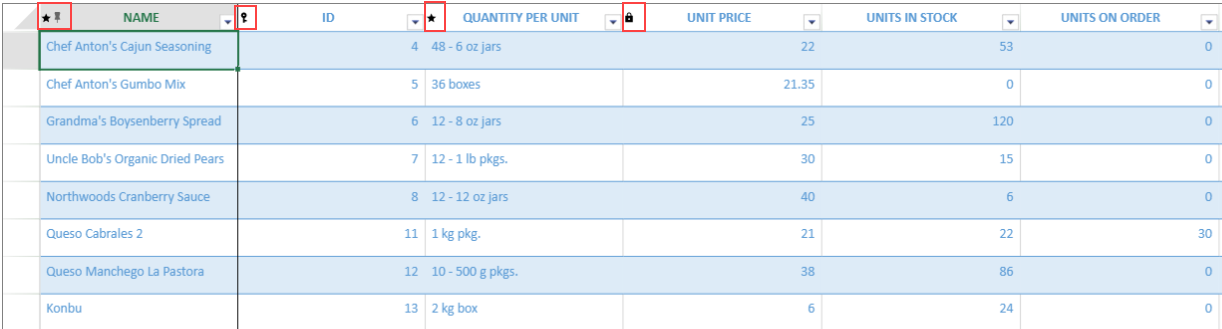
The following image shows how "Is Primary Key", "Read Only" and "IsRequired" icons appear on the column header of the TableSheet.
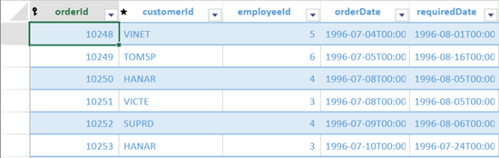
The following image shows how the tablesheet looks after implementing the **removeStyleRule** method on **readonly** icon.
### Using Designer
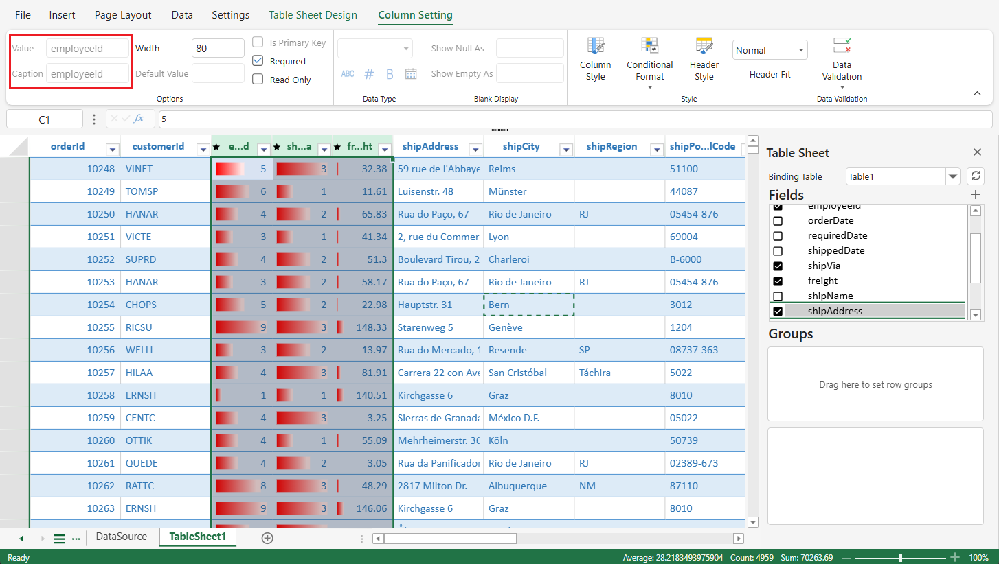
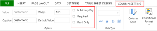
You can assign the pre-defined rules to the column headers using the **Column Setting** tab of the SpreadJS Designer.
The following image shows how rules appear on the column header of the TableSheet.
.fa9a54.png?width=500)
After applying rules, you can style the rules in a TableSheet using the **Table Sheet Design** Tab of the SpreadJS Designer.

**Steps to style the rules are as follows:**
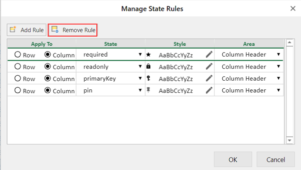
1. Click on the State Rules option from the Table Sheet Design tab to open the Manage State Rules dialog box.
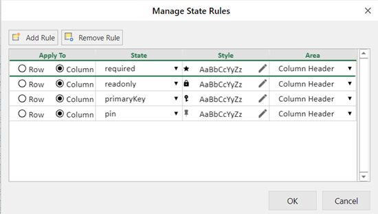
2. Choose a suitable option to apply rules on the column header.
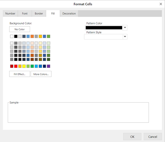
3. To style the selected column header, you can either create a new rule using the **New Rule** button or you can edit the existing rules and assign it to the column header.
4. To edit the mentioned rules, use the  icon from the Style column that opens the Format Cells dialog box.
5. To remove the icon from the selected column header, use the **Remove Rule** button.
**Support Multiple Columns Setting**
When multiple columns are selected, the column settings in the **Column Setting** tab apply to all selected columns simultaneously.
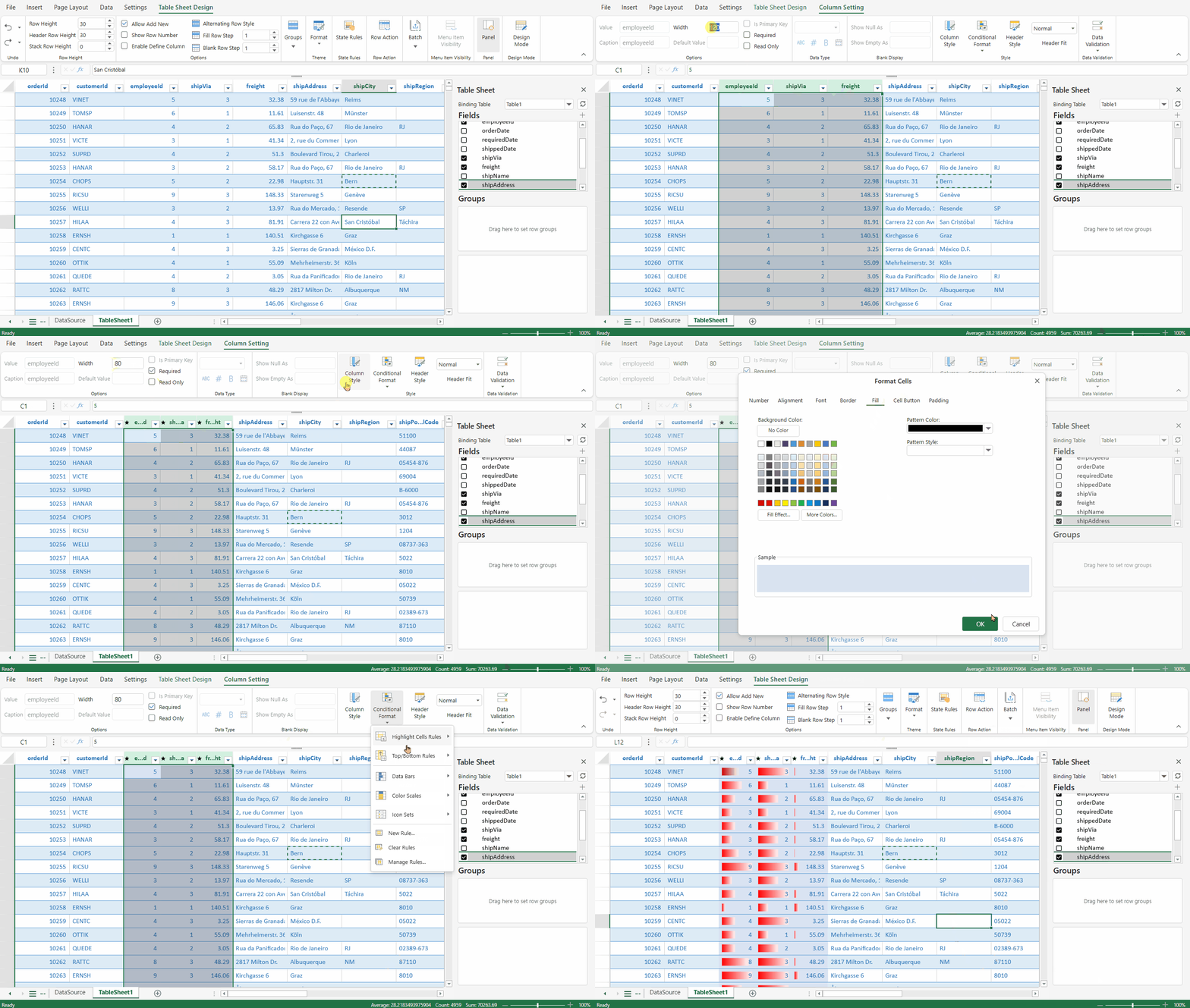
The dialog displays the settings of the first selected column; any changes made are applied to all selected columns.
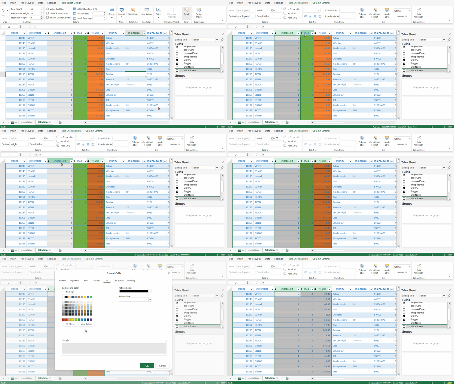
Settings that do not support multi-column operations are disabled.