# Text and Objects

## Content

Text and Objects tools are a set of tools or functions used to add text and various <span id="9a274d22-71c3-435f-809b-c68f163817b2" data-mark-type="annotation" data-mark-annotation-type="inlineComment" data-id="9a274d22-71c3-435f-809b-c68f163817b2" data-prosemirror-content-type="mark" data-prosemirror-mark-name="annotation">objects</span> to the current layer.<span id="b7e604f3-647e-4516-80e3-8ea1f9854df7" data-mark-type="annotation" data-mark-annotation-type="inlineComment" data-id="b7e604f3-647e-4516-80e3-8ea1f9854df7" data-prosemirror-content-type="mark" data-prosemirror-mark-name="annotation"> These tools can be added to the toolbar using the </span>**<span id="b7e604f3-647e-4516-80e3-8ea1f9854df7" data-mark-type="annotation" data-mark-annotation-type="inlineComment" data-id="b7e604f3-647e-4516-80e3-8ea1f9854df7" data-prosemirror-content-type="mark" data-prosemirror-mark-name="annotation">PaintToolsPlugin</span>**<span id="b7e604f3-647e-4516-80e3-8ea1f9854df7" data-mark-type="annotation" data-mark-annotation-type="inlineComment" data-id="b7e604f3-647e-4516-80e3-8ea1f9854df7" data-prosemirror-content-type="mark" data-prosemirror-mark-name="annotation">.</span>
The Text and Objects Tool button (![image](https://cdn.mescius.io/document-site-files/images/f7d467d4-b18c-4650-9a21-1502779f5487/image.238383.png)<span id="62ea6fea-5655-4cf7-948d-3fbb7767ea8a" data-mark-type="annotation" data-mark-annotation-type="inlineComment" data-id="62ea6fea-5655-4cf7-948d-3fbb7767ea8a" data-prosemirror-content-type="mark" data-prosemirror-mark-name="annotation">) o</span>pens a secondary toolbar with buttons for adding text and objects, and a properties panel that will display configurable options for the selected option.
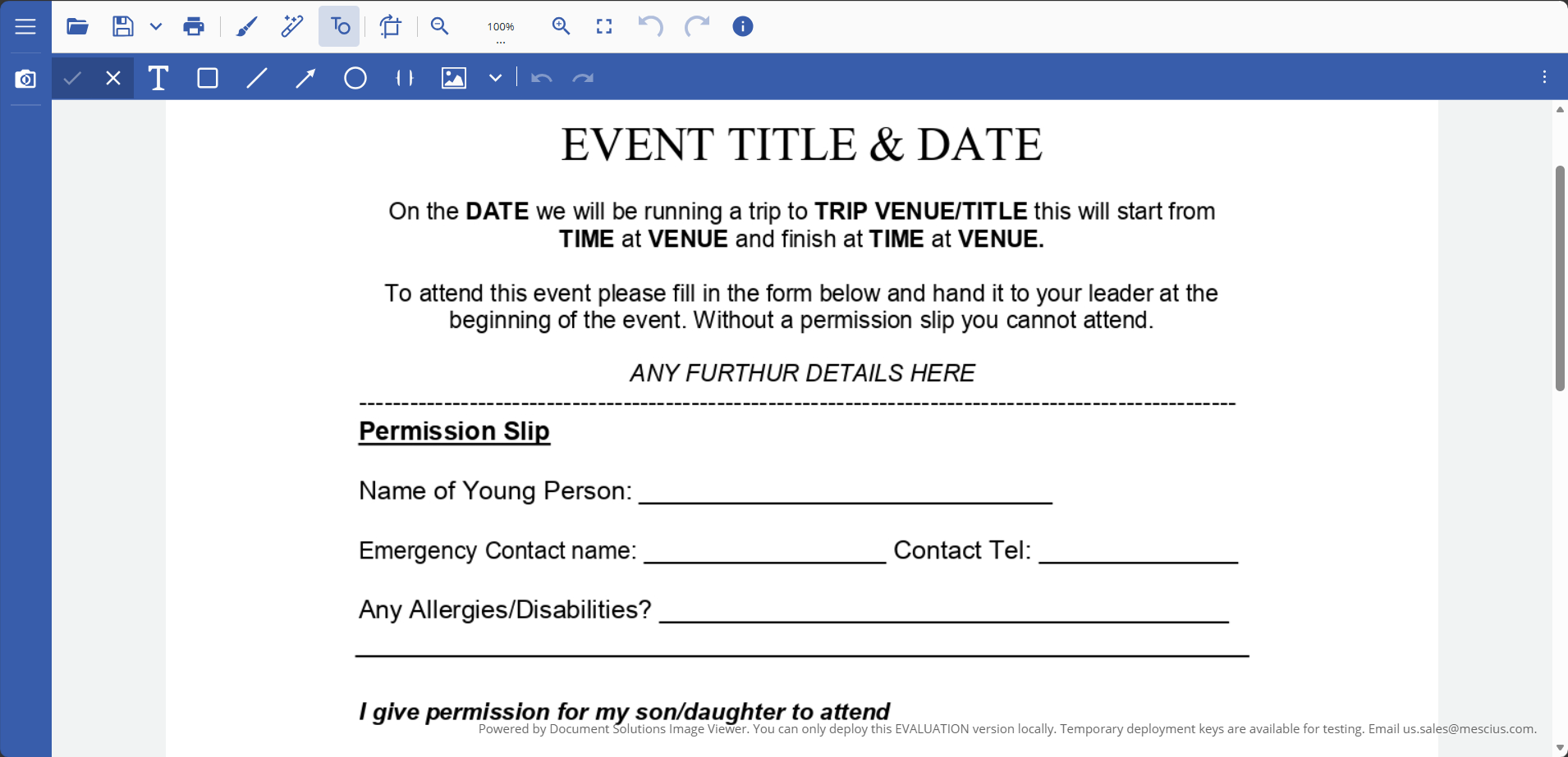
![DsImageViewer_Look.png](https://cdn.mescius.io/document-site-files/images/b1e20479-3ebf-4636-9f5d-18bc0f2a9fad/DsImageViewer_Look.828600.png?width=790)
The following table lists the options available in the <span id="70a34c75-ddbb-4860-a85a-1a6434ca3837" data-mark-type="annotation" data-mark-annotation-type="inlineComment" data-id="70a34c75-ddbb-4860-a85a-1a6434ca3837" data-prosemirror-content-type="mark" data-prosemirror-mark-name="annotation">Text and Objects Tools secondary toolbar:</span>

| **<span class="resizer-hover-zone">Icon</span>** | **<span class="resizer-hover-zone">Name</span>** | **<span class="resizer-hover-zone">Description</span>** |
| ---- | ---- | ----------- |
| ![Text.png](https://cdn.mescius.io/document-site-files/images/f7d467d4-b18c-4650-9a21-1502779f5487/Text.6bf7b8.png) | <span class="resizer-hover-zone">Text</span> | <span class="resizer-hover-zone">The Text button adds text on top of the image at the desired position.</span> |
| ![Rectangle.png](https://cdn.mescius.io/document-site-files/images/f7d467d4-b18c-4650-9a21-1502779f5487/Rectangle.b745d8.png) | <span class="resizer-hover-zone">Rectangle</span> | <span class="resizer-hover-zone">The Rectangle button adds a rectangular shape on top of the image at the desired position.</span> |
| ![Line.png](https://cdn.mescius.io/document-site-files/images/f7d467d4-b18c-4650-9a21-1502779f5487/Line.610820.png) | <span class="resizer-hover-zone">Line</span> | <span class="resizer-hover-zone">The Line button draws a straight line on top of the image at the desired position. Multiple line endings are provided.</span> |
| ![Arrow.png](https://cdn.mescius.io/document-site-files/images/f7d467d4-b18c-4650-9a21-1502779f5487/Arrow.62b2d6.png) | <span class="resizer-hover-zone">Arrow</span> | <span class="resizer-hover-zone">The Arrow button is a </span><span id="09a540f2-434d-4a8e-b9d0-1af80bcf5de9" data-mark-type="annotation" data-mark-annotation-type="inlineComment" data-id="09a540f2-434d-4a8e-b9d0-1af80bcf5de9" data-prosemirror-content-type="mark" data-prosemirror-mark-name="annotation">convenience</span><span class="resizer-hover-zone"> object for drawing an arrow on top of the image at the desired position.</span> |
| ![Ellipse.png](https://cdn.mescius.io/document-site-files/images/f7d467d4-b18c-4650-9a21-1502779f5487/Ellipse.2881ef.png) | <span class="resizer-hover-zone">Ellipse</span> | <span class="resizer-hover-zone">The Ellipse button adds an oval/circular shape on top of the image at the desired position.</span> |
| ![Brackets.png](https://cdn.mescius.io/document-site-files/images/f7d467d4-b18c-4650-9a21-1502779f5487/Brackets.72dcd5.png) | <span class="resizer-hover-zone">Brackets</span> | <span class="resizer-hover-zone">The Brackets button adds brackets with adjustable curves/arrows on top of the image at the desired position.</span> |
| ![Picture.png](https://cdn.mescius.io/document-site-files/images/f7d467d4-b18c-4650-9a21-1502779f5487/Picture.0a9ce9.png) | <span class="resizer-hover-zone">Image</span> | <span class="resizer-hover-zone">The Image button inserts an image file on top of the background image at the desired position.</span> |
| ![Image_Gallery.png](https://cdn.mescius.io/document-site-files/images/b1e20479-3ebf-4636-9f5d-18bc0f2a9fad/Image_Gallery.ffb135.png) | Image Gallery | The Open image gallery button inserts a predefined image from the toolbar at the desired position. |
| ![Back.png](https://cdn.mescius.io/document-site-files/images/f7d467d4-b18c-4650-9a21-1502779f5487/Back.3ad74c.png) | <span class="resizer-hover-zone">Undo</span> | <span class="resizer-hover-zone">The Undo button reverts the image to its state before the last change.</span> |
| ![Forward.png](https://cdn.mescius.io/document-site-files/images/f7d467d4-b18c-4650-9a21-1502779f5487/Forward.ff44d0.png) | <span class="resizer-hover-zone">Redo</span> | <span class="resizer-hover-zone">The Redo button changes the image to its state after the last change.</span> |
| ![Apply.png](https://cdn.mescius.io/document-site-files/images/f7d467d4-b18c-4650-9a21-1502779f5487/Apply.03a228.png) | <span class="resizer-hover-zone">Apply</span> | <span class="resizer-hover-zone">The Apply button accepts all the changes and applies them to the image.</span> |
| ![Deny.png](https://cdn.mescius.io/document-site-files/images/f7d467d4-b18c-4650-9a21-1502779f5487/Deny.55d043.png) | <span class="resizer-hover-zone">Cancel</span> | <span class="resizer-hover-zone">The Cancel button discards all the changes and reverts the image to its original state.</span> |

>type=warning
> **Note:** For more information on adding PaintToolsPlugin to <span id="f8474f16-1176-4a55-9c2c-e7df433d1d30" data-mark-type="annotation" data-mark-annotation-type="inlineComment" data-id="f8474f16-1176-4a55-9c2c-e7df433d1d30" data-prosemirror-content-type="mark" data-prosemirror-mark-name="annotation">DsImageViewer</span> toolbar, refer to [Using Plug-ins](https://developer.mescius.com/document-solutions/javascript-image-viewer/docs/using-plug-ins).

The following <span id="cb61a356-5052-4a45-830c-4348b47f901d" data-mark-type="annotation" data-mark-annotation-type="inlineComment" data-id="cb61a356-5052-4a45-830c-4348b47f901d" data-prosemirror-content-type="mark" data-prosemirror-mark-name="annotation">tables</span> list the configurable options for each selected <span id="2270a6d5-fc64-4441-8695-3841d8a552b8" data-mark-type="annotation" data-mark-annotation-type="inlineComment" data-id="2270a6d5-fc64-4441-8695-3841d8a552b8" data-prosemirror-content-type="mark" data-prosemirror-mark-name="annotation">text/object</span>.

### Text

| **<span class="resizer-hover-zone">Property</span>** | **<span class="resizer-hover-zone">Description</span>** |
| -------- | ----------- |
| <span class="resizer-hover-zone">Font Name</span> | <span class="resizer-hover-zone">Font family selection.</span> |
| <span class="resizer-hover-zone">Font Size</span> | <span class="resizer-hover-zone">Text size in pixels.</span> |
| <span class="resizer-hover-zone">Text Color</span> | <span class="resizer-hover-zone">Text color.</span> |
| <span class="resizer-hover-zone">Italic</span> | <span class="resizer-hover-zone">Toggles italic style.</span> |
| <span class="resizer-hover-zone">Bold</span> | <span class="resizer-hover-zone">Toggles bold style.</span> |
| <span class="resizer-hover-zone">Opacity</span> | <span class="resizer-hover-zone">Transparency (0–100%).</span> |
| <span class="resizer-hover-zone">Rotation</span> | <span class="resizer-hover-zone">Rotation angle (0–360°).</span> |

### Rectangle

| **<span class="resizer-hover-zone">Property</span>** | **<span class="resizer-hover-zone">Description</span>** |
| -------- | ----------- |
| <span class="resizer-hover-zone">Border Color</span> | <span class="resizer-hover-zone">Border color.</span> |
| <span class="resizer-hover-zone">Fill Color</span> | <span class="resizer-hover-zone">Inner fill color.</span> |
| <span class="resizer-hover-zone">Line Width</span> | <span class="resizer-hover-zone">Border thickness (px).</span> |
| <span class="resizer-hover-zone">Opacity</span> | <span class="resizer-hover-zone">Transparency (0–100%).</span> |
| <span class="resizer-hover-zone">Rotation</span> | <span class="resizer-hover-zone">Rotation angle (0–360°).</span> |

### Line

| **<span class="resizer-hover-zone">Property</span>** | **<span class="resizer-hover-zone">Description</span>** |
| -------- | ----------- |
| <span class="resizer-hover-zone">Line Color</span> | <span class="resizer-hover-zone">Line color.</span> |
| <span class="resizer-hover-zone">Line Width</span> | <span class="resizer-hover-zone">Line thickness (px).</span> |
| <span class="resizer-hover-zone">Start Cap Style</span> | <span class="resizer-hover-zone">Style of the line start cap. Available styles: </span><span class="code" spellcheck="false" data-prosemirror-content-type="mark" data-prosemirror-mark-name="code">none</span><span class="resizer-hover-zone">, </span><span class="code" spellcheck="false" data-prosemirror-content-type="mark" data-prosemirror-mark-name="code">openArrow</span><span class="resizer-hover-zone">, </span><span class="code" spellcheck="false" data-prosemirror-content-type="mark" data-prosemirror-mark-name="code">closedArrow</span><span class="resizer-hover-zone">, </span><span class="code" spellcheck="false" data-prosemirror-content-type="mark" data-prosemirror-mark-name="code">dot</span><span class="resizer-hover-zone">, </span><span class="code" spellcheck="false" data-prosemirror-content-type="mark" data-prosemirror-mark-name="code">circle</span><span class="resizer-hover-zone">, </span><span class="code" spellcheck="false" data-prosemirror-content-type="mark" data-prosemirror-mark-name="code">diamond</span><span class="resizer-hover-zone">, </span><span class="code" spellcheck="false" data-prosemirror-content-type="mark" data-prosemirror-mark-name="code">square</span><span class="resizer-hover-zone">, </span><span class="code" spellcheck="false" data-prosemirror-content-type="mark" data-prosemirror-mark-name="code">slash</span><span class="resizer-hover-zone">, </span><span class="code" spellcheck="false" data-prosemirror-content-type="mark" data-prosemirror-mark-name="code">star</span><span class="resizer-hover-zone">, </span><span class="code" spellcheck="false" data-prosemirror-content-type="mark" data-prosemirror-mark-name="code">bar</span><span class="resizer-hover-zone">.</span> |
| <span class="resizer-hover-zone">End Cap Style</span> | <span class="resizer-hover-zone">Style of the line end cap. Same options as start cap.</span> |
| <span class="resizer-hover-zone">Cap Size</span> | <span class="resizer-hover-zone">Size of the line cap (e.g., arrowhead size).</span> |
| <span class="resizer-hover-zone">Cap Color</span> | <span class="resizer-hover-zone">Color of the line caps.</span> |
| <span class="resizer-hover-zone">Opacity</span> | <span class="resizer-hover-zone">Transparency (0–100%).</span> |
| <span class="resizer-hover-zone">Rotation</span> | <span class="resizer-hover-zone">Rotation angle (0–360°).</span> |

### Arrow

The properties for the Arrow object are the same as those for the Line object, with the main difference that the `End Cap Style` is preset to `'closedArrow'` by default for convenience.

### Ellipse

| **<span class="resizer-hover-zone">Property</span>** | **<span class="resizer-hover-zone">Description</span>** |
| -------- | ----------- |
| <span class="resizer-hover-zone">Border Color</span> | <span class="resizer-hover-zone">Border color.</span> |
| <span class="resizer-hover-zone">Fill Color</span> | <span class="resizer-hover-zone">Inner fill color.</span> |
| <span class="resizer-hover-zone">Line Width</span> | <span class="resizer-hover-zone">Border thickness (px).</span> |
| <span class="resizer-hover-zone">Opacity</span> | <span class="resizer-hover-zone">Transparency (0–100%).</span> |
| <span class="resizer-hover-zone">Rotation</span> | <span class="resizer-hover-zone">Rotation angle (0–360°).</span> |

### Brackets

| **<span class="resizer-hover-zone">Property</span>** | **<span class="resizer-hover-zone">Description</span>** |
| -------- | ----------- |
| <span class="resizer-hover-zone">Line Color</span> | <span class="resizer-hover-zone">Color of the bracket outline.</span> |
| <span class="resizer-hover-zone">Line Width</span> | <span class="resizer-hover-zone">Stroke thickness of the brackets (in px).</span> |
| <span class="resizer-hover-zone">Opacity</span> | <span class="resizer-hover-zone">Transparency level (0 = transparent, 100 = opaque).</span> |
| <span class="resizer-hover-zone">Rotation</span> | <span class="resizer-hover-zone">Rotation angle applied to the brackets.</span> |
| <span class="resizer-hover-zone">Shape</span> | <span class="resizer-hover-zone">Visual style of brackets: curly </span><span class="code" spellcheck="false" data-prosemirror-content-type="mark" data-prosemirror-mark-name="code">{}</span><span class="resizer-hover-zone">, round </span><span class="code" spellcheck="false" data-prosemirror-content-type="mark" data-prosemirror-mark-name="code">()</span><span class="resizer-hover-zone">, square </span><span class="code" spellcheck="false" data-prosemirror-content-type="mark" data-prosemirror-mark-name="code">[]</span><span class="resizer-hover-zone">, angle </span><span class="code" spellcheck="false" data-prosemirror-content-type="mark" data-prosemirror-mark-name="code"><></span><span class="resizer-hover-zone">, or custom.</span> |
| <span class="resizer-hover-zone">Arrow Direction</span> | <span class="resizer-hover-zone">Bending direction of brackets.</span> |
| <span class="resizer-hover-zone">Curve Intensity</span> | <span class="resizer-hover-zone">Controls how much the brackets curve (0.0–2.0).</span> |
| <span class="resizer-hover-zone">Arrow Intensity</span> | <span class="resizer-hover-zone">Controls sharpness or depth of the inner bend (0.0–1.5).</span> |
| <span class="resizer-hover-zone">Left Bracket</span> | <span class="resizer-hover-zone">Show or hide the left-side bracket.</span> |
| <span class="resizer-hover-zone">Right Bracket</span> | <span class="resizer-hover-zone">Show or hide the right-side bracket.</span> |
| <span class="resizer-hover-zone">Bracket Width (%)</span> | <span class="resizer-hover-zone">Horizontal size of each bracket relative to total width.</span> |

### Image

| **<span class="resizer-hover-zone">Property</span>** | **<span class="resizer-hover-zone">Description</span>** |
| -------- | ----------- |
| <span class="resizer-hover-zone">Image</span> | <span class="resizer-hover-zone">Image upload/replacement. Allows selecting or changing the image displayed.</span> |
| <span class="resizer-hover-zone">Border Color</span> | <span class="resizer-hover-zone">Color of the image border.</span> |
| <span class="resizer-hover-zone">Border Width</span> | <span class="resizer-hover-zone">Thickness of the border in pixels.</span> |
| <span class="resizer-hover-zone">Border Radius</span> | <span class="resizer-hover-zone">Radius of the border corners in pixels, enabling rounded corners.</span> |
| <span class="resizer-hover-zone">Fill Color</span> | <span class="resizer-hover-zone">Background fill color used to fill any empty space within the image’s bounding rectangle. This is especially useful when Keep Aspect Ratio is enabled - unused space around the image is filled with this color. Also, if the image contains transparent areas, these regions are filled with this color to improve visual consistency.</span> |
| <span class="resizer-hover-zone">Opacity</span> | <span class="resizer-hover-zone">Transparency level of the entire image object. 0% is fully transparent, 100% is fully opaque.</span> |
| <span class="resizer-hover-zone">Rotation</span> | <span class="resizer-hover-zone">Rotation angle of the image, from 0° to 360°.</span> |
| Alignment | Positions the image within its container. |
| Horizontal Skew | Tilts the image horizontally along the X-axis to create a slanted effect. |
| Vertical Skew | Tilts the image vertically along the Y-axis to create a slanted effect. |
| <span class="resizer-hover-zone">Keep Aspect Ratio</span> | <span class="resizer-hover-zone">When enabled (</span><span class="code" spellcheck="false" data-prosemirror-content-type="mark" data-prosemirror-mark-name="code">true</span><span class="resizer-hover-zone">), preserves the original aspect ratio of the image during resizing, potentially creating empty space filled with the Fill Color. When disabled (</span><span class="code" spellcheck="false" data-prosemirror-content-type="mark" data-prosemirror-mark-name="code">false</span><span class="resizer-hover-zone">), the image stretches to fill the container.</span> |

### Image Gallery

The Image Gallery is a predefined collection of icons and graphic elements that’s available on the toolbar. You can use it to insert common images, icons, and symbols without preloading assets, hosting extra files, or writing custom code.
The properties for the Image Gallery are the same as those for the Image object.

#### **<span data-teams="true">Adding & Customizing Image Gallery</span>**

Users can add the Image Gallery via the [imageGallery ](https://developer.mescius.com/document-solutions/javascript-image-viewer/api/type-aliases/PaintToolsPluginOptions#imagegallery)property from [PaintToolsPluginOptions ](https://developer.mescius.com/document-solutions/javascript-image-viewer/api/type-aliases/PaintToolsPluginOptions)type.

```javascript
type PaintToolsPluginOptions = {
  imageGallery?: string[] | ImageGalleryConfig;
}
```

The Image Gallery button is automatically included in the secondary toolbar (Text and Objects tools) when PaintToolsPlugin is added to the Viewer. To check how to add Text and Objects tools via PaintToolsPlugin, visit [this topic](https://developer.mescius.com/document-solutions/javascript-image-viewer/docs/using-plug-ins#text-and-objects-tools).
You can pass a simple list of image URLs or a structured ImageGalleryConfig that organizes images into categories and controls display behavior. Typical configuration options include categories, default width/height, aspect ratio controls, tags, labels, and per-image size rules. You can check the [API](https://developer.mescius.com/document-solutions/javascript-image-viewer/api/type-aliases/PaintToolsPluginOptions#examples) for more examples.
Refer to the following example code demonstrating how to customize the Image Gallery by adding custom images:

```auto
viewer.addPlugin(new PaintToolsPlugin({
    imageGallery: [
        'images/croissant.svg',
        'images/curry-rice.svg',
        'images/doughnut.svg',
        'images/french-fries.svg',
        'images/green-salad.svg',
        'images/hamburger.svg',
        'images/hot-beverage.svg',
        'images/hot-dog.svg',
        'images/ice-cream.svg',
        'images/pancakes.svg'
    ],
}));
```
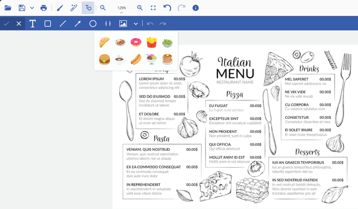
![Image_Gallery.png](https://cdn.mescius.io/document-site-files/images/00af782e-1574-4480-84e3-170a91a0b268/Image_Gallery-20260214.269d3c.png?width=790)

## <span id="fe632d28-7c38-4cf7-806c-412741bd5bf1" data-mark-type="annotation" data-mark-annotation-type="inlineComment" data-id="fe632d28-7c38-4cf7-806c-412741bd5bf1" data-prosemirror-content-type="mark" data-prosemirror-mark-name="annotation">Displaying Text and Objects Tools on Image Load</span>

This example demonstrates how to configure the DsImageViewer to show **only text and objects tools** when an image loads, while hiding other tool groups (paint, effects).

```javascript
viewer.addPlugin(new PaintToolsPlugin({ 
  toolbarLayout: { 
    paintTools: false,    // Hide painting tools
    effectsTools: false,  // Hide effects tools
    objectTools: true     // Show text and objects tools
  }
}));
viewer.open("./nature.jpg").then(() => {
  viewer.showSecondToolbar("objects"); // Display object toolbar post-load
});
```

## Work with Text/Objects

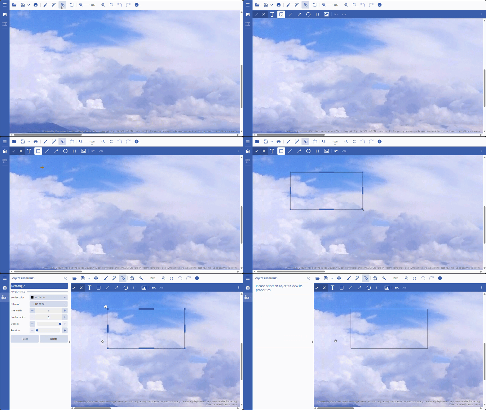
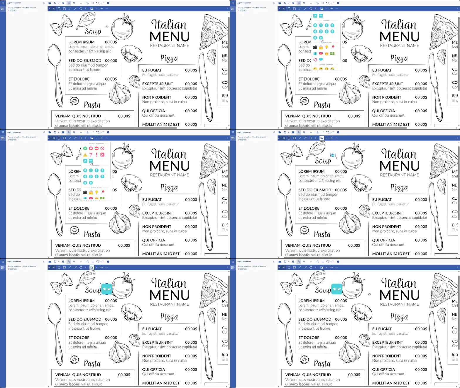
DsImageViewer allows you to add, edit, move, and delete text/objects per your needs. Examples for Text, Rectangle, and Image gallery appear below with step-by-step illustrations.

### Text

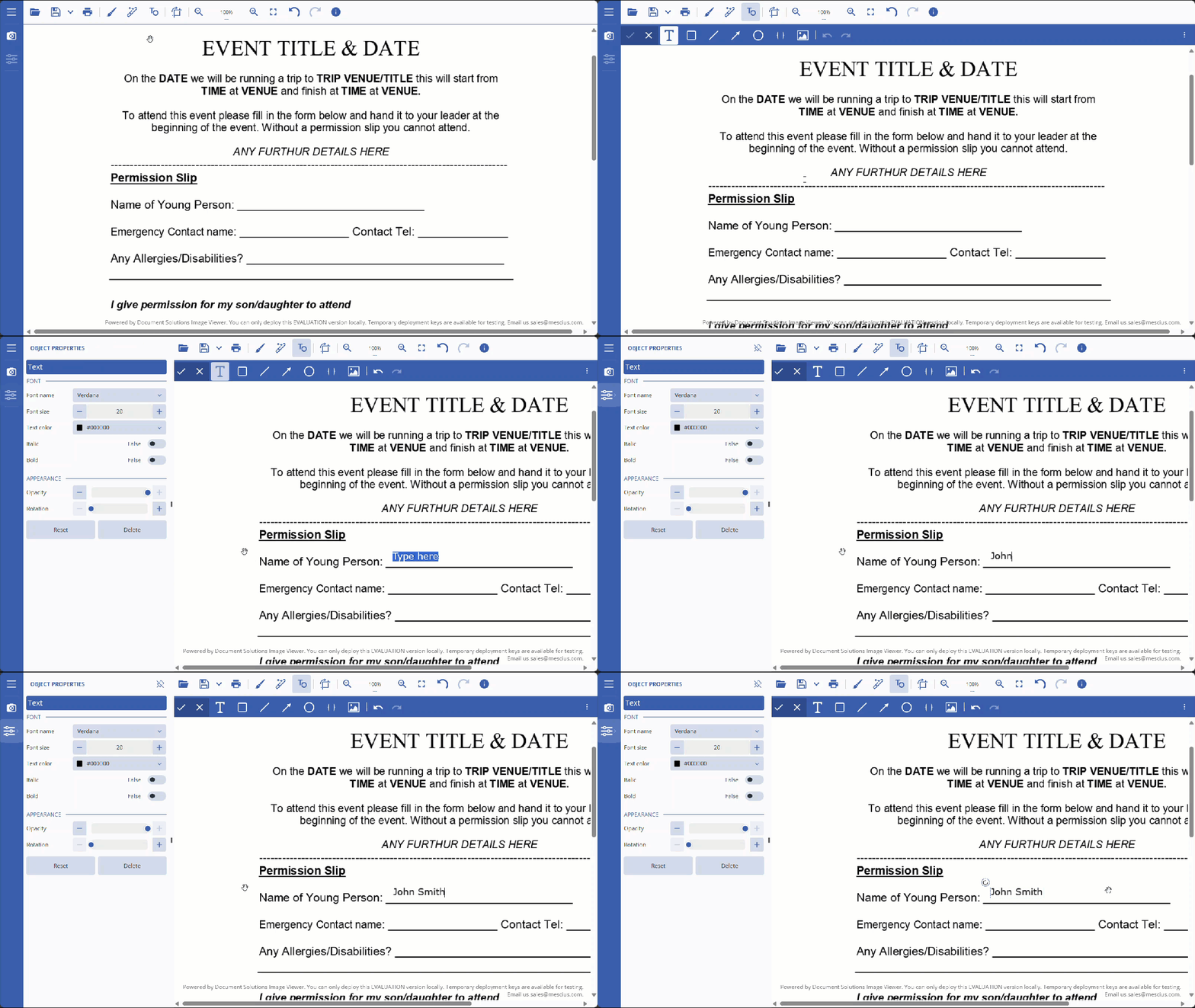
Text is a toolbar button that adds editable text layers to the canvas. Use it to add, move, edit, select, and delete text. Refer to the step-by-step workflows below:

#### Add Text

1. Click on the Text button and on the desired location.
2. Start typing the text, then press the Enter button.
![text_add.gif](https://cdn.mescius.io/document-site-files/images/f7d467d4-b18c-4650-9a21-1502779f5487/text_add.13b9a3.gif?width=790)

#### Edit Text

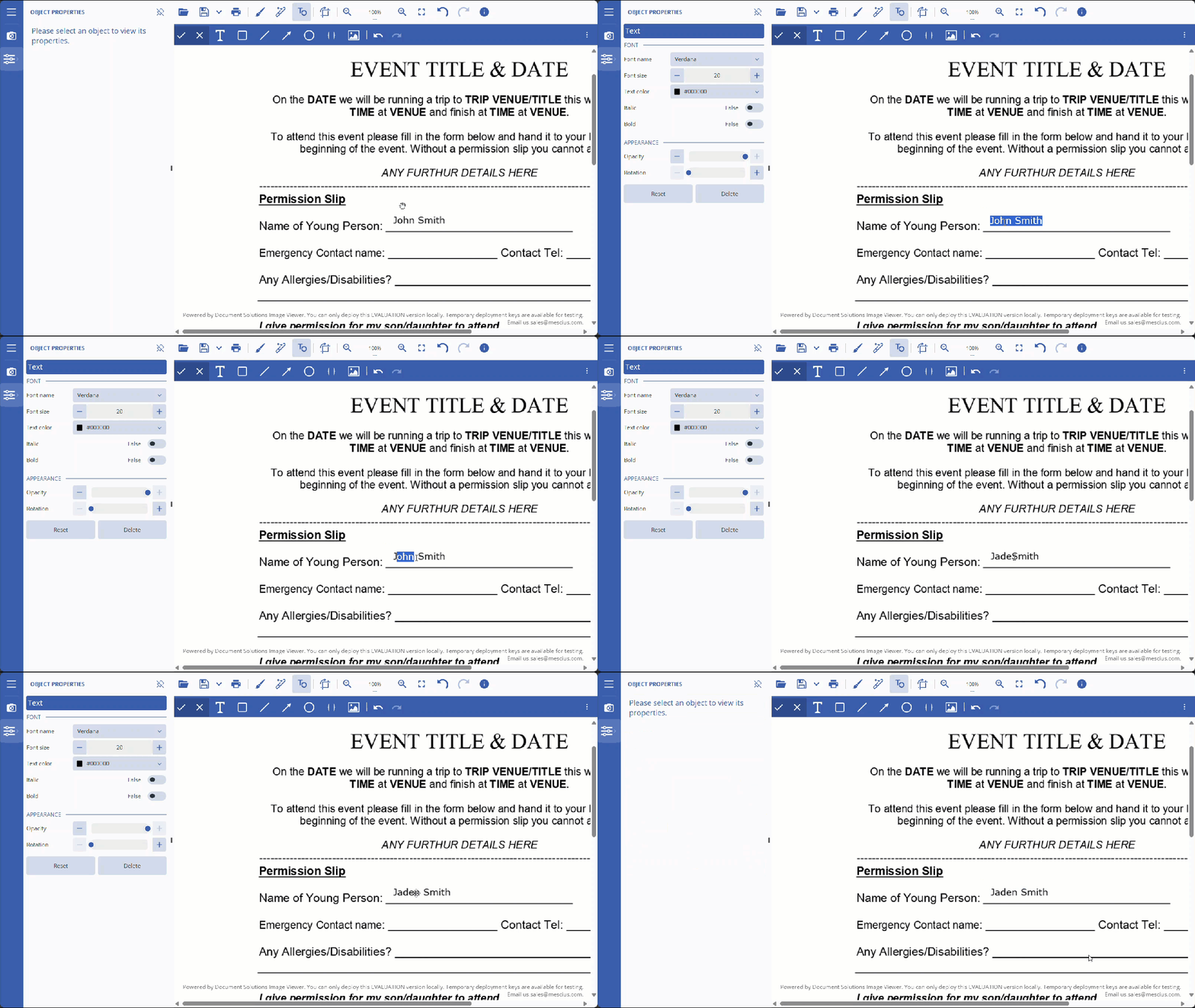
1. Click on the text box to open the properties panel.
2. Edit the text, then press the Control+Enter keys to apply changes.
![text_edit.gif](https://cdn.mescius.io/document-site-files/images/f7d467d4-b18c-4650-9a21-1502779f5487/text_edit.bf0186.gif?width=790)

#### Move Text

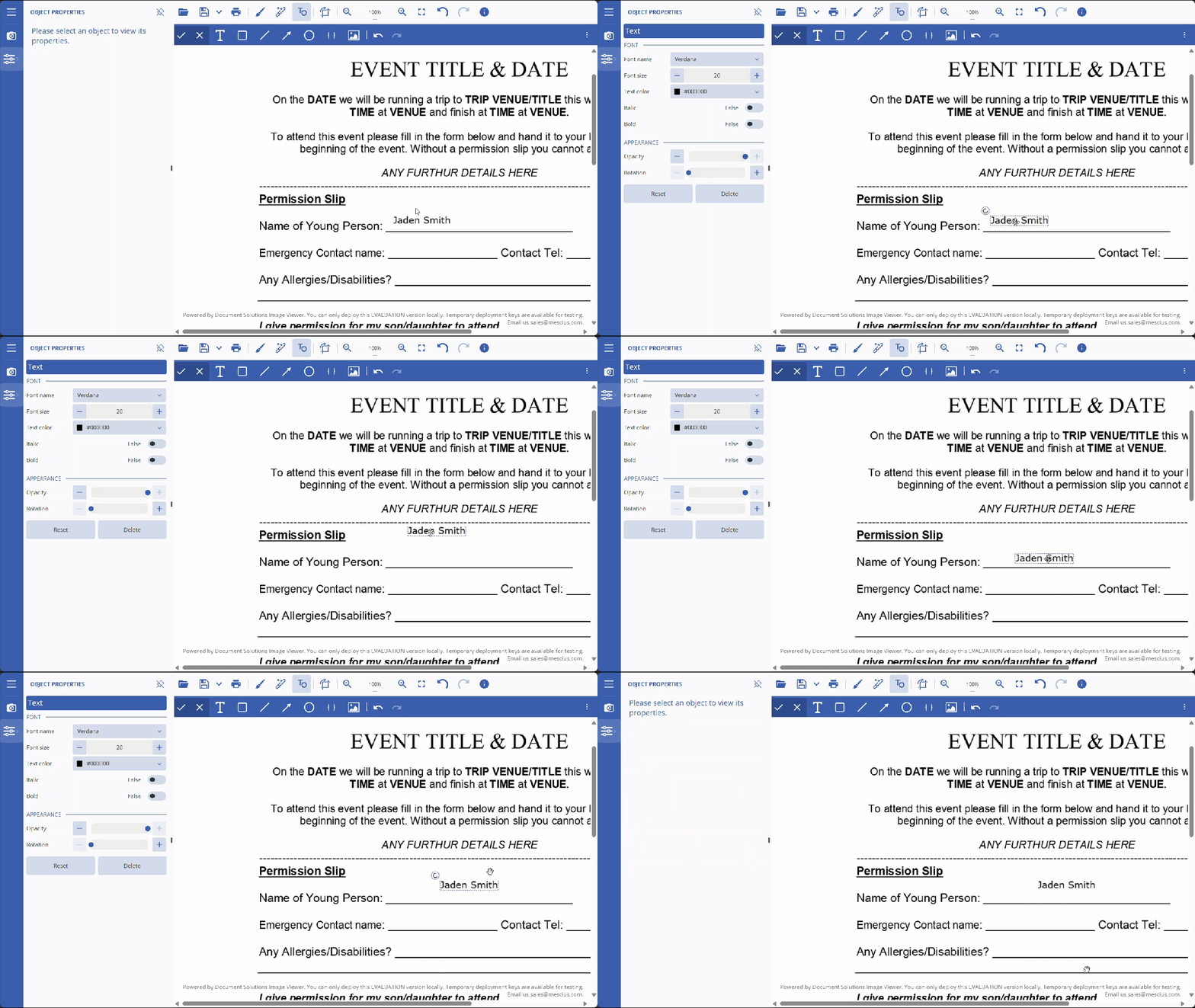
1. Click on the text box. The move cursor icon will appear.
2. Click and move the text to the desired location.
![text_move.gif](https://cdn.mescius.io/document-site-files/images/f7d467d4-b18c-4650-9a21-1502779f5487/text_move.5e7439.gif?width=790)

#### Select and Delete Text

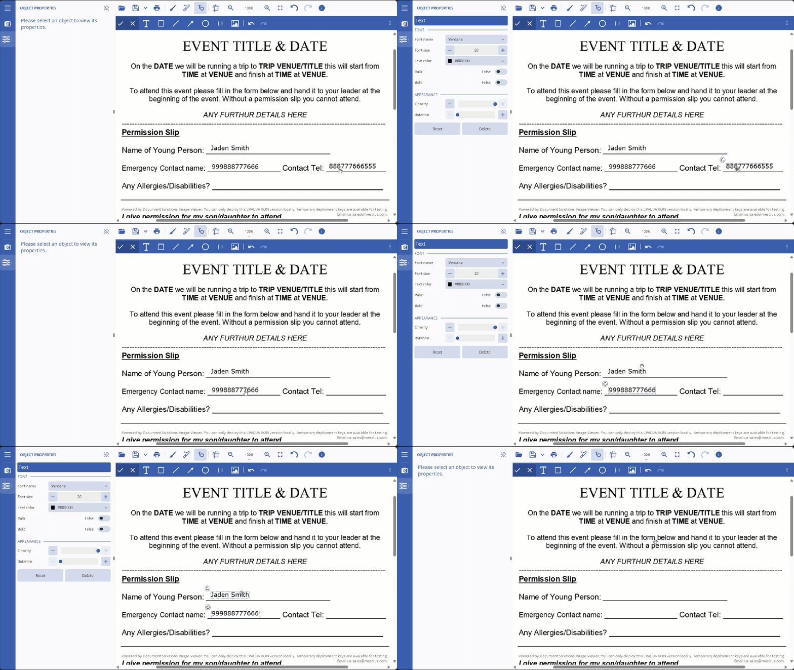
1. To select a text, click on the text box.
2. To delete a text, press the Delete button.

>type=note
> **Note:** You can also select multiple texts/objects by pressing the Control or Shift keys.
![text_delete.gif](https://cdn.mescius.io/document-site-files/images/f7d467d4-b18c-4650-9a21-1502779f5487/text_delete.8f644d.gif?width=790)

### Rectangle

Rectangle is a toolbar button that creates rectangular shape objects on the canvas. Use it to draw, resize, move, select, and delete rectangles. Refer to the step-by-step workflows below:

#### Add Rectangle

1. Click on the Rectangle button and on the desired location.
2. <span data-teams="true">Position and size the rectangle, then click outside</span>.

![rectangle_add.gif](https://cdn.mescius.io/document-site-files/images/f7d467d4-b18c-4650-9a21-1502779f5487/rectangle_add.72509b.gif?width=790)

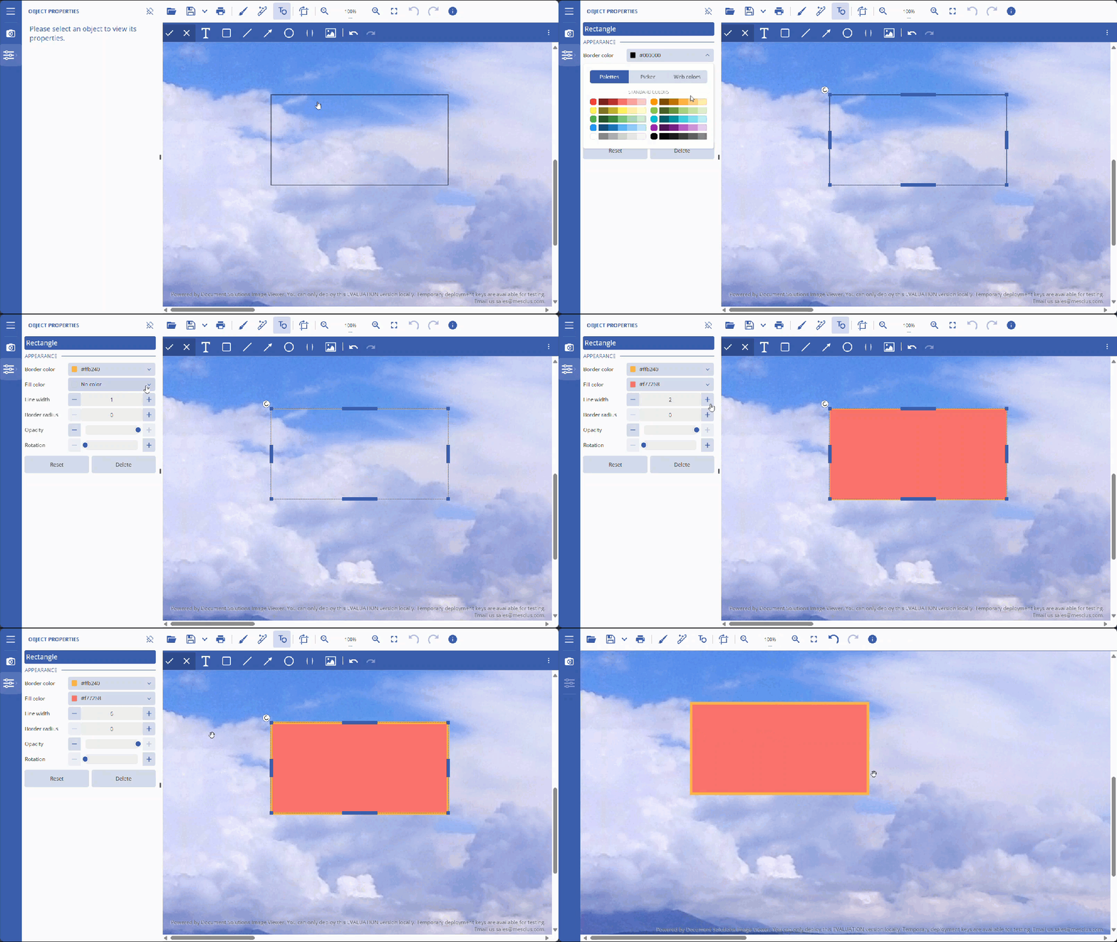
#### Edit Rectangle

1. Click on the rectangle to open the properties panel.
2. Edit the properties, then press the Control+Enter keys to apply changes.
![rectangle_edit.gif](https://cdn.mescius.io/document-site-files/images/f7d467d4-b18c-4650-9a21-1502779f5487/rectangle_edit.169dcf.gif?width=790)

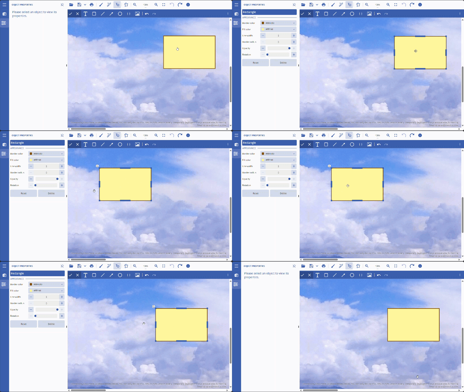
#### Move Rectangle

1. Click on the rectangle. The move cursor icon will appear.
2. Click and move the rectangle to the desired location.
![rectangle_move.gif](https://cdn.mescius.io/document-site-files/images/f7d467d4-b18c-4650-9a21-1502779f5487/rectangle_move.e9f9e2.gif?width=790)

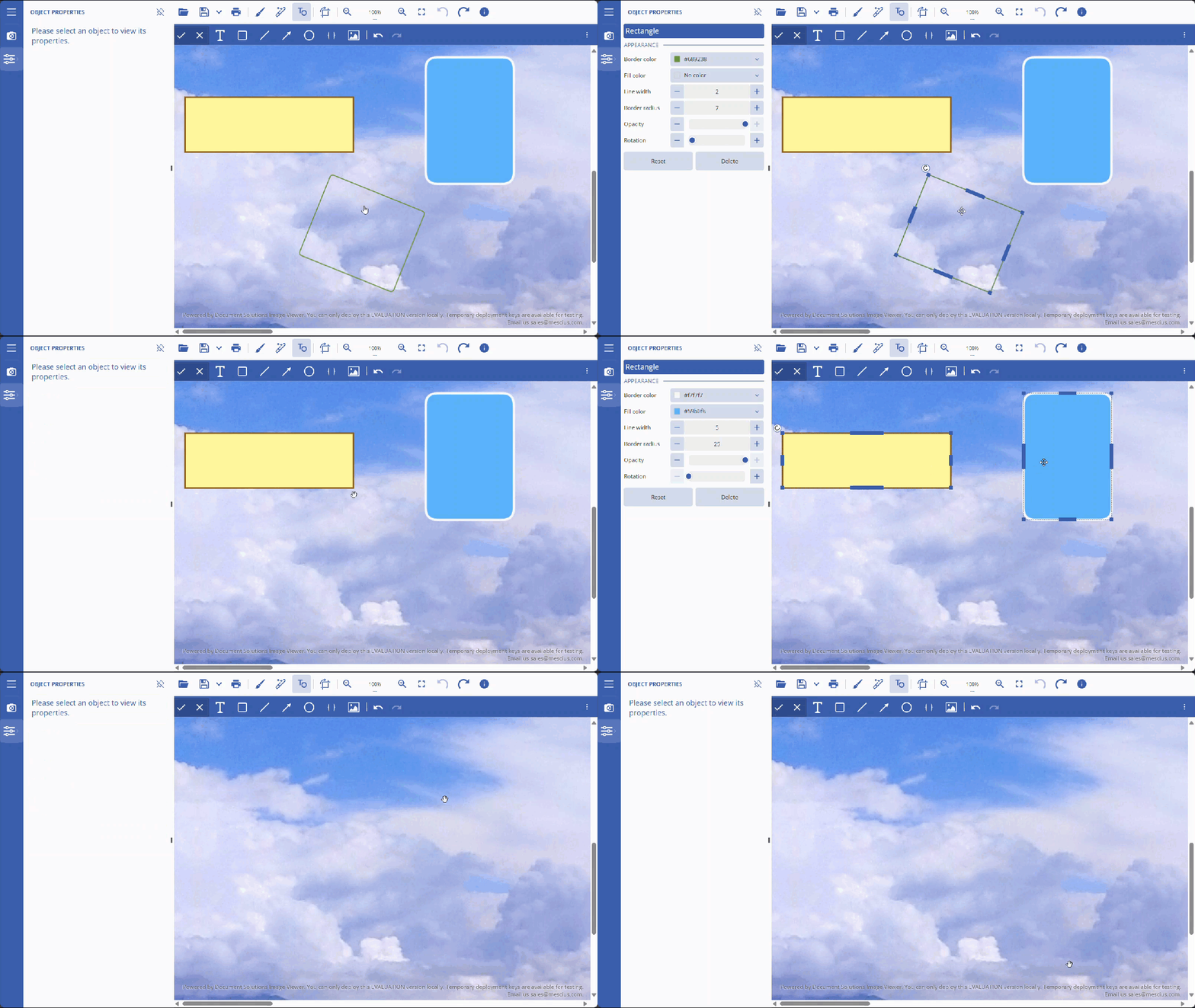
#### Select and Delete Rectangle

1. To select a rectangle, click on it.
2. To delete a rectangle, press the Delete button.
![rectangle_delete.gif](https://cdn.mescius.io/document-site-files/images/f7d467d4-b18c-4650-9a21-1502779f5487/rectangle_delete.685272.gif?width=790)

### Image Gallery

Image gallery is a toolbar button that opens a collection of preset and custom images for quick insertion. Use it to insert, resize, move, select, and remove gallery images. Refer to the step-by-step workflows below:

#### Add Image from Image Gallery

1. Click on the Image Gallery button, select your desired image, and add it on the desired location.
2. <span data-teams="true">Position and size the image, then click outside</span>.

![Add_Image_From_Image_Gallery.gif](https://cdn.mescius.io/document-site-files/images/00af782e-1574-4480-84e3-170a91a0b268/Add_Image_From_Image_Gallery-20260219.0a8103.gif?width=790)

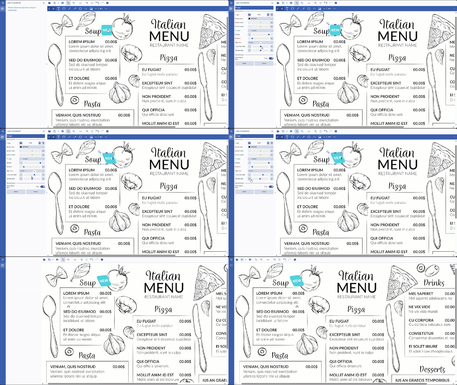
#### Edit Image from Image Gallery

1. Click on the image to open the properties panel.
2. Edit the properties, then press the Control+Enter keys to apply changes.
![Edit_Image_From_Image_Gallery.gif](https://cdn.mescius.io/document-site-files/images/00af782e-1574-4480-84e3-170a91a0b268/Edit_Image_From_Image_Gallery-20260219.c4ebef.gif?width=790)

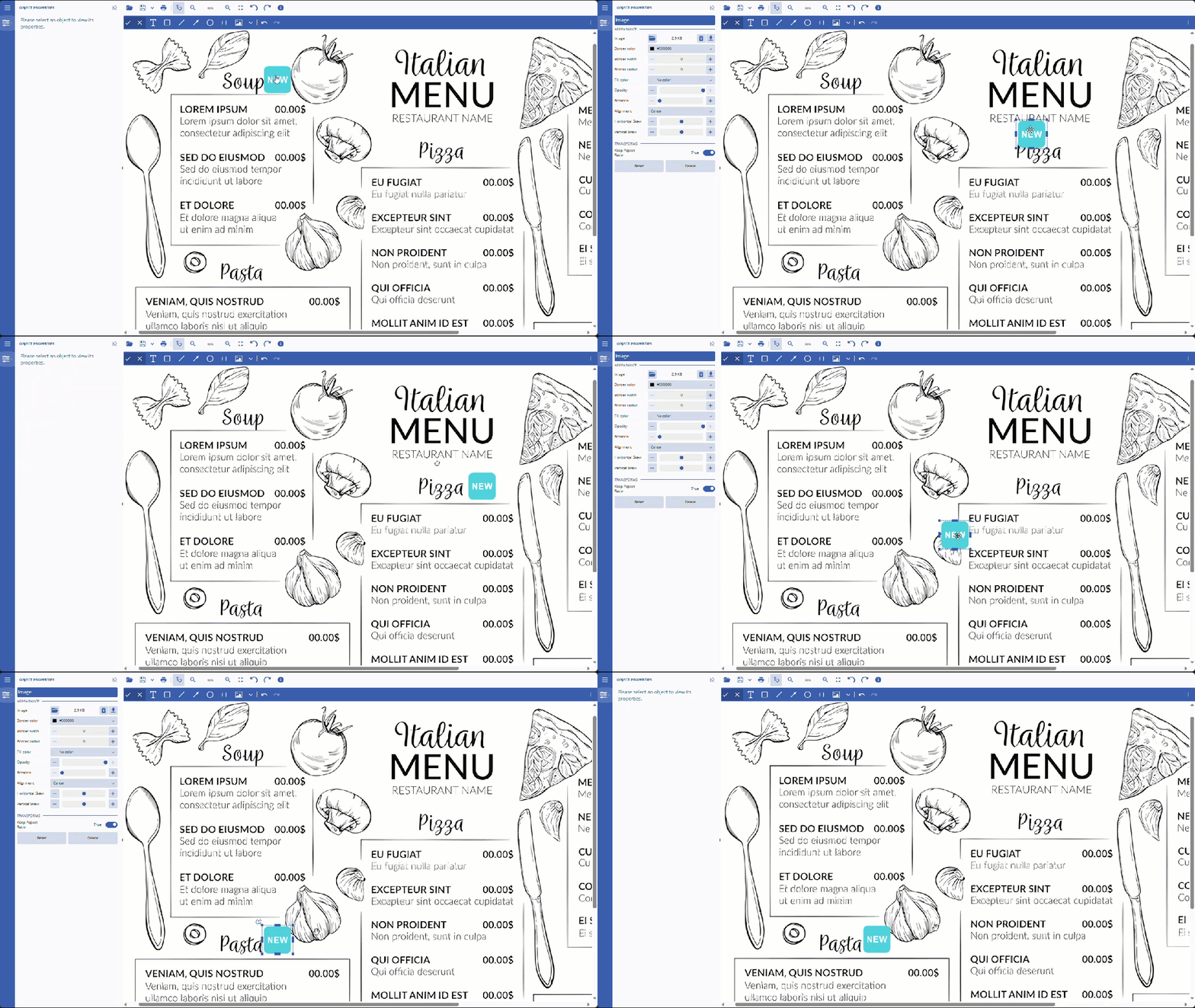
#### Move Image from Image Gallery

1. Click on the image. The move cursor icon will appear.
2. Click and move the image to the desired location.
![Move_Image_From_Image_Gallery.gif](https://cdn.mescius.io/document-site-files/images/00af782e-1574-4480-84e3-170a91a0b268/Move_Image_From_Image_Gallery-20260219.5f04bf.gif?width=790)

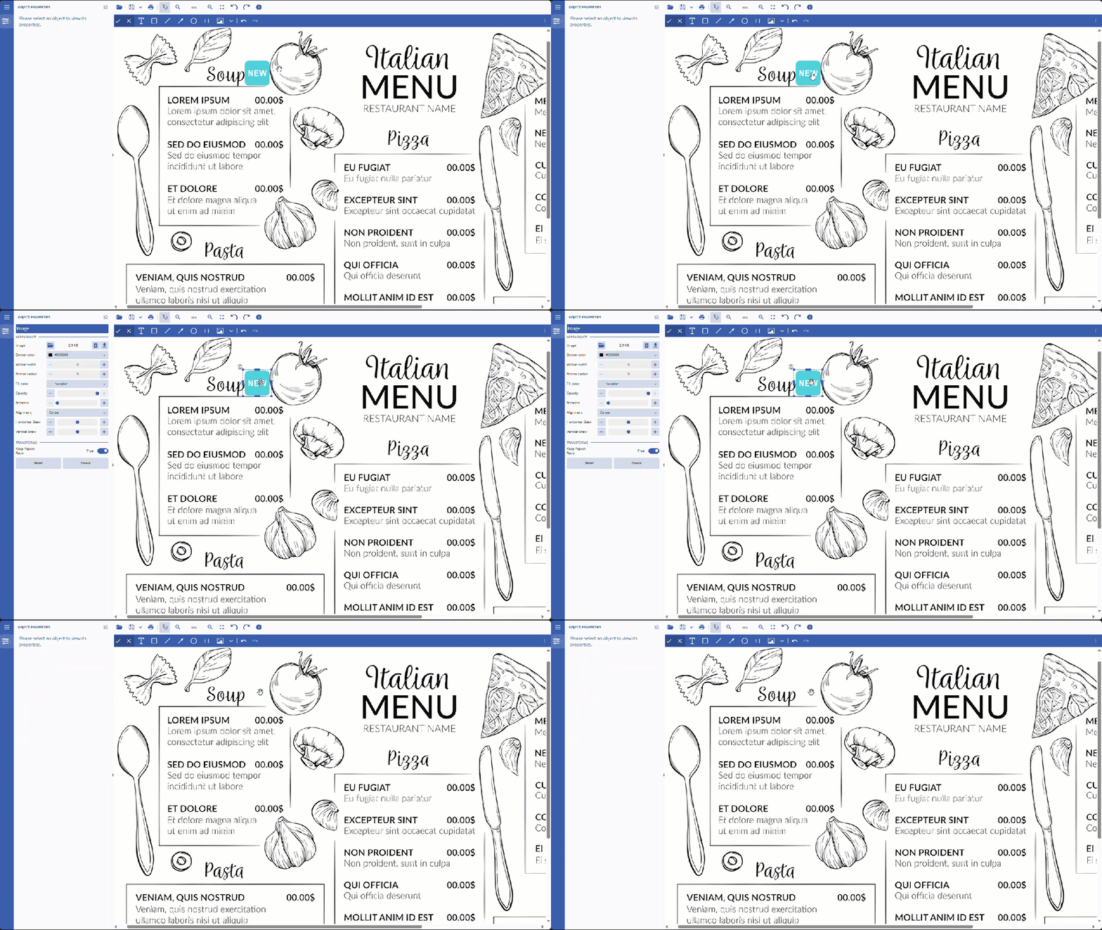
#### Select and Delete Image from Image Gallery

1. To select an image, click on it.
2. To delete an image, press the Delete button.
![Delete_Image_From_Image_Gallery.gif](https://cdn.mescius.io/document-site-files/images/00af782e-1574-4480-84e3-170a91a0b268/Delete_Image_From_Image_Gallery-20260219.86c285.gif?width=790)
**Limitations**
DsImageViewer does not support editing images with animation or multi-frame images. The following is a list of uneditable image formats:

* GIF
* ICO
* SVG
* TIFF