# Material Theme
## Content
From 2018v3 onwards, the default appearance of FlexGrid has changed to the material design pattern. So, for users using 2018v3 or beyond, FlexGrid appears as follows.
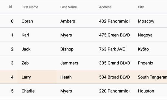
In order to revert to the classic style which was there until 2018v2, use the following code:
```csharp
Grid.Style = GridStyle.Classic;
```
We have also added following features to support the material design in the FlexGrid control:
* **Checklist behavior**
To further support the material design, you can now enable the checklist like selection. This kind of selection lets you select the non-consecutive rows of data. You can enable it by using the following code:
```csharp
var details = new CheckListBehavior();
details.SelectionBinding = "Selected";
details.Attach(grid);
```
* **Header grid lines**
Also, to provide more garnular styling capabilities suited for Material design, FlexGrid supports RowHeaderGridLinesVisibility, ColumnHeaderGridLinesVisibility, and TopLeftHeaderGridLinesVisibility properties to display or hide the individual header grid lines.