# Data Labels
## Content
You can add data labels in the FlexChart control to show the exact values corresponding to a particular column, bar or point in the plot area. You can display the data labels at the following positions relative to each plot element.
* **Top** - on the top of the column, bar or point in the chart area.
* **Bottom** - below the edge of the column, bar or point in the chart area.
* **Right** - to the right of the column, bar or point in the chart area.
* **Left** - to the left of the column, bar or point in the chart area.
* **Center** - in the center of the column, bar or point in the chart area.
* **None -** no labels are visible.
The following image shows a column chart with data labels positioned on the top.
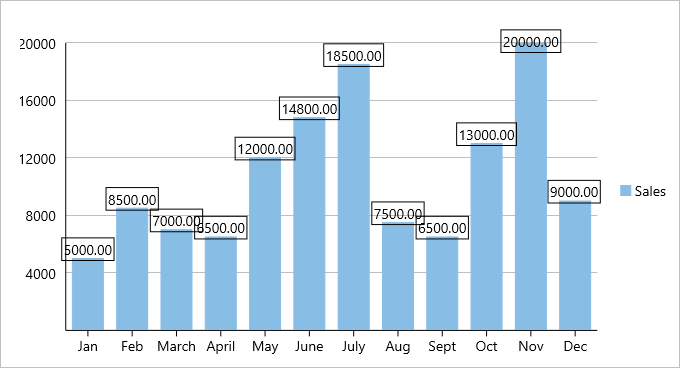
A data label can contain any amount of text and other UI elements. To display data labels in a FlexChart control, you must set the [ChartDataLabel.Position](/componentone/api/xamarin/online-forms/dotnet-api/C1.Xamarin.Forms.Chart/C1.Xamarin.Forms.Chart.ChartDataLabel.Position.html) property and define the content template to display as the label.
The table below lists the predefined parameters applicable for data label content customization.
| **Parameter** | **Description** |
| --- | --- |
| x | Shows the X value of the data point. |
| y | Shows the Y value of the data point. |
| value | Shows the Y value of the data point. |
| name | Shows the X value of the data point. |
| seriesName | Shows the name of the series. |
| pointIndex | Shows the index of the data point. |
| Percentage | Shows the percentage of a pie slice to the whole pie chart. |
### In XAML
The following code example demonstrates how to use data labels in FlexChart and set their position. This examples uses the sample created in the [Quick Start](/componentone/docs/xamarin/online-forms/controls/chartOverview/chartQuickStart) section.
```xml
```
### In Code
To add the content and change the label position in code, use the following code.
```csharp
//Setting the data labels
chart.DataLabel.Content = "{}{value:F2}";
chart.DataLabel.Position = ChartLabelPosition.Top;
```
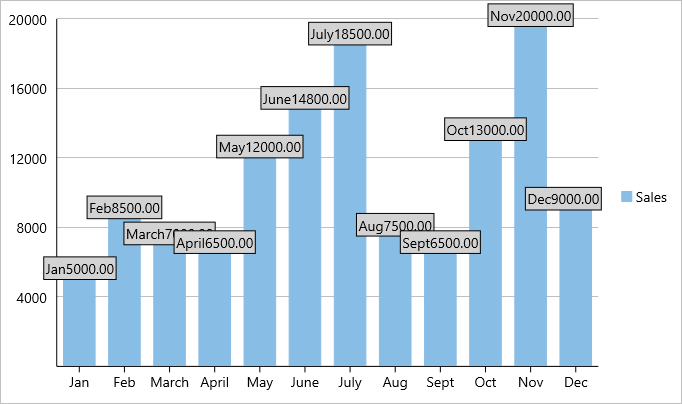
To display the X and Y values in a single label you would add two Labels to the data label template as shown below. You can also customize the appearance of the data labels.
### In XAML
```xml
```
### In Code
```csharp
chart.DataLabel.Content = "{}{x}{value:F2}";
chart.DataLabel.Position = ChartLabelPosition.Top;
chart.DataLabel.Style.Fill = Color.LightGray;
chart.DataLabel.Style.FontSize = 14;
```
The image below show how the X and Y values appear in a single label.