# Drag and Drop Nodes
## Content
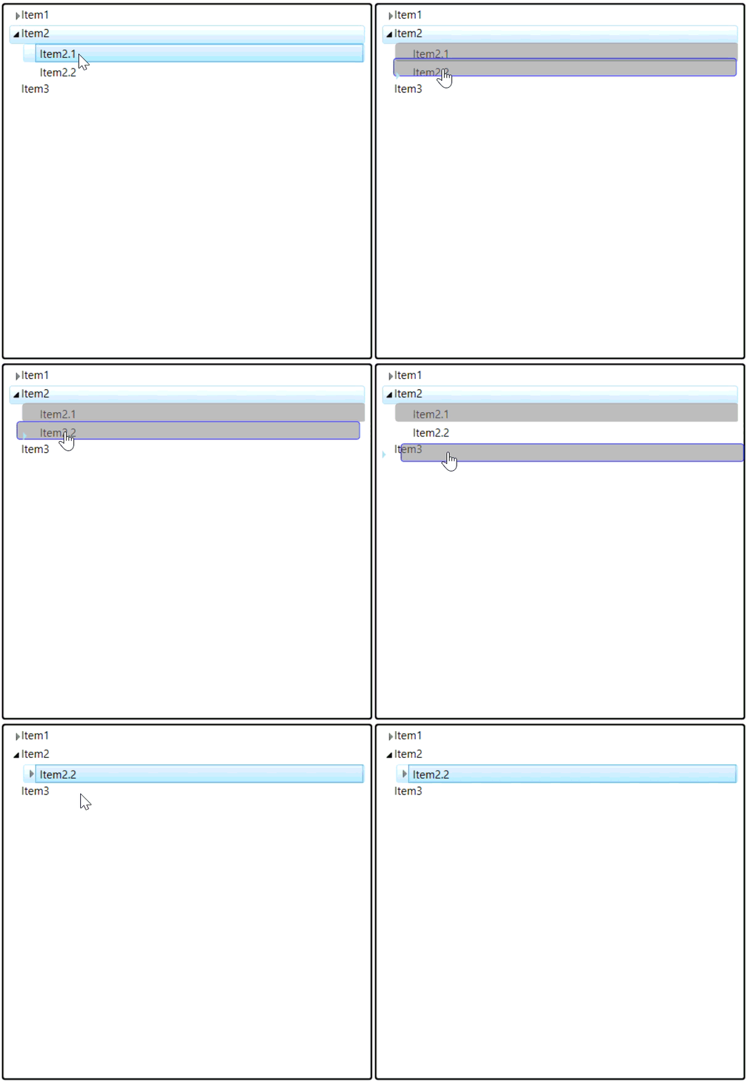
You can drag-and-drop C1TreeViewItems on nodes, in between nodes, or from one tree to another tree when the [AllowDragDrop](/componentone/api/wpf/online-treeview5/dotnet-api/C1.WPF.TreeView/C1.WPF.TreeView.C1TreeView.AllowDragDrop.html) property is set to True.
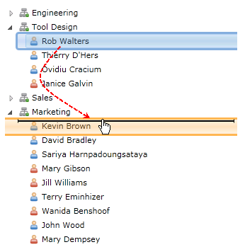
The following image shows a C1TreeViewItem being dragged from one C1TreeView to another C1TreeView. An arrow or vertical line can be used as a visual cue to show you where the C1TreeViewItem is going to be dropped when either the [DragDropArrowMarker](/componentone/api/wpf/online-treeview5/dotnet-api/C1.WPF.TreeView/C1.WPF.TreeView.C1TreeView.DragDropArrowMarker.html) or [DragDropLineMarker](/componentone/api/wpf/online-treeview5/dotnet-api/C1.WPF.TreeView/C1.WPF.TreeView.C1TreeView.DragDropLineMarker.html) properties are applied.
To set the **AllowDragDrop** property to **True**, use the following code:
```vbnet
C1TreeView.AllowDragDrop = True
```
```csharp
C1TreeView.AllowDragDrop = true;
```
To enable visual drag-and-drop indicators you can set the **DragDropArrowMarker** and **DragDropLineMarker** properties.
## Customize Source Marker and Target Marker
ComponentOne TreeView allows users to customize the appearance of the source marker and target marker to match their application's design and usability requirements. The appearance of the source marker and the target marker can be customized using two properties:
* **DragSourceStyle**
* **DragTargetStyle**
### Default
By default, the source marker appears as a small rectangular silhouette representing the element being dragged, while the target marker is displayed as a simple line or highlight indicating the intended drop position. Both markers have a fixed default size of one item and a fixed color. The default appearance is automatically applied if custom styles are not defined.
### Customize Source Marker
Customize the visual appearance (size, color, border, shape, and more) of the source marker using **DragSourceStyle**. The following code snippet demonstrates how to apply a custom style.
```auto
```
### Customize Target Marker
Customize the visual appearance (size, color, border, shape, and more) of the target marker using **DragTargetStyle**. The following code snippet demonstrates how to apply a custom style.
```auto
```
**Build and Verify**
The end appearance will reflect the styles defined by the user: