# Styling and Appearance

## Content


Sparkline provides various properties in the <span data-popup-content="This class is available in \u003ca href=\u0022/componentone/api/wpf/online-sparkline/dotnet-api/C1.WPF.Sparkline/C1.WPF.Sparkline.C1Sparkline.html\u0022\u003e.NET\u003c/a\u003e and \u003ca href=\u0022/componentone/api/wpf/online-sparkline/dotnet-api/C1.WPF.Sparkline/C1.WPF.Sparkline.C1Sparkline.html\u0022\u003e.NET Framework\u003c/a\u003e." data-popup-title="C1Sparkline" data-popup-theme="ui-tooltip-green qtip-green">C1Sparkline</span> class to style the appearance of the control to change its look and feel. It allows you to set the color of the axis, data points, series, and much more. Let us discuss how to change the Sparkline appearance and style in the following sections.

### Style Markers

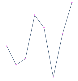
By default, the markers are displayed in the default color, i.e., red. However, you can change the color of the markers using <span data-popup-content="This property is available in \u003ca href=\u0022/componentone/api/wpf/online-sparkline/dotnet-api/C1.WPF.Sparkline/C1.WPF.Sparkline.C1Sparkline.MarkersColor.html\u0022\u003e.NET\u003c/a\u003e and \u003ca href=\u0022/componentone/api/wpf/online-sparkline/dotnet-api/C1.WPF.Sparkline/C1.WPF.Sparkline.C1Sparkline.MarkersColor.html\u0022\u003e.NET Framework\u003c/a\u003e." data-popup-title="MarkersColor" data-popup-theme="ui-tooltip-green qtip-green">MarkersColor</span> property of the **C1Sparkline** class.
![Displays markers in violet color](https://cdn.mescius.io/document-site-files/images/9decca57-66c3-4dca-a1cc-04fdd3fb16b4/images/style-marker.png)

To highlight data markers in a different color programmatically, set the **MarkersColor** property as shown in the following code. Here, we used violet color for the markers.

**xml**

```xml
<c1:C1Sparkline x:Name="sparkline" MarkersColor="Violet" Height="150" Width="250" />
```

**csharp**

```csharp
sparkline.MarkersColor = Colors.Violet;
```

Here is a list of properties provided by the C1Sparkline class that can be used to customize marker colors for highlighting specific data points.<br />

| **Property** | **Description** |
| --- | --- |
| <span data-popup-content="This property is available in \u003ca href=\u0022/componentone/api/wpf/online-sparkline/dotnet-api/C1.WPF.Sparkline/C1.WPF.Sparkline.C1Sparkline.FirstMarkerColor.html\u0022\u003e.NET\u003c/a\u003e and \u003ca href=\u0022/componentone/api/wpf/online-sparkline/dotnet-api/C1.WPF.Sparkline/C1.WPF.Sparkline.C1Sparkline.FirstMarkerColor.html\u0022\u003e.NET Framework\u003c/a\u003e." data-popup-title="FirstMarkerColor" data-popup-theme="ui-tooltip-green qtip-green">FirstMarkerColor</span> | Specifies the marker color for the first data point in Sparkline. |
| <span data-popup-content="This property is available in \u003ca href=\u0022/componentone/api/wpf/online-sparkline/dotnet-api/C1.WPF.Sparkline/C1.WPF.Sparkline.C1Sparkline.LastMarkerColor.html\u0022\u003e.NET\u003c/a\u003e and \u003ca href=\u0022/componentone/api/wpf/online-sparkline/dotnet-api/C1.WPF.Sparkline/C1.WPF.Sparkline.C1Sparkline.LastMarkerColor.html\u0022\u003e.NET Framework\u003c/a\u003e." data-popup-title="LastMarkerColor" data-popup-theme="ui-tooltip-green qtip-green">LastMarkerColor</span> | Specifies the marker color for the last data point in Sparkline. |
| <span data-popup-content="This property is available in \u003ca href=\u0022/componentone/api/wpf/online-sparkline/dotnet-api/C1.WPF.Sparkline/C1.WPF.Sparkline.C1Sparkline.HighMarkerColor.html\u0022\u003e.NET\u003c/a\u003e and \u003ca href=\u0022/componentone/api/wpf/online-sparkline/dotnet-api/C1.WPF.Sparkline/C1.WPF.Sparkline.C1Sparkline.HighMarkerColor.html\u0022\u003e.NET Framework\u003c/a\u003e." data-popup-title="HighMarkerColor" data-popup-theme="ui-tooltip-green qtip-green">HighMarkerColor</span> | Specifies the marker color for the highest data point in Sparkline. |
| <span data-popup-content="This property is available in \u003ca href=\u0022/componentone/api/wpf/online-sparkline/dotnet-api/C1.WPF.Sparkline/C1.WPF.Sparkline.C1Sparkline.LowMarkerColor.html\u0022\u003e.NET\u003c/a\u003e and \u003ca href=\u0022/componentone/api/wpf/online-sparkline/dotnet-api/C1.WPF.Sparkline/C1.WPF.Sparkline.C1Sparkline.LowMarkerColor.html\u0022\u003e.NET Framework\u003c/a\u003e." data-popup-title="LowMarkerColor" data-popup-theme="ui-tooltip-green qtip-green">LowMarkerColor</span> | Specifies the marker color for the lowest data point in Sparkline. |
| <span data-popup-content="This property is available in \u003ca href=\u0022/componentone/api/wpf/online-sparkline/dotnet-api/C1.WPF.Sparkline/C1.WPF.Sparkline.C1Sparkline.NegativeColor.html\u0022\u003e.NET\u003c/a\u003e and \u003ca href=\u0022/componentone/api/wpf/online-sparkline/dotnet-api/C1.WPF.Sparkline/C1.WPF.Sparkline.C1Sparkline.NegativeColor.html\u0022\u003e.NET Framework\u003c/a\u003e." data-popup-title="NegativeColor" data-popup-theme="ui-tooltip-green qtip-green">NegativeColor</span> | Specifies the marker color for negative data points in Sparkline. |

### Style Axis

Sparkline lets you set the color of the axis based on your requirements. You can use <span data-popup-content="This property is available in \u003ca href=\u0022/componentone/api/wpf/online-sparkline/dotnet-api/C1.WPF.Sparkline/C1.WPF.Sparkline.C1Sparkline.AxisColor.html\u0022\u003e.NET\u003c/a\u003e and \u003ca href=\u0022/componentone/api/wpf/online-sparkline/dotnet-api/C1.WPF.Sparkline/C1.WPF.Sparkline.C1Sparkline.AxisColor.html\u0022\u003e.NET Framework\u003c/a\u003e." data-popup-title="AxisColor" data-popup-theme="ui-tooltip-green qtip-green">AxisColor</span> property of the C1Sparkline class to set the color of the axis.

![Displays axis in green color](https://cdn.mescius.io/document-site-files/images/9decca57-66c3-4dca-a1cc-04fdd3fb16b4/images/style-axis.png)

The following code shows how to set the axis color.

**xml**

```xml
<c1:C1Sparkline x:Name="sparkline" AxisColor="Green" Height="150" Width="250" />
```

**csharp**

```csharp
sparkline.AxisColor = Colors.Green;
```

### Customize Line

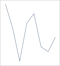
Sparkline lets you customize the line by allowing you to set its direction and thickness. You can use <span data-popup-content="This property is available in \u003ca href=\u0022/componentone/api/wpf/online-sparkline/dotnet-api/C1.WPF.Sparkline/C1.WPF.Sparkline.C1Sparkline.LineWeight.html\u0022\u003e.NET\u003c/a\u003e and \u003ca href=\u0022/componentone/api/wpf/online-sparkline/dotnet-api/C1.WPF.Sparkline/C1.WPF.Sparkline.C1Sparkline.LineWeight.html\u0022\u003e.NET Framework\u003c/a\u003e." data-popup-title="LineWeight" data-popup-theme="ui-tooltip-green qtip-green">LineWeight</span> property of the C1Sparkline class to change the thickness of the line in a line sparkline by specifying the line weight. Additionally, you can set the line direction by using the <span data-popup-content="This property is available in \u003ca href=\u0022/componentone/api/wpf/online-sparkline/dotnet-api/C1.WPF.Sparkline/C1.WPF.Sparkline.C1Sparkline.RightToLeft.html\u0022\u003e.NET\u003c/a\u003e and \u003ca href=\u0022/componentone/api/wpf/online-sparkline/dotnet-api/C1.WPF.Sparkline/C1.WPF.Sparkline.C1Sparkline.RightToLeft.html\u0022\u003e.NET Framework\u003c/a\u003e." data-popup-title="RightToLeft" data-popup-theme="ui-tooltip-green qtip-green">RightToLeft</span> property.

The following image shows the Sparkline control after setting **RightToLeft** property in the sample created in [Quick Start](/componentone/docs/wpf/online-sparkline/quick_start) topic.
![Displays sparkline after chaning appearance of line](https://cdn.mescius.io/document-site-files/images/9decca57-66c3-4dca-a1cc-04fdd3fb16b4/images/style-line.png)

The following code shows how to change the appearance of line in a sparkline.

**xml**

```xml
<c1:C1Sparkline x:Name="sparkline" LineWeight="5" RightToLeft="True" Height="150" Width="250" />
```

**csharp**

```csharp
sparkline.LineWeight = 5;
sparkline.RightToLeft = true;
```