# Quick Start
## Content
Like the standard Microsoft **PropertyGrid** control, the **WPF** **PropertyGrid** control works based on a [SelectedObject](/componentone/api/wpf/online-propertygrid5/dotnet-api/C1.WPF.PropertyGrid/C1.WPF.PropertyGrid.C1PropertyGrid.SelectedObject.html) property. Once this property is set, the control displays the object's public properties and allows the user to edit them. In this quick start, we add **PropertyGrid** to the WPF application to create a UI to display and edit information in the PropertyGrid control.
### Binding with Object
To bind an object with PropertyGrid, follow these steps:
## Set up the application
1. Create a new WPF project in Visual Studio.
2. In the **Solution Explorer**, right-click the **Dependencies** and select **Manage NuGet packages**.
3. In the **NuGet Package Manager**, search and add the following reference to your project:
* C1.WPF.PropertyGrid
4. Drag-drop a Button control from the **Toolbox** and place it on the Top-Left area of **MainWindow.xaml**. Now, from the **Properties** window, set its **Name** to "TextButton" and **Content** to "Button".
5. In the XAML view, add the **C1PropertyGrid** control and set its properties using the following code.
```xml
```
## Bind PropertyGrid with a Button
To customize and connect the **C1PropertyGrid** control to the **Button** control, complete the following steps:
1. In XAML view, bind the **C1PropertyGrid** control to the **Button** control and then customize the controls.
2. Set the object for PropertyGrid to display properties using **SelectedObject** property as shown the following code. In this example, the SelectedObject property determines the object for which the PropertyGrid control displays properties to edit.
```xml
```
You will notice in Design view that the **C1PropertyGrid** control now reflects all of the button’s properties.
3. In the **Properties** window, locate the **PropertyAttributes** collection under **Data** category and click the ellipsis button next to it. The **Property Attribute Collection Editor** dialog box will appear.
4. In the **Property Attribute Collection Editor**, click the **Add** button to add items to the PropertyGrid. Repeat this step seven more times to create a total of eight **PropertyAttribute** items.
5. Set the following properties in the **Properties** pane (on the right side) for the items you just added:
| **PropertyAttribute** | **Category** | **DisplayName** | **MemberName** |
| --- | --- | --- | --- |
| [0\] PropertyAttribute | Appearance | Background Color | Background |
| [1\] PropertyAttribute | Appearance | Border Color | BorderBrush |
| [2\] PropertyAttribute | Appearance | Visibility | Visibility |
| [3\] PropertyAttribute | Size | Button Height | Height |
| [4\] PropertyAttribute | Size | Button Width | Width |
| [5\] PropertyAttribute | Text | Button Text | Content |
| [6\] PropertyAttribute | Text | Text Color | Foreground |
| [7\] PropertyAttribute | Text | Text Size | FontSize |
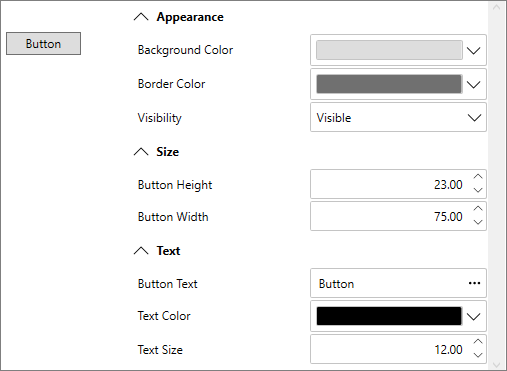
Here, the **Category** identifies what section the item appears in, the **DisplayName** indicates the name displayed for the item and the **MemberName** indicates the actual name of the member.
6. Click the **OK** button to close the **Property Attribute Collection Editor** dialog box and change the settings.
## Run the application
To run your application and observe the run-time behavior of the PropertyGrid control, complete the following steps:
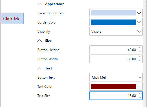
1. From the **Debug** menu, select **Start Debugging** to view how your application will appear at run time. The application will appear similar to the following:
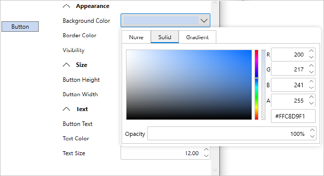
2. Click the **Background Color** drop-down arrow and pick a color, for example, light blue, using color slider in the color picker. You can also set light blue color either using its hexadecimal value (#FFC8D9F1) or RGB value in the color picker. The button's background color will change to your selection.
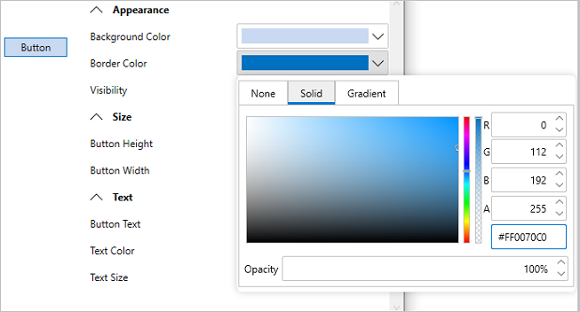
3. Click the **Border Color** drop-down arrow and pick a color, for example blue, from the color picker which appears on the border of the Button control.
4. Change the size of the button by entering values in the **Button Height** and **Button Width** numeric boxes. For example, enter 40 for height and 80 for width.
5. Enter a string, for example "Click Me!" in the **Button Text** textbox.
6. Click the **Text Color** drop-down arrow and pick a color, for example maroon(#FF800000), from the color picker that appears on the text of **Button** control.
7. Click the **Up** or **Down** arrow next to the **Text Size** value to change the size of the text that appears on the button control. For example, set the value to 16.
### Binding with Class
To bind a class with PropertyGrid, follow these steps:
## Set up the application
1. Create a new WPF project in Visual Studio.
2. In the **Solution Explorer**, right-click the **Dependencies** and select **Manage NuGet packages**.
3. In the **NuGet Package Manager**, search and add the following reference to your project:
* C1.WPF.PropertyGrid
4. In the XAML view, add the **C1PropertyGrid** control and set its properties using the following code.
```xml
```
## Bind PropertyGrid with a Class
To customize and connect the **PropertyGrid** control to the class, complete the following steps:
1. Switch to the code view and create a class, say Customer, using the following code.
```csharp
public class Customer
{
public string Name { get; set; }
public string EMail { get; set; }
public string Address { get; set; }
public DateTime CustomerSince { get; set; }
public int? PointBalance { get; set; }
public bool SendNewsletter { get; set; }
}
```
2. Create an object of the **Customer** class and bind it to the PropertyGrid using **SelectedObject** property as shown the following code. In this example, the SelectedObject property determines the object of the class for which the PropertyGrid control displays properties to edit.
```csharp
// Create object to browse
var customer = new Customer();
// Show customer properties
propertyGrid.SelectedObject = customer;
```
## Run the application
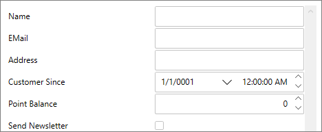
Observe the output appears similar to the following: