# Adding an Image to a C1OutlookItem
## Content
[C1OutlookBar](/componentone/api/wpf/online-outlookbar/dotnet-framework-api/C1.WPF.OutlookBar.4.6.2/C1.WPF.OutlookBar.C1OutlookBar.html) is an **ItemsControl** that can be bound to any list of objects of any data type using DataTemplates to create a visual representation of the items. In this example, you'll see how easily you can add an image to a [C1OutlookItem](/componentone/api/wpf/online-outlookbar/dotnet-framework-api/C1.WPF.OutlookBar.4.6.2/C1.WPF.OutlookBar.C1OutlookItem.html) by binding through a **DataTemplate**.
Suppose you have a [C1OutlookBar](/componentone/api/wpf/online-outlookbar/dotnet-framework-api/C1.WPF.OutlookBar.4.6.2/C1.WPF.OutlookBar.C1OutlookBar.html) named **C1OutlookBar1** which contains a [C1OutlookItem](/componentone/api/wpf/online-outlookbar/dotnet-framework-api/C1.WPF.OutlookBar.4.6.2/C1.WPF.OutlookBar.C1OutlookItem.html) with the **Header** = **Mail**. You will also need an image for the [C1OutlookItem](/componentone/api/wpf/online-outlookbar/dotnet-framework-api/C1.WPF.OutlookBar.4.6.2/C1.WPF.OutlookBar.C1OutlookItem.html). In this example, we'll use a _Resources_ folder containing images in our project. Here's how the XAML might look:
```xml
```
1. Add XAML for a [SmallIconTemplate](/componentone/api/wpf/online-outlookbar/dotnet-framework-api/C1.WPF.OutlookBar.4.6.2/C1.WPF.OutlookBar.C1OutlookBar.SmallIconTemplate.html) and [LargeIconTemplate](/componentone/api/wpf/online-outlookbar/dotnet-framework-api/C1.WPF.OutlookBar.4.6.2/C1.WPF.OutlookBar.C1OutlookBar.LargeIconTemplate.html) for the images that will be shown in the **Collasped Item Panel** and for the **Item Button**, respectively. This markup should be placed within the [C1OutlookBar](/componentone/api/wpf/online-outlookbar/dotnet-framework-api/C1.WPF.OutlookBar.4.6.2/C1.WPF.OutlookBar.C1OutlookBar.html) tags.
```xml
```
2. Add XAML to the [C1OutlookItem](/componentone/api/wpf/online-outlookbar/dotnet-framework-api/C1.WPF.OutlookBar.4.6.2/C1.WPF.OutlookBar.C1OutlookItem.html) specifying the [SmallIcon](/componentone/api/wpf/online-outlookbar/dotnet-framework-api/C1.WPF.OutlookBar.4.6.2/C1.WPF.OutlookBar.C1OutlookItem.SmallIcon.html) and [LargeIcon](/componentone/api/wpf/online-outlookbar/dotnet-framework-api/C1.WPF.OutlookBar.4.6.2/C1.WPF.OutlookBar.C1OutlookItem.LargeIcon.html) bound to the DataTemplates so the markup should now look like this:
```auto
```
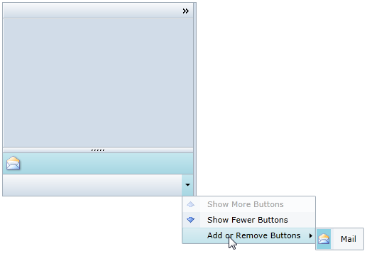
3. Run the project and notice when the [C1OutlookBar](/componentone/api/wpf/online-outlookbar/dotnet-framework-api/C1.WPF.OutlookBar.4.6.2/C1.WPF.OutlookBar.C1OutlookBar.html) is collasped, you will see the small icon in the **Collapsed Item Panel**. When the [C1OutlookBar](/componentone/api/wpf/online-outlookbar/dotnet-framework-api/C1.WPF.OutlookBar.4.6.2/C1.WPF.OutlookBar.C1OutlookBar.html) is expanded, the large icon will appear in the **Item Buttons (Expanded)** area.
_Expanded_
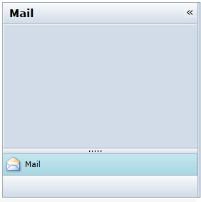
_Collapsed_