# Appearance
## Content
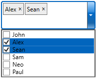
MultiSelect allows you to customize the appearance of all the individual elements of the control and manage its overall appearance.
* [Apply Styles to C1MultiSelect](/componentone/docs/wpf/online-multiselect/features/appearance#apply-styles-to-c1multiselect)
* [Apply Styles to Tags](/componentone/docs/wpf/online-multiselect/features/appearance#apply-styles-to-tags)
* [Apply Styles to CheckList Items](/componentone/docs/wpf/online-multiselect/features/appearance#apply-styles-to-checklist-items)
* [Apply Theme](/componentone/docs/wpf/online-multiselect/features/appearance#apply-theme)
### Apply Styles to C1MultiSelect
The following image shows styles applied to C1MultiSelect.
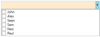
To apply style to MultiSelect using System.Windows.Style class, use the following code.
**In code**
```vbnet
Dim s As Style = New Style(GetType(C1MultiSelect))
s.Setters.Add(New Setter(ItemsControl.BackgroundProperty,
New SolidColorBrush(Color.FromRgb(255, 235, 205))))
mselect.Style = s
```
```csharp
Style s = new Style(typeof(C1MultiSelect));
s.Setters.Add(new Setter(ItemsControl.BackgroundProperty,
new SolidColorBrush(Color.FromRgb(255, 235, 205))));
mselect.Style = s;
```
**In XAML**
```xml
```
### Apply Styles to Tags
The following image shows styles applied to the tags in MultiSelect.
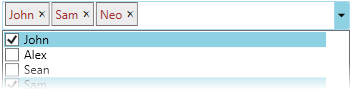
To customize the appearance of tags of C1MultiSelect, use the following code. Tags styles in C1MultiSelect can be accessed via the [TagStyle](/componentone/api/wpf/online-multiselect/dotnet-framework-api/C1.WPF.Input.4.6.2/C1.WPF.Input.C1MultiSelect.TagStyle.html) property.
**In code**
```vbnet
Dim ts As Style = New Style(GetType(C1Tag))
ts.Setters.Add(New Setter(ItemsControl.ForegroundProperty,
New SolidColorBrush(Color.FromRgb(165, 42, 42))))
mselect.TagStyle = ts
```
```csharp
Style ts = new Style(typeof(C1Tag));
ts.Setters.Add(new Setter(ItemsControl.ForegroundProperty,
new SolidColorBrush(Color.FromRgb(165, 42, 42))));
mselect.TagStyle = ts;
```
**In XAML**
```xml
```
### Apply Styles to CheckList Items
The following image shows styles applied to the CheckList items in MultiSelect.
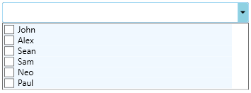
To customize the appearance of checklist items in C1MultiSelect, use the following code. Styles an be applied to the Checklist items in C1MultiSelect using the ItemContainerStyle property.
**In code**
```vbnet
Dim cs As Style = New Style(GetType(C1CheckListItem))
cs.Setters.Add(New Setter(ItemsControl.BackgroundProperty,
New SolidColorBrush(Color.FromRgb(240, 248, 255))))
mselect.ItemContainerStyle = cs
```
```csharp
Style cs = new Style(typeof(C1CheckListItem));
cs.Setters.Add(new Setter(ItemsControl.BackgroundProperty,
new SolidColorBrush(Color.FromRgb(240, 248, 255))));
mselect.ItemContainerStyle = cs;
```
**In XAML**
```xml
```
### Apply Theme
You can customize the appearance of the MultiSelect control using built-in themes or by designing your own themes. For example, you can apply ShinyBlue theme to the control using the following code:
```vbnet
Public Partial Class MainWindow
Inherits Window
Public Sub New()
InitializeComponent()
Dim myTheme As MyThemes = New MyThemes()
MyThemes.MyTheme.Apply(mselect)
End Sub
End Class
Public Class MyThemes
Private Shared _myTheme As C1ThemeShinyBlue = Nothing
Public Shared ReadOnly Property MyTheme As C1ThemeShinyBlue
Get
If _myTheme Is Nothing Then _myTheme = New C1ThemeShinyBlue()
Return _myTheme
End Get
End Property
End Class
```
```csharp
public partial class MainWindow : Window
{
public MainWindow()
{
InitializeComponent();
MyThemes myTheme = new MyThemes();
MyThemes.MyTheme.Apply(mselect);
}
}
public class MyThemes
{
private static C1ThemeShinyBlue _myTheme = null;
public static C1ThemeShinyBlue MyTheme
{
get
{
if (_myTheme == null)
_myTheme = new C1ThemeShinyBlue();
return _myTheme;
}
}
}
```
Similarly, you can apply any other built-in or your own custom theme to the MultiSelect control. For more information on themes, see [Theming](https://developer.mescius.com/componentone/docs/wpf/online-studio/Theming.html).
The following image shows the MultiSelect control with MacBlue theme applied to it.