# RangeSlider Quick Start
## Content
The following quick start guide is intended to get you up and running with **RangeSlider for WPF**. In this quick start, you add a C1RangeSlider control to your application and customize the appearance and behavior of the control.
### Set up the Application
1. In Visual Studio, select **File | New | Project**.
2. In the **New Project** dialog box, select **WPF** **Application**.
3. Enter a **Name** and **Location** for your project and click **OK** to create the new application.
4. In Design view, click once within the **Grid** in your application.
5. Navigate to the Toolbox and double-click the **Rectangle** icon to add the standard control to the **Grid**.
6. In the **Design** pane, resize **Rectangle1** to fill the entire **Grid**.
7. Switch to XAML view and add a **Fill** to the **\** tag so it appears similar to the following:
```xml
```
This will add a black and gold radial gradient fill to the rectangle.
11. Run your application now and observe that it looks similar to the following:

You've successfully created a WPF application and customized the Rectangle control. In the next step you'll add and customize the C1RangeSlider control.
### Add the RangeSlider control to the Application
In the previous step you created a new WPF project and added a Rectangle control with a gradient to the application. In this step you'll continue by adding a C1RangeSlider control that will control the gradient fill in the Rectangle.
Complete the following steps:
1. In the XAML window of the project, place the cursor between the **\** and **\** tags and click once.
2. Navigate to the Toolbox and double-click the **C1RangeSlider** icon to add the control to the application on top of the Rectangle.
3. Give your control a name by adding **x:Name="c1rs1"** to the **** tag so that it appears similar to the following:
```xml
```
By giving it a unique identifier, you'll be able to access the control in code.
4. Add a margin by adding **Margin="50"** to the **** tag so that it appears similar to the following:
```xml
```
This will set each edge the same distance away from the grid's border.
5. Set the [Orientation](/componentone/api/wpf/online-input-net/dotnet-api/C1.WPF.Input/C1.WPF.Input.C1RangeSlider.Orientation.html) property to Vertical by adding **Orientation="Vertical"** to the **** tag so that it appears similar to the following:
```EXAMPLE
```
By default **Orientation** is Horizontal and the control appears across the page.
6. Set the [UpperValue](/componentone/api/wpf/online-input-net/dotnet-api/C1.WPF.Input/C1.WPF.Input.C1RangeSlider.UpperValue.html) property to 1 by adding **UpperValue="1"** to the **** tag so that it appears similar to the following:
```xml
```
The upper thumb will now begin at 1.
7. Set the [Maximum](/componentone/api/wpf/online-input-net/dotnet-api/C1.WPF.Input/C1.WPF.Input.C1RangeSlider.Maximum.html) property to 1 by adding **Maximum="1"** to the **** tag so that it appears similar to the following:
```xml
```
Users will now not be able to select a value greater than 1.
8. Set the [ValueChange](/componentone/api/wpf/online-input-net/dotnet-api/C1.WPF.Input/C1.WPF.Input.C1RangeSlider.ValueChange.html) property to 0.1 by adding **ValueChange="0.1"** to the **** tag so that it appears similar to the following:
```xml
```
When you click on the slider track at run time, the slider thumb will now move by 0.1 units.
9. Set the **Opacity** property to "0.8" by adding **Opacity="0.8"** to the **** tag so that it appears similar to the following:
```EXAMPLE
```
By default this property is set to 1 and the control appears completely opaque. Changing this to a lower number will make the control appear slightly transparent.
10. Indicate event handlers by adding **LowerValueChanged="c1rs1\_LowerValueChanged" UpperValueChanged="c1rs1\_UpperValueChanged"** to the **** tag so that it appears similar to the following:
```xml
```
You'll add code for these event handlers in a later step.
11. Run your application now and observe that it looks similar to the following:
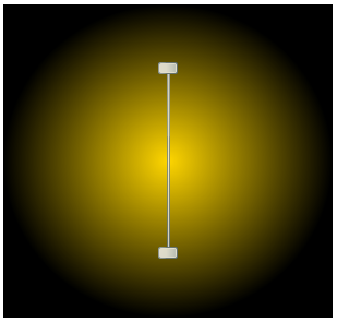
You've successfully set up your application's user interface, but right now the slider will do nothing if you move it. In the next step you'll add code to your application to add functionality.
### Add Code to the Application
In the previous steps you set up the application's user interface and added controls to your application. In this step you'll add code to your application to finalize it.
Complete the following steps:
1. Double-click **Window1** to switch to **Code** view and create the **Window1\_Loaded** event handler.
2. In **Code** view, add the following import statement to the top of the page:
```vbnet
Imports C1.WPF.Input
```
```csharp
using C1.WPF.Input;
```
3. In a WPF application, add code to the **Window\_Loaded** event handler so that it appears like the following:
```vbnet
Private Sub Window1_Loaded(ByVal sender As System.Object, ByVal e As System.Windows.RoutedEventArgs) Handles MyBase.Loaded
UpdateGradient()
End Sub
```
```csharp
private void Window_Loaded(object sender, RoutedEventArgs e)
{
UpdateGradient();
}
```
4. Add the following code just after the **Window1\_Loaded** event handler to update the gradient values:
```vbnet
Private Sub UpdateGradient()
If IsLoaded Then
Me.goldcol.Offset = Me.c1rs1.LowerValue
Me.blackcol.Offset = Me.c1rs1.UpperValue
End If
End Sub
```
```csharp
UpdateGradient()
{
if (IsLoaded)
{
this.goldcol.Offset = this.c1rs1.LowerValue;
this.blackcol.Offset = this.c1rs1.UpperValue;
}
}
```
5. Return to **Design** view.
6. Click once on the **C1RangeSlider** control to select it and then navigate to the Properties window.
7. Click the lightning bolt **Events** icon at the top of the Properties window to view events.
8. Double-click the **LowerValueChanged** event to switch to **Code** view and create the **c1rs1\_LowerValueChanged** event handler. Return to **Design** view and repeat this step with the **UpperValueChanged** event to create the **c1rs1\_UpperValueChanged** event handler.
9. Add code to the **c1rs1\_LowerValueChanged** event handler so that it appears like the following:
```vbnet
Private Sub c1rs1_LowerValueChanged(ByVal sender As System.Object, ByVal e As System.EventArgs) Handles c1rs1.LowerValueChanged
UpdateGradient()
End Sub
```
```csharp
private void c1rs1_LowerValueChanged(object sender, EventArgs e)
{
UpdateGradient();
}
```
10. Add code to the **c1rs1\_UpperValueChanged** event handler so that it appears like the following:
```vbnet
Private Sub c1rs1_UpperValueChanged(ByVal sender As System.Object, ByVal e As System.EventArgs) Handles c1rs1.UpperValueChanged
UpdateGradient()
End Sub
```
```csharp
c1rs1_UpperValueChanged(object sender, EventArgs e)
{
UpdateGradient();
}
```
In this step you completed adding code to your application. In the next step you'll run the application and observe run-time interactions.
### Run the Application
Now that you've created a WPF application and customized the application's appearance and behavior, the only thing left to do is run your application.
To run your application and observe **RangeSlider for WPF**'s run-time behavior, complete the following steps:
1. From the Project menu, select Test Solution to view how your application will appear at run time.
The application will appear similar to the following:
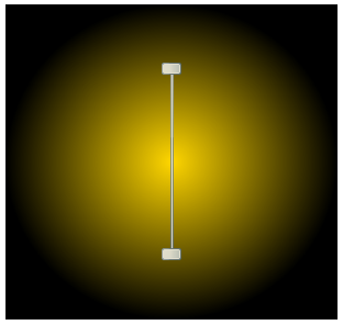
2. Move the top slider thumb down. Notice that the gradient's appearance changes:
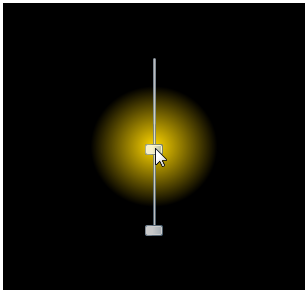
3. Move the bottom thumb up, notice that the gradient effect appears less diffused:
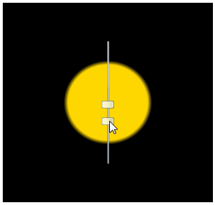
4. Click once between the slider thumbs and drag the cursor down the slider track – notice that both thumbs move together: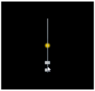
**Congratulations!**
You've completed the **RangeSlider for WPF** quick start and created a **RangeSlider for WPF** application, customized the appearance and behavior of the controls, and viewed some of the run-time capabilities of your application.