# Drop Down Elements

## Content


DropDown for WPF is a combination of three controls, namely DropDown, DropDownButton and SplitButton. You can have a look at the list of all the elements in each of these controls below along with the code to add content in them.

### C1DropDown Elements

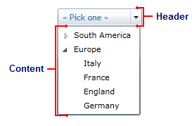
The **C1DropDown** control consists of two parts: a header area and a content area. The header appears visible when the drop-down box is not open; the content is what is visible when the drop-down area is clicked. The image below identifies the header and content area:
![](https://cdn.mescius.io/document-site-files/images/47c7dd3c-b586-44f5-903c-f615f88e343f/images/dropdown/narrdropdownelements.png)

You can add content to neither, either, or both the header and content areas. You can customize the **C1DropDown** control in XAML by adding content to the header and content areas. For example the following markup creates a drop-down control similar to the one pictured above:

```xml
<c1:C1DropDown Height="36" HorizontalAlignment="Left" Margin="10,12,0,0" Name="C1DropDown1" VerticalAlignment="Top" Width="101">
    <c1:C1DropDown.Header>
        <TextBlock Height="21" Name="TextBlock1" Text="« Pick one »" Width="120" />
    </c1:C1DropDown.Header>
    <c1:C1DropDown.Content>
        <TreeView HorizontalAlignment="Left" Name="TreeView1" Width="120">
            <TreeViewItem Header="South America">
                <TreeViewItem Header="Brazil" />
                <TreeViewItem Header="Argentina" />
                <TreeViewItem Header="Uruguay" />
            </TreeViewItem>
            <TreeViewItem Header="Europe">
                <TreeViewItem Header="Italy" />
                <TreeViewItem Header="France" />
                <TreeViewItem Header="England" />
                <TreeViewItem Header="Germany" />
            </TreeViewItem>
        </TreeView>
    </c1:C1DropDown.Content>
</c1:C1DropDown>
```

Note that the **<c1:C1DropDown.Header>** and **<c1:C1DropDown.Content>** tags are used to define header and content. You can add controls and content within these tags.

### C1DropDownButton Elements

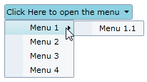
The **C1DropDownButton** control is similar to the **C1DropDown** control and consists of two parts: a header area and a content area. The header appears visible when the drop-down box is not open; the content is what is visible when the drop-down area is clicked. For example, in the below image the content area concludes a structured menu:
![](https://cdn.mescius.io/document-site-files/images/47c7dd3c-b586-44f5-903c-f615f88e343f/images/dropdown/narrdropdownbuttonelements.png)

You can add content to neither, either, or both the header and content areas. You can customize the **C1DropDown** control in XAML by adding content to the header and content areas. For example the following markup creates a drop-down control similar to the one pictured above:

```xml
<c1:C1DropDownButton x:Name="ddl" Header="Click Here to open the menu" HorizontalAlignment="Left">
    <c1:C1MenuList>
        <c1:C1MenuItem Header="Menu 1">
                <c1:C1MenuItem Header="Menu 1.1" />
        </c1:C1MenuItem>
        <c1:C1MenuItem Header="Menu 2" />
        <c1:C1MenuItem Header="Menu 3" />
        <c1:C1MenuItem Header="Menu 4" />
    </c1:C1MenuList>
</c1:C1DropDownButton>
```

Note that the header text is defined in the **<c1:C1DropDownButton>** tag and the content is placed within the **<c1:C1DropDownButton></c1:C1DropDownButton>** tags.

### C1SplitButton Elements

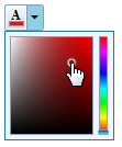
The **C1SplitButton** control combined a button and a drop-down content area, similar to a standard SplitButton. The **C1SplitButton** is more dynamic in the type of content that can be included. In the following image, the **C1SplitButton**'s header includes a color picker icon that changes when a color is picked and the **C1SplitButton**'s content area includes a color picker:
![](https://cdn.mescius.io/document-site-files/images/47c7dd3c-b586-44f5-903c-f615f88e343f/images/dropdown/narrsplitbuttonelements.png)

You can add content to neither, either, or both the header and content areas. You can customize the **C1SplitButton** control in XAML by adding content to the header and content areas. For example the following markup creates a drop-down control similar to the one pictured above:

```xml
<c1:C1SplitButton x:Name="btn" DropDownWidth="100" DropDownHeight="100" HorizontalAlignment="Left" Click="btn_Click">
    <c1:C1DropDown.Header>
        <StackPanel>
            <TextBlock FontFamily="Times New Roman" FontSize="12" Text="A" FontWeight="Bold" VerticalAlignment="Top" Margin="3 0 0 -2" />
            <Border x:Name="selectedColorBorder" Background="Red">
                <Border.Style>
                    <Style TargetType="Border">
                        <Setter Property="BorderThickness" Value="1" />
                        <Setter Property="BorderBrush" Value="#FF9E9DA7" />
                        <Setter Property="Width" Value="14" />
                        <Setter Property="Height" Value="5" />
                        <Setter Property="VerticalAlignment" Value="Bottom" />
                        <Setter Property="Margin" Value="1,0,0,1" />
                    </Style>
                </Border.Style>
            </Border>
        </StackPanel>
    </c1:C1DropDown.Header>
    <Border BorderThickness="1" BorderBrush="#FF207A9C" Background="#FFEFF5FF">
        <Border.Resources>
            <c1:ColorConverter x:Key="colorConverter" />
        </Border.Resources>
        <c1:C1SpectrumColorPicker ShowAlphaChannel="False" Margin="4" Color="{Binding Background, ElementName=selectedColorBorder, Mode=TwoWay, Converter={StaticResource colorConverter}}" />
    </Border>
</c1:C1SplitButton>
```

Note that the **<c1:C1DropDown.Header>** defines the header element and the content element is contained within the **<c1:C1SplitButton></c1:C1SplitButton>** tags.

## See Also

[Creating Drop Down](/componentone/docs/wpf/online-input-net/overview/dropdown/work-with-dropdown/CreatingDropDown)