# Decorator
## Content
The Gauge controls support visual elements called **decorators**, which are rendered relative to the gauge face. Decorators help visualize ranges, intervals, labels, and the current gauge value.
The following decorator types are supported:
* `GaugeRange`
* `GaugeMark`
* `GaugeLabel`
* `GaugePointer`
All decorators are positioned relative to the gauge face and share common layout properties such as `Location`, `Thickness`, and `Alignment`.
## Common Decorator Properties
All gauge decorators provide common properties for controlling positioning and layout.
| Property | Description |
| -------- | ----------- |
| `Location` | Specifies the relative position of the decorator between the inner and outer edges of the gauge face. |
| `Thickness` | Defines the relative size or width of the decorator. |
| `Alignment` | Specifies whether the decorator is rendered inside, outside, or centered on the gauge scale. |
These properties allow you to precisely control decorator placement within the gauge.
## GaugeRange
The `GaugeRange` decorator represents a continuous value range on the gauge scale.
* In a linear gauge, the range is rendered as a rectangle.
* In a radial gauge, the range is rendered as a donut-shaped segment.
A range is defined using the following properties:
| Property | Description |
| -------- | ----------- |
| `From` | Specifies the starting value of the range. |
| `To` | Specifies the ending value of the range. |
If `From` equals the gauge `Minimum` value and `To` equals the `Maximum` value, the range spans the entire gauge face. If the `Origin` value is greater than `Minimum`, the range is rendered from `Origin` to `Maximum`.
### Appearance
### ShowRanges Property
The `ShowRanges` property determines whether gauge ranges are displayed.
| Property Value | Behavior |
| -------------- | -------- |
| `ShowRanges="True"` | Displays all defined ranges. The pointer color is derived from the active range color. |
| `ShowRanges="False"` | Hides all defined ranges. |
### Range Appearance Properties
| Property | Description |
| -------- | ----------- |
| `Brush` | Specifies the fill brush used to render the range. |
| `BorderBrush` | Specifies the brush used to render the range border. |
| `BorderWidth` | Specifies the thickness of the range border. |
#### Example
```auto
```

For detailed information about `GaugeRange` configuration and appearance settings, see **[Range](https://developer.mescius.com/componentone/docs/wpf/online-gauges-net/range "https://developer.mescius.com/componentone/docs/wpf/online-gauges-net/range").**
## GaugeMark
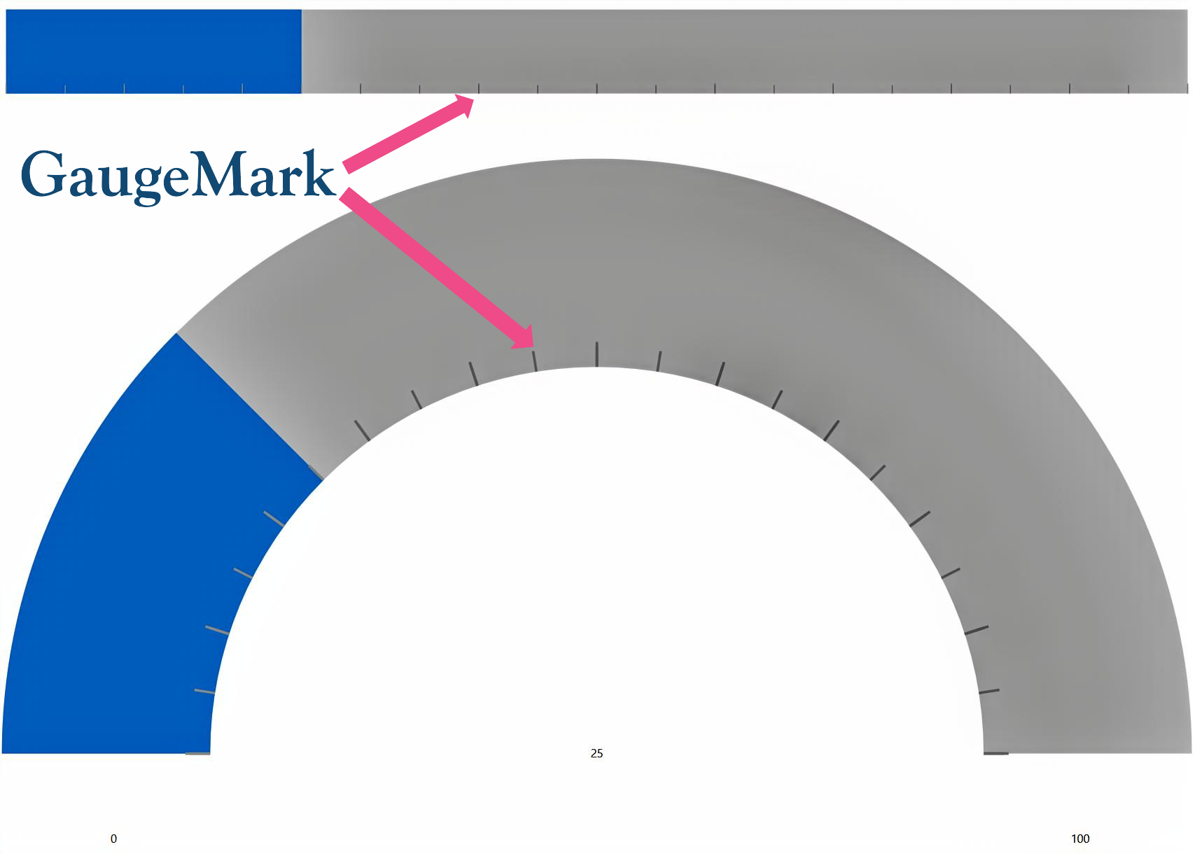
The `GaugeMark` decorator renders tick marks along the gauge scale.
Marks are displayed at intervals specified by the `Interval` property relative to the `Origin` property. By default, marks are rendered as lines.
## Key Properties
### Range and Interval
| Property | Description |
| -------- | ----------- |
| `From` | Specifies the starting value for rendering marks. If not set, the gauge minimum value is used. |
| `To` | Specifies the ending value for rendering marks. If not set, the gauge maximum value is used. |
| `Interval` | Specifies the spacing between marks on the gauge scale. |
### Positioning
| Property | Description |
| -------- | ----------- |
| `Location` | Specifies the position of marks relative to the gauge face. |
| `AbsoluteLocation` | Specifies an absolute position for marks instead of using `Location`. |
| `Alignment` | Specifies whether marks are rendered inside, outside, or centered on the gauge axis. |
### Appearance
| Property | Description |
| -------- | ----------- |
| `Thickness` | Specifies the relative length of the marks. |
| `AbsoluteThickness` | Specifies the mark thickness independently of the gauge thickness. |
| `Brush` | Specifies the brush used to render the marks. |
| `BorderBrush` | Specifies the brush used to render the mark border. |
| `BorderWidth` | Specifies the thickness of the mark border. |
| `StrokeThickness` | Specifies the width of the mark line. |
| `Opacity` | Specifies the transparency level of the marks. |
### SVG Customization
You can use SVG files to render custom mark shapes such as dots, lines, or icons.
| Property | Description |
| -------- | ----------- |
| `Source` | Specifies the URI of the SVG file used to render custom marks. |
| `StartPoint` | Specifies the starting point in SVG coordinate space. |
| `EndPoint` | Specifies the ending point in SVG coordinate space. |
#### Example
```auto
```
```auto
```
## GaugeLabel
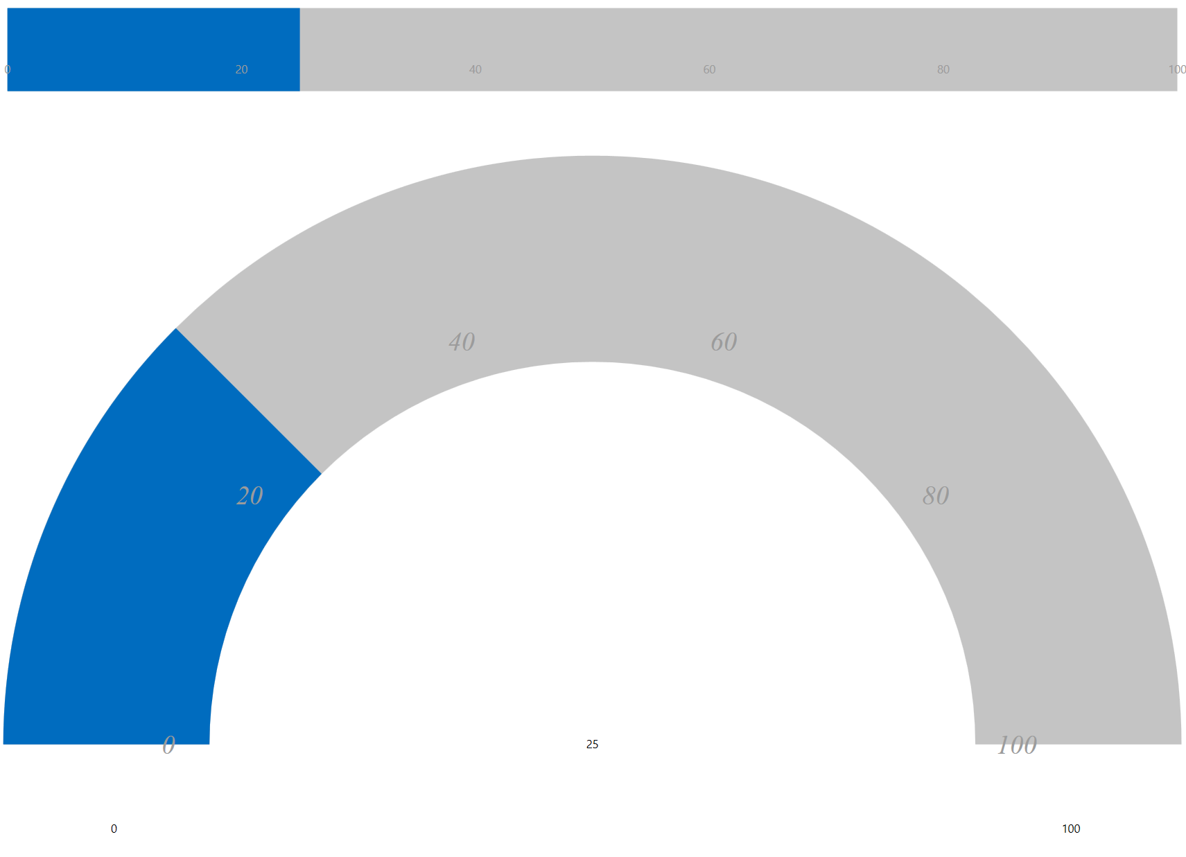
The `GaugeLabel` decorator displays text labels along the gauge scale.
Labels are rendered at intervals specified by the `Interval` property. Labels can display formatted values such as units, time values, or domain-specific text.
### Key Properties
### Range and Interval
| Property | Description |
| -------- | ----------- |
| `From` | Specifies the starting value for rendering labels. If not set, the gauge minimum value is used. |
| `To` | Specifies the ending value for rendering labels. If not set, the gauge maximum value is used. |
| `Interval` | Specifies the spacing between labels on the gauge scale. |
### Positioning
| Property | Description |
| -------- | ----------- |
| `Location` | Specifies the position of labels relative to the gauge face. |
| `AbsoluteLocation` | Specifies an absolute position for labels instead of using `Location`. |
| `Alignment` | Specifies whether labels are rendered inside, outside, or centered on the gauge axis. |
### Appearance
| Property | Description |
| -------- | ----------- |
| `Thickness` | Specifies the space allocated for rendering labels. |
| `AbsoluteThickness` | Specifies the label thickness independently of the gauge thickness. |
| `Brush` | Specifies the brush used to render label text. |
### Text Formatting
| Property | Description |
| -------- | ----------- |
| `Format` | Applies a format string to label values. |
| `Converter` | Converts numeric values into custom display text. |
### Behavior
| Property | Description |
| -------- | ----------- |
| `IsScaled` | Specifies whether labels scale to fit the available space. |
| `IsRotated` | Specifies whether labels rotate according to the gauge angle |
### Font Properties
The following properties control the appearance of label text.
| Property | Description |
| -------- | ----------- |
| `FontSize` | Specifies the font size of the label text. |
| `FontFamily` | Specifies the font family used for the label text. |
| `FontStyle` | Specifies the font style, such as `Normal` or `Italic`. |
| `FontWeight` | Specifies the font weight, such as `Normal`, `Bold`, or `Light`. |
#### Example
```auto
```
## GaugePointer
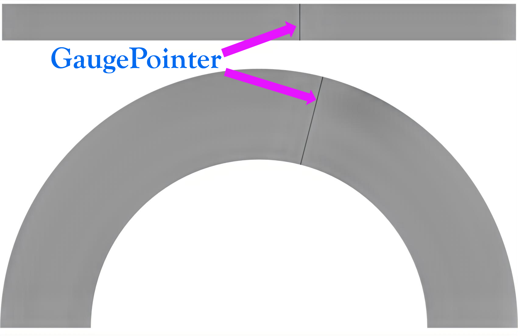
The `GaugePointer` decorator represents the current value of the gauge.
The pointer position is determined by the `Value` property of the parent gauge. By default, the pointer is rendered as a line.
The pointer updates dynamically as the gauge value changes, making it useful for real-time data visualization.
### Key Properties
### Value and Behavior
| Property | Description |
| -------- | ----------- |
| `Value` | Specifies the current gauge value and determines the pointer position. This property is defined on the parent gauge. |
| `ShowRangePointer` | Specifies whether the pointer is displayed. |
### Appearance
| Property | Description |
| -------- | ----------- |
| `Thickness` | Specifies the width of the pointer. |
| `Brush` | Specifies the brush used to render the pointer. |
| `BorderBrush` | Specifies the brush used to render the pointer border. |
| `BorderWidth` | Specifies the thickness of the pointer border. |
### SVG Customization
| Property | Description |
| -------- | ----------- |
| `Source` | Specifies the SVG file used to render a custom pointer. |
| `StartPoint` | Specifies the starting point in SVG coordinate space. |
| `EndPoint` | Specifies the ending point in SVG coordinate space. |
#### Example
```auto
```
```auto
```