# Appearance and Styling
With Gauge controls for WinForms (GaugeControl) you can visualize your date in beautiful and meaningful ways. This API provides different gauges as Linear Gauge, Radial Gauge, BulletGraph Gauge to create simple and practical usecases.
## Content
Gauges provide several properties to customize the appearance of the control. You can change the overall look of the Gauge Face, and alter text color of Value, Min and Max properties. Not just this, you can also change the color of the Gauge Pointer.
The following sections will cover the Appearance and Styling of the Gauge controls in detail.
### Styling Face
The **C1Gauge** class provides different properties to change the look of the face of the gauge. You can not only change the face color and faced border, but also change the face border width.
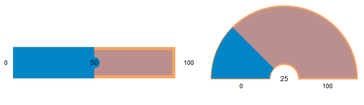
The following table lists properties that help to style the face of the gauge.
| **Property** | **Description** |
| --- | --- |
| [FaceColor](/componentone/api/wpf/online-gauges-net/dotnet-api/C1.WPF.Gauge/C1.WPF.Gauge.C1Gauge.FaceColor.html) | Change the color of face. |
| [FaceBorderColor](/componentone/api/wpf/online-gauges-net/dotnet-api/C1.WPF.Gauge/C1.WPF.Gauge.C1Gauge.FaceBorderColor.html) | Change the border color of face. |
| [FaceBorderWidth](/componentone/api/wpf/online-gauges-net/dotnet-api/C1.WPF.Gauge/C1.WPF.Gauge.C1Gauge.FaceBorderWidth.html) | Change the border width of face. |
The following code sample shows how to style the face of the Gauge control.
```xml
```
### Styling Value
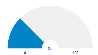
The **C1Gauge** class provides the [ValueTextColor](/componentone/api/wpf/online-gauges-net/dotnet-api/C1.WPF.Gauge/C1.WPF.Gauge.C1Gauge.ValueTextColor.html) property to change the font color of the value text. This is depicted in the following image.
The following code snippet show how to set the **ValueTextColor** property.
```xml
```
### Styling Max and Min
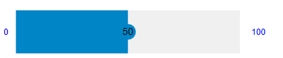
The **C1Gauge** class provides the [MinTextColor](/componentone/api/wpf/online-gauges-net/dotnet-api/C1.WPF.Gauge/C1.WPF.Gauge.C1Gauge.MinTextColor.html) and [MaxTextColor](/componentone/api/wpf/online-gauges-net/dotnet-api/C1.WPF.Gauge/C1.WPF.Gauge.C1Gauge.MaxTextColor.html) properties to change the font color of the value text. This is depicted in the following image.
The following code snippet show how to set the text color of min and max values.
```xml
```
### Styling Pointer
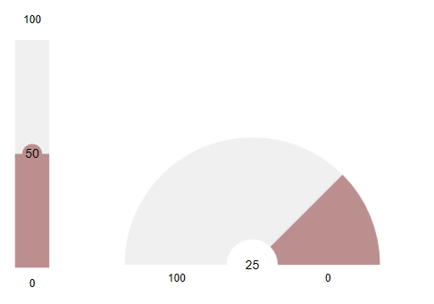
The **C1Gauge** class provides the [PointerColor](/componentone/api/wpf/online-gauges-net/dotnet-api/C1.WPF.Gauge/C1.WPF.Gauge.C1Gauge.PointerColor.html) property to change the color of the pointer. This is depicted in the following image.
The following code snippet show how to set the pointer color.
```xml
```