# Style and Appearance
## Content
Styling nodes in a TreeGrid enhances visual clarity and user experience. It mainly simplifies navigation through the nodes in the tree structure. The **FlexGrid** class provides the following properties to improve distinction between parent nodes and child nodes.
### Display Tree Lines
You can set whether and how the tree lines are displayed to connect parent-children rows by using the [TreeLinesMode](/componentone/api/wpf/online-flexgrid/dotnet-api/C1.WPF.Grid/C1.WPF.Grid.FlexGrid.TreeLinesMode.html) property of the FlexGrid class. The **TreeLinesMode** property is of type **GridTreeLinesMode** enum, which provides the following three options:
| **Options** | **Description** |
| --- | --- |
| None | No tree lines are displayed. It is the default value. |
| Vertical | The tree lines are displayed as vertical lines showing how far a group reaches. |
| Connected | The tree lines are displayed as a series of connected lines between tree nodes. |
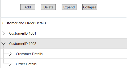
You can display the connected tree lines in TreeGrid by using the following code. This example uses the sample used in [TreeGrid](/componentone/docs/wpf/online-flexgrid/FlexGridFeatures/treegrid) topic.
**xml**
```xml
```
**csharp**
```csharp
flexgridbound.TreeLinesMode = GridTreeLinesMode.Connected;
```
### Set Tree Lines Thickness
Setting thickness in TreeGrid controls changes the width of the tree lines. Thicker lines can make the connections between parent and child nodes more prominent, helping users easily distinguish hierarchical relationships at a glance. In TreeGrid, you can set the thickness of tree lines by using the [TreeLinesThickness](/componentone/api/wpf/online-flexgrid/dotnet-api/C1.WPF.Grid/C1.WPF.Grid.FlexGrid.TreeLinesThickness.html) property.
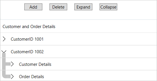
**xml**
```xml
```
**csharp**
```csharp
flexgridbound.TreeLinesThickness = 5;
```
### Set Tree Lines Color
The [TreeLinesBrush](/componentone/api/wpf/online-flexgrid/dotnet-api/C1.WPF.Grid/C1.WPF.Grid.FlexGrid.TreeLinesBrush.html) property of the **FlexGrid** class allows you to set the color of the tree lines. By using colors, tree lines become more visible, improving overall clarity, especially needed in complex or dense grids. This helps prevent confusion when multiple levels or branches are displayed.
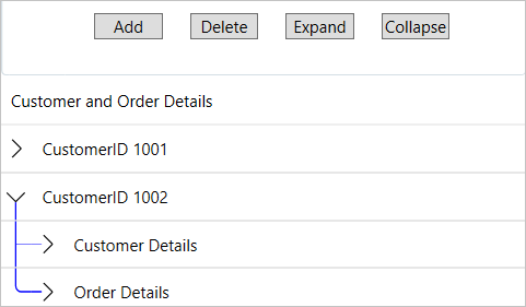
You can set the color of the tree lines by using the following code snippet:
**xml**
```xml
```
**csharp**
```csharp
flexgridbound.TreeLinesDashArray= [5.0,1.0,6.0,5.0,8.0];
```
### Set Tree Lines Radius
The term horizontal or vertical radius of the tree lines refers to the curvature or the spread of the lines that connect parent and child nodes in a tree structure. The **FlexGrid** class provides [TreeLinesRadiusX](/componentone/api/wpf/online-flexgrid/dotnet-api/C1.WPF.Grid/C1.WPF.Grid.FlexGrid.TreeLinesRadiusX.html) and [TreeLinesRadiusY](/componentone/api/wpf/online-flexgrid/dotnet-api/C1.WPF.Grid/C1.WPF.Grid.FlexGrid.TreeLinesRadiusY.html) properties to set the horizontal and vertical radius of the tree lines, respectively.
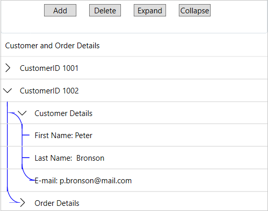
You can set these properties either in XAML or C# using the following code example:
**xml**
```xml
```
**csharp**
```csharp
flexgridbound.TreeLinesRadiusX = 10;
flexgridbound.TreeLinesRadiusY = 10;
```
### Customize Toggle Button
In a TreeGrid, a toggle button typically manages the expansion and collapse of hierarchical nodes. For example, by default, arrow buttons (>,ν) appear in a TreeGrid for expanding and collapsing the rows. However, you can replace these default arrow buttons with icons as per your application requirements in a TreeGrid by using the following template properties of the FlexGrid control:
| **Properties** | **Description** |
| --- | --- |
| GroupCollapsedIconTemplate | Gets or sets the template used to create the icon displayed when the group is collapsed |
| GroupExpandedIconTemplate | Gets or sets the template used to create the icon displayed when the group is expanded |
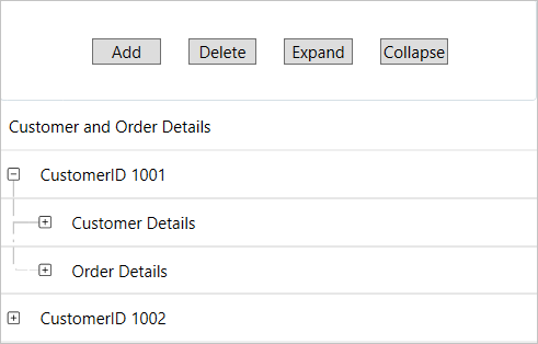
To swap the default arrow icons with images in a TreeGrid, templates are used in the same application in which a TreeGrid is created using the **ChildItemsPath** property. The **Build Action** property of these images available in the Images folder in the application must be set to **Resource** to access them. The templates are created using the following XAML code, which defines two icon templates using the **C1IconTemplate** class. The first template, with the key **CollapsedIcon** ,uses an SVG icon (plus-square.svg) with a size of 9x9. The second template, with the key **ExpandIcon** ,uses a different SVG icon (dash-square.svg) with the same size. These templates display different icons for the collapsed or expanded state of TreeGrid.
```xml
```
Now, set the values of the **GroupCollapsedIconTemplate** and **GroupExpandedIconTemplate** properties using the template's key for the FlexGrid control in the following manner:
```xml
```
After running the application, clicking the plus (+) icon will expand the rows, while clicking the dash (–) icon will collapse the rows.
> type=note
> **Note**: These properties are available in .NET only.