# Column Footer
## Content
The FlexGrid control can display summary of each column at the bottom using column footer. The column footer in the FlexGrid control appears similar to the header of the control. It can be used to display sales summary of an organization using various aggregate functions such as Sum, Average, Count, Minimum, Maximum, etc.
The benefit of displaying summary of records using column footer is that it is always visible even if you scroll the data of the FlexGrid control downwards or upwards. Moreover, the summary row gets automatically updated whenever you make any changes in the data displayed in the FlexGrid control.
In the following section, you learn how to implement column footer in .NET Framework and .NET versions of the FlexGrid control.
### .NET Framework
The FlexGrid control provides the **ColumnFooters** property which gets the column footer cells that can be added to the **Columns** collection of FlexGrid using its **Add** method. The **Add** method takes object of the **Column** class. The columns are then added into a row using the instance of the **GroupRow** class. The row is then added in the footer by using the **Add** method of the **Rows** collection available in the **ColumnFooters** property.
Following image displays the column footer in the FlexGrid control having sum of each column:
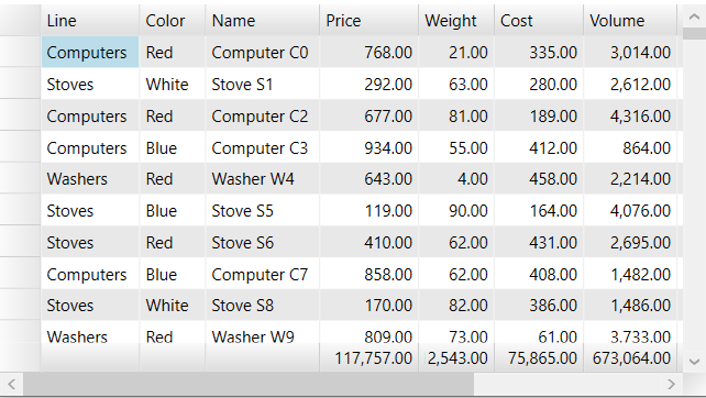
Perform the following steps to add column footer to the FlexGrid control. This example uses the same data binding method as used in the [Data Binding](/componentone/docs/wpf/online-flexgrid/DataBinding) topic:
1. Add the FlexGrid control in the XAML view using the following code:
```xml
```
2. Switch to the Code view, create **AddColumnFooter** method for adding a column footer row using the following code:
```csharp
void AddColumnFooter(C1.WPF.FlexGrid.C1FlexGrid flex)
{
flex.ColumnFooters.Columns.Add(new Column());
var gr = new C1.WPF.FlexGrid.GroupRow();
// adding the row to the ColumnFooter
flex.ColumnFooters.Rows.Add(gr);
}
}
```
3. Add the following code in the MainWindow() constructor to populate the Flexgrid control and find the aggregate of columns using the **Sum** value of the **Aggregate** enum. The aggregate is then assigned to **GroupAggregate** property of the **Column** class to apply on the columns such as Price, Cost, Weight and Volume:
```csharp
// populate bound grid
var products = Product.GetProducts(250);
var view = new ListCollectionView(products);
_flexBound.ItemsSource = view;
// add a column footer row to the bound grid
AddColumnFooter(_flexBound);
// show aggregate values in subtotal cell
foreach (var colName in "Price,Cost,Weight,Volume".Split(','))
{
var c = _flexBound.Columns[colName];
c.GroupAggregate = C1.WPF.FlexGrid.Aggregate.Sum;
}
```
### .NET
In .NET, you can add the column footer easily by using the **ColumnFooterRows** property of the **C1.WPF.Grid.GridRowCollection** class which returns the collection of rows to create the rows. A summary row is created in the footer using the **GridSummaryRow** class to display values.
Moreover, the summary row allows you to configure the aggregate function at runtime using the **OptionsMenuVisibility** property of the **GridSummaryRow** class. The **OptionsMenuVisibility** property calls **GridColumnOptionsMenuVisibility** enumeration which provides **Collapsed**, **MouseOver** or **Visible** values to hide or display functions as per your requirement. In our case, we have set the value of the **OptionsMenuVisibility** property to **Visible** to show the ellipsis(...) button in the footer. You just need to click the ellipsis(...) button for using the aggregate functions. You can apply more than one aggregate function on a particular column. For example, you can find the sum of values and count total values of a particular column by using the Sum and Count functions. The following image shows a summary row with multiple aggregate functions used for calculation:
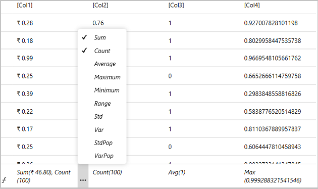
Perform the following steps to add summary row to the FlexGrid control. In this example, the data binding with FlexGrid control is done using list and dictionaries.
1. Add column footer using the **FlexGrid.ColumnFooterRows** property and add summary row to the footer using the GridSummaryRow class as shown in the following code snippet:
```csharp
```
2. Switch to the Code view and add the following code to add data to the FlexGrid and bind the FlexGrid control with list to show data:
```csharp
Random _rand = new Random();
public MainWindow()
{
InitializeComponent();
var list = new List>();
for (int i = 0; i < 100; i++)
{
var dictionary = new Dictionary();
for (int j = 1; j <= 4; j++)
dictionary[$"Col{j}"] = _rand.NextDouble();
list.Add(dictionary);
}
grid.ItemSource=list;
}
```
## Set Separator
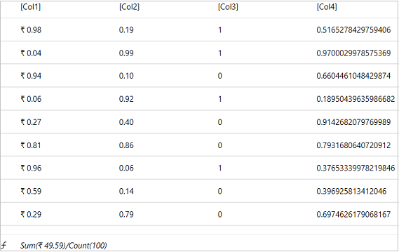
In .NET, the multiple aggregate functions are separated by comma(,), by default. But, you can change the separator symbol and set it as forward slash, backward slash, etc. by using the **Separator** property in the summary row. In our case, we have used forward slash(/) as separator.
Following image shows the forward slash (/) as separator between Sum and Count aggregate functions:
Following code snippet allows you to set the Separator in XAML view:
```xml
```
## Merge Cells
In .NET, you can merge cells of a summary row by setting the **AllowMerging** property of the **GridRow** class to **true**. Following image shows merging of two cells keeping their caption remains same:
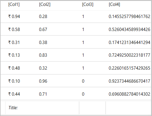
In the following code snippet, the **Add** method of **ColumnFootersRows** collection adds a new row in the collection by taking the instance of **GridRow** class. The **AllowMerging** property of the **GridRow** class is set to boolean value **true** for merging cells in the summary row. The **AllowMerging** property calls the **GridAllowMerging** enumeration which provides value **ColumnFooters** to merge cells.
Following code snippet allows you to merge cells in the column footer:
```csharp
//Adding footer row and merging cells
grid.ColumnFooterRows.Add(new GridRow { AllowMerging = true });
var caption = "Total:";
grid.ColumnFooters[0, 0] = caption;
grid.ColumnFooters[0, 1] = caption;
grid.AllowMerging = GridAllowMerging.ColumnFooters;
```
## Specify Aggregate and Custom Functions
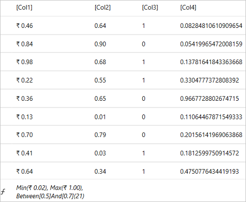
In .NET, you can specify an aggregate function using the **Aggregate** property of the **GridAggregateFunction** class,. The **GridAggregateFunction** class also allows you to create the custom functions by inheriting or subclassing the **GridAggregateFunction** class. For instance, you can create a custom function with the name **CountBetweenFunction** function to count the number of items whose value is between a maximum and a minimum value.
Following image shows values in the column footer using aggregate and custom functions:
Consider the following code snippet which shows how aggregate and custom functions are specified in XAML view:
```xml
```
Following code snippet illustrates how to define a custom function with the name **CountBetweenFunction** that counts the number of items whose value is between a maximum and a minimum value using the **Getvalue** method:
```csharp
// Returns the number of rows whose value for the column is between and .
public class CountBetweenFunction : GridAggregateFunction
{
//The minimum value.
public new double Minimum { get; set; } = double.MinValue;
//The maximum value.
public new double Maximum { get; set; } = double.MaxValue;
public override double GetValue(GridColumn column, IEnumerable rows)
{
var count = 0;
var grid = column.Grid;
foreach (var row in rows)
{
// get raw value
var val = grid[row, column];
if (val is double dVal)
if (dVal >= Minimum && dVal <= Maximum)
count++;
}
return count;
}
}
```
## Layout and Appearance
You can modify the appearance of the column footer to make it visually appealing by setting the following properties available in **FlexGrid** class in .NET Framework and .NET :
### .NET Framework
In case of .NET Framework, the following properties are used to set the appearance of the column footer:
| **Property** | **Description** |
| --- | --- |
| FontFamily | Gets or sets the Font for the cells |
| FontSize | Gets or sets the Font Size for the cells |
| FontStyle | Gets or sets the font style for the cells |
| FontWeight | Gets or sets the thickness or weight of the specified font |
| Background | Gets or sets the background color of the footer |
| Foreground | Gets or sets the foreground color of the footer |
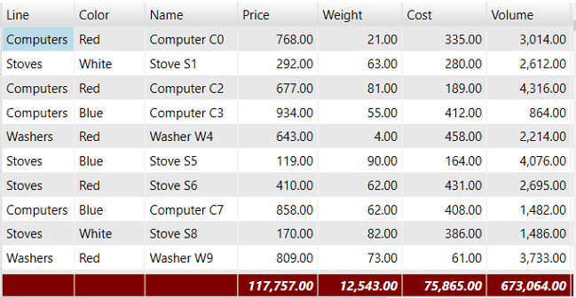
Following image displays a column footer in Maroon background color and White foreground color using the instance of the **GroupRow** class. The FontStyle and FontWeight properties for the values in column footer can also be changed to Italic and Bold respectively using the same instance:
You can use the following code snippet to set the style of column footer in .NET Framework:
```csharp
void AddColumnFooter(C1.WPF.FlexGrid.C1FlexGrid flex)
{
flex.ColumnFooters.Columns.Add(new Column());
var gr = new C1.WPF.FlexGrid.GroupRow();
flex.ColumnFooters.Rows.Add(gr);
gr.FontWeight = FontWeights.Bold;
gr.FontStyle = FontStyles.Italic;
gr.Background = new SolidColorBrush(Color.FromArgb(0xff, 0x80, 0x00, 0x00));
gr.Foreground = new SolidColorBrush(Colors.White);
}
```
### .NET
In case of .NET, the following properties are used to set the appearance of the column footer:
| **Property** | **Description** |
| --- | --- |
| ColumnFooterStyle | Gets or sets the style of the column footers. |
| BottomLeftHeaderStyle | Gets or sets the style of the bottom-left headers. |
| ColumnFooterGridLinesVisibility | Gets or sets a value that indicates which grid lines separating column footer cells are shown. |
| BottomLeftHeaderGridLinesVisibility | Gets or sets a value that indicates which grid lines separating bottom-left header cells are shown. |
| ColumnFooterGridLinesBrush | Gets or sets the brush that is used to paint the lines between column header cells. |
| ColumnFooterSelectedStyle | Gets or sets the style applied to the selected column headers. It provides four values All, Horizontal, None and Vertical. |
| ColumnFooterBackground | Gets or sets the background color of the column footer. |
| ColumnFooterForeground | Gets or sets the foreground color of the column footer text and glyphs. |
| ColumnFooterFontSize | Gets or sets the font size applied to column footer cells. |
| ColumnFooterFontFamily | Gets or sets the font family applied to column footer cells. |
| ColumnFooterFontWeight | Gets or sets the font weight applied to column footer cells. |
| ColumnFooterFontStyle | Gets or sets the font style applied to column footer cells. |
| ColumnFooterSelectedBackground | Gets or sets the brush that is used to paint column footer background for selected cells. |
| ColumnFooterSelectedForeground | Gets or sets the brush that is used to paint column footer foreground for selected cells. |
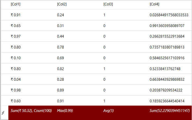
Following image displays a column footer in Maroon background color and White foreground color using the **ColumnFooterBackground** and **ColumnFooterForeground** properties respectively. The font style of the values in column footer can also be changed to Italic by using the **ColumnFooterFontStyle** property:
You can use the following code snippet to set the style of column footer in XAML view:
```xml
```