# Header & Footer

## Content


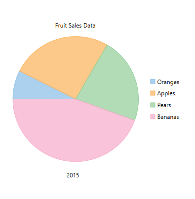
You can add a header to the **FlexPie** control by setting the **Header** property of <span data-popup-content="This class is available in \u003ca href=\u0022/componentone/api/wpf/online-flexchart/dotnet-api/C1.WPF.Chart/C1.WPF.Chart.FlexChartBase.html\u0022\u003e.NET\u003c/a\u003e and \u003ca href=\u0022/componentone/api/wpf/online-flexchart/dotnet-api/C1.WPF.Chart/C1.WPF.Chart.FlexChartBase.html\u0022\u003e.NET Framework\u003c/a\u003e." data-popup-title="FlexChartBase" data-popup-theme="ui-tooltip-green qtip-green">FlexChartBase</span>. Besides a header, you can add a footer to the control by setting the **Footer** property of FlexChartBase.

See the following code snippet for setting the two properties:

**xml**

```xml
<Grid>
    <Chart:C1FlexPie 
        x:Name="flexPie" 
        InnerRadius="0.5"
        Offset="0.5"
        Header="Fruit Sales Data"
        Footer="2015"
        LegendOrientation="Horizontal"
        LegendPosition="Bottom"
        SelectionMode="Point" 
        SelectedItemPosition="Top"
        SelectedItemOffset="2"
        Margin="95,99,328,275" 
        Binding="April" 
        BindingName="Fruit" 
        ItemsSource="{Binding DataContext.Data}">
        <Chart:C1FlexPie.SelectionStyle>
            <Chart:ChartStyle Stroke="Red" 
                              StrokeThickness="2"/>
        </Chart:C1FlexPie.SelectionStyle>
        <Chart:C1FlexPie.DataLabel>
            <Chart:PieDataLabel Content="{}{y}"/>
        </Chart:C1FlexPie.DataLabel>
    </Chart:C1FlexPie>
</Grid>
```

### Code

```csharp
flexPie.Header = "Fruit Sales Data";
flexPie.Footer = "2015";
```
![](https://cdn.mescius.io/document-site-files/images/8ba28e07-1633-4a6a-9114-13b9f1f04eed/images/flexpieheaderfooter.png)