# Customizing Tooltip Content
## Content
FlexChart simplifies customizing tooltip content by allowing you to set pre-defined parameters in the **ToolTipContent** property of the tooltip.
To customize content in a tooltip, set the pre-defined parameters in the template string of the ToolTipContent property of the FlexChartBase class.
The table below lists the pre-defined parameters applicable for tooltip content customization.
| **Parameter** | **Description** |
| --- | --- |
| **x** | Shows the X value of the data point. |
| **y** | Shows the Y value of the data point. |
| **value** | Shows the Y value of the data point. |
| **name** | Shows the X value of the data point. |
| **seriesName** | Shows the name of the series. |
| **pointIndex** | Shows the index of the data point. |
The following image displays customized tooltip content showing the index and the data point values.
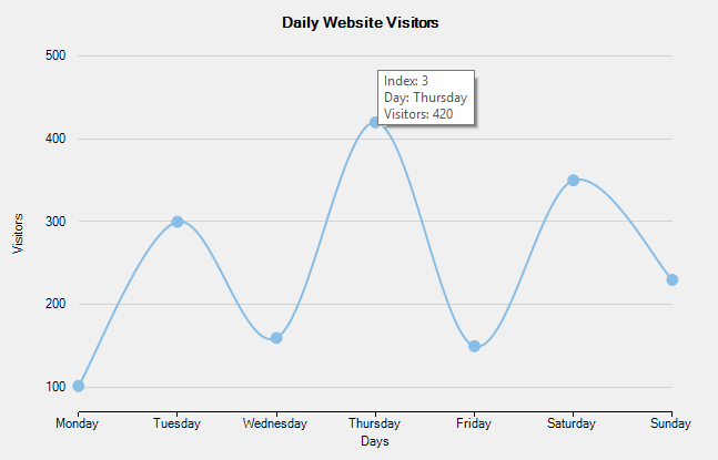
The following code compares and displays data of number of daily website visitors in a specific week. The code shows how to configure the ToolTipContent property to customize tooltip content.
**xml**
```xml
```