# WPF Heat Map Chart
## Content
A heat map is a graphical representation of tabular data values through color coding and shading. Heat map helps in identifying patterns, areas of concentration, and data variance. The heat map data is represented by a two-dimensional matrix. You can use the heat map chart to plot data like event schedule, temperature records, weekly traffic intensity, etc.
A heat map chart can showcase different visual representations depending upon the type of data. Heat map chart can therefore be categorized into two types.
* [Category based heat map](/componentone/docs/wpf/online-flexchart/FlexChart/UnderstandingFlexChart/FlexChartTypes/HeatMap#category-based-wpf-heat-map)
* [Value based heat map](/componentone/docs/wpf/online-flexchart/FlexChart/UnderstandingFlexChart/FlexChartTypes/HeatMap#value-based-wpf-heat-map)
### Category based WPF heat map
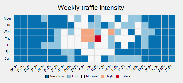
When you want to plot the data against intervals or specific numeric ranges, you can create a category based heat map. To implement category based heat map chart, you need to use the [DiscreteColorScale](/componentone/api/wpf/online-flexchart/dotnet-framework-api/C1.WPF.FlexChart.Extended.4.6.2/C1.WPF.Chart.Extended.DiscreteColorScale.html) class. It provides Intervals property that allows you to get or set the collection of intervals. Set the **Min**, **Max**, **Color**, and **Name** properties for each interval. So, the data points belonging to a particular interval are represented by the same color. The list of user-defined intervals is shown on the chart legend.
For example, if you use heat map chart to show the weekly traffic intensity of a city, you can use the DiscreteColorScale class and add intervals such as very low, low, normal, and set its corresponding min, max, and color property.
The following image shows a category based heat map.
Use the following code snippet to create a category based WPF heat map.
**xml**
```xml
```
**csharp**
```csharp
public partial class Loading : UserControl
{
public Loading()
{
InitializeComponent();
}
private void ChartLoaded(object sender, RoutedEventArgs e)
{
chart.BeginUpdate();
var scale = new DiscreteColorScale() { Intervals = new List() };
scale.Intervals.Add(new DiscreteColorScale.Interval(0, 10, Color.FromRgb(0x05,0x71,0xB0), "Very Low"));
scale.Intervals.Add(new DiscreteColorScale.Interval(10, 25, Color.FromRgb(0x92, 0xC5, 0xDE), "Low"));
scale.Intervals.Add(new DiscreteColorScale.Interval(25, 75, Color.FromRgb(0xD7, 0xD7, 0xD7), "Normal"));
scale.Intervals.Add(new DiscreteColorScale.Interval(75, 90, Color.FromRgb(0xF4, 0xA5, 0x82), "High"));
scale.Intervals.Add(new DiscreteColorScale.Interval(90, 100, Color.FromRgb(0xCA, 0x00, 0x20), "Critical"));
var rnd = new Random();
var data = new double[24, 7];
for (var j = 0; j < 7; j++)
for (var i = 0; i < 24; i++)
data[i, j] = 10 * Math.Exp(-(i - 12) * (i - 12) / (2 * 4.0 * 4.0))
/ Math.Sqrt(2 * Math.PI * 4.0 * 4.0) * ((j == 5 || j == 6) ? 50 : 100)
* rnd.NextDouble();
var hmap = new Heatmap();
hmap.ItemsSource = data;
hmap.ColorScale = scale;
chart.Series.Add(hmap);
var times = new string[24];
for (var i = 0; i < 24; i++)
times[i] = new DateTime(2000, 1, 1, i, 0, 0).ToShortTimeString();
chart.AxisX.ItemsSource = times;
chart.AxisY.ItemsSource = new string[] { "Mon", "Tue", "Wed", "Thu", "Fri", "Sat", "Sun" };
chart.EndUpdate();
}
}
```
### Value based WPF heat map
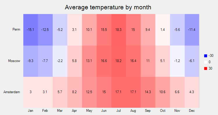
When you want to plot the raw data values without dividing them into intervals, you can create a value based heat map. To implement the value-based heat map, you need to use the [GradientColorScale](/componentone/api/wpf/online-flexchart/dotnet-framework-api/C1.WPF.FlexChart.Extended.4.6.2/C1.WPF.Chart.Extended.GradientColorScale.html) class. By default, a heat map is rendered with the chart legend. Each legend entry corresponds to a numeric value between the **Min** and **Max** values. The interval used to generate the numeric values for the legend entries is calculated by using the formula (|Min| + |Max|)/(n-1) where n refers to the number of colors specified in the Colors property.
For example, a simple custom palette containing red, white and blue color maps the values from -30 to 30 to shades of red, white, blue, where -30 is mapped to red and 30 to blue.
The following image shows a value based heat map.
Use the following code snippet to create a value based WPF heat map.
**xml**
```xml
```
**csharp**
```csharp
public partial class Temperature : UserControl
{
public Temperature()
{
InitializeComponent();
}
private void ChartLoaded(object sender, RoutedEventArgs e)
{
chart.BeginUpdate();
chart.AxisY.MajorGrid = false;
var scale = new GradientColorScale() { Min = -30, Max = 30 };
scale.Colors = new List { Colors.Blue, Colors.White, Colors.Red };
var hmap = new Heatmap();
hmap.ItemsSource = new double[,] {
{ 3.0, 3.1, 5.7, 8.2, 12.5, 15.0, 17.1, 17.1, 14.3, 10.6, 6.6, 4.3 },
{ -9.3, -7.7, -2.2, 5.8, 13.1, 16.6, 18.2, 16.4, 11.0, 5.1, -1.2, -6.1},
{ -15.1, -12.5, -5.2, 3.1, 10.1, 15.5, 18.3, 15.0, 9.4, 1.4, -5.6, -11.4},
};
hmap.ColorScale = scale;
chart.Series.Add(hmap);
chart.AxisX.ItemsSource = new string[] { "Jan", "Feb", "Mar", "Apr", "May", "Jun", "Jul", "Aug", "Sep", "Oct", "Nov", "Dec" };
chart.AxisY.ItemsSource = new string[] { "Amsterdam", "Moscow", "Perm" };
chart.EndUpdate();
}
}
```
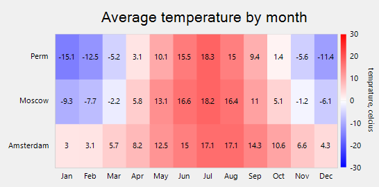
The default chart legend can be replaced with a gradient chart legend by using the [ColorAxis](/componentone/api/wpf/online-flexchart/dotnet-framework-api/C1.WPF.FlexChart.Extended.4.6.2/C1.WPF.Chart.Extended.ColorAxis.html) class. Gradient chart legend is a small bar of integrated colors obtained from the [Colors](/componentone/api/wpf/online-flexchart/dotnet-framework-api/C1.WPF.FlexChart.Extended.4.6.2/C1.WPF.Chart.Extended.GradientColorScale.Colors.html) definitions. Each color is for a specific numeric range and it integrates with the next color, creating a gradient legend. Every point on the gradient legend represents a distinctive color and value. Therefore, all the dissimilar values in the chart appear in distinctive colors as per the position on the gradient legend.
To implement heat map with a gradient legend, you need to provide an instance of ColorAxis class to the Axis property provided by the
GradientColorScale class. Moreover, you also need to specify the **Min**, **Max** and **Colors** property of GradientColorScale class to set up a gradient legend.
The following image shows a value based heat map with gradient legends.
Use the following code snippet to create a value based heat map with gradient legends.
**xml**
```xml
```
**csharp**
```csharp
public partial class Temperature : UserControl
{
public Temperature()
{
InitializeComponent();
}
private void ChartLoaded(object sender, RoutedEventArgs e)
{
chart.BeginUpdate();
chart.AxisY.MajorGrid = false;
var scale = new GradientColorScale() { Min = -30, Max = 30 };
scale.Axis = scale.Axis = new C1.WPF.Chart.Extended.ColorAxis()
{ Position = Position.Right, Title = "temprature, celcius" };
scale.Colors = new List { Colors.Blue, Colors.White, Colors.Red };
var hmap = new Heatmap();
hmap.ItemsSource = new double[,] {
{ 3.0, 3.1, 5.7, 8.2, 12.5, 15.0, 17.1, 17.1, 14.3, 10.6, 6.6, 4.3 },
{ -9.3, -7.7, -2.2, 5.8, 13.1, 16.6, 18.2, 16.4, 11.0, 5.1, -1.2, -6.1},
{ -15.1, -12.5, -5.2, 3.1, 10.1, 15.5, 18.3, 15.0, 9.4, 1.4, -5.6, -11.4},
};
hmap.ColorScale = scale;
chart.Series.Add(hmap);
chart.AxisX.ItemsSource = new string[] { "Jan", "Feb", "Mar", "Apr", "May", "Jun", "Jul", "Aug", "Sep", "Oct", "Nov", "Dec" };
chart.AxisY.ItemsSource = new string[] { "Amsterdam", "Moscow", "Perm" };
chart.EndUpdate();
}
}
```
> type=note
> **Note**: C1.WPF.Chart.Extended is available in .NET Framework version.
## See Also
**Reference**
[C1.WPF.Chart.Extended Namespace](/componentone/api/wpf/online-flexchart/dotnet-framework-api/C1.WPF.FlexChart.Extended.4.6.2/C1.WPF.Chart.Extended.html)