# Header and Footer

## Content


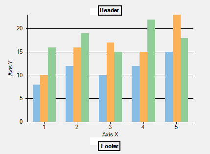
Header and Footer are used to display descriptive and relevant information with respect to the chart.
![](https://cdn.mescius.io/document-site-files/images/8ba28e07-1633-4a6a-9114-13b9f1f04eed/images/imagesext/headerandfooter.png)

In FlexChart, these elements are set by using the <span data-popup-content="This property is available in \u003ca href=\u0022/componentone/api/wpf/online-flexchart/dotnet-api/C1.WPF.Chart/C1.WPF.Chart.FlexChartBase.Header.html\u0022\u003e.NET\u003c/a\u003e and \u003ca href=\u0022/componentone/api/wpf/online-flexchart/dotnet-api/C1.WPF.Chart/C1.WPF.Chart.FlexChartBase.Header.html\u0022\u003e.NET Framework\u003c/a\u003e." data-popup-title="Header" data-popup-theme="ui-tooltip-green qtip-green">Header</span> and the <span data-popup-content="This property is available in \u003ca href=\u0022/componentone/api/wpf/online-flexchart/dotnet-api/C1.WPF.Chart/C1.WPF.Chart.FlexChartBase.Footer.html\u0022\u003e.NET\u003c/a\u003e and \u003ca href=\u0022/componentone/api/wpf/online-flexchart/dotnet-api/C1.WPF.Chart/C1.WPF.Chart.FlexChartBase.Footer.html\u0022\u003e.NET Framework\u003c/a\u003e." data-popup-title="Footer" data-popup-theme="ui-tooltip-green qtip-green">Footer</span> property. Both properties are the members of the <span data-popup-content="This class is available in \u003ca href=\u0022/componentone/api/wpf/online-flexchart/dotnet-api/C1.WPF.Chart/C1.WPF.Chart.FlexChartBase.html\u0022\u003e.NET\u003c/a\u003e and \u003ca href=\u0022/componentone/api/wpf/online-flexchart/dotnet-api/C1.WPF.Chart/C1.WPF.Chart.FlexChartBase.html\u0022\u003e.NET Framework\u003c/a\u003e." data-popup-title="FlexChartBase" data-popup-theme="ui-tooltip-green qtip-green">FlexChartBase</span> class.