# DockControl ClearStyle Properties

## Content


**DockControl for WPF** supports ComponentOne's ClearStyle technology, which allows you to easily change control colors without having to change control templates. By setting a few color properties, you can quickly style the <span data-popup-content="This class is available in \u003ca href=\u0022/componentone/api/wpf/online-dockcontrol/dotnet-api/C1.WPF.Docking/C1.WPF.Docking.C1DockControl.html\u0022\u003e.NET\u003c/a\u003e and \u003ca href=\u0022/componentone/api/wpf/online-dockcontrol/dotnet-api/C1.WPF.Docking/C1.WPF.Docking.C1DockControl.html\u0022\u003e.NET Framework\u003c/a\u003e." data-popup-title="C1DockControl" data-popup-theme="ui-tooltip-green qtip-green">C1DockControl</span> elements. The supported properties for **C1DockControl** are listed in the following table:

|   **Property**   |   **Description**   |
| --- | --- |
|   Background   |   Gets or sets the background used to fill the **C1DockControl**.   |
|   MouseOverBrush   |   Gets or sets the brush used to highlight the control when the mouse is hovering over it.   |
|   TabControlBackground   |   Gets or sets the background color of the <span data-popup-content="This class is available in \u003ca href=\u0022/componentone/api/wpf/online-dockcontrol/dotnet-api/C1.WPF.Docking/C1.WPF.Docking.C1DockTabControl.html\u0022\u003e.NET\u003c/a\u003e and \u003ca href=\u0022/componentone/api/wpf/online-dockcontrol/dotnet-api/C1.WPF.Docking/C1.WPF.Docking.C1DockTabControl.html\u0022\u003e.NET Framework\u003c/a\u003e." data-popup-title="C1DockTabControl" data-popup-theme="ui-tooltip-green qtip-green">C1DockTabControl</span>.   |
|   TabControlForeground   |   Gets or sets the foreground color, or the color of the text, in the **C1DockTabControl**.   |
|   TabStripBackground   |   Gets or sets the background color of the **C1DockTabItem**.   |
|   TabStripForeground   |   Gets or sets the foreground color, or the color of the text, in the **C1DockTabItem**.   |

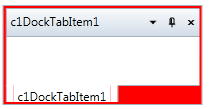
You can completely change the appearance of the **C1DockControl** by setting these properties. For example, if you set the **C1DockControl.Background** property to **Red** so the XAML markup appears similar to the following:

```xml
<my:C1DockControl Height="100" Background="Red" HorizontalAlignment="Left" Margin="176,100,0,0" Name="c1DockControl1" VerticalAlignment="Top" Width="200">
            <my:C1DockTabControl Height="100" HorizontalAlignment="Left" Name="c1DockTabControl1" VerticalAlignment="Top" Width="200">
                <my:C1DockTabItem Header="c1DockTabItem1" HorizontalAlignment="Left" Name="c1DockTabItem1" VerticalAlignment="Top" />
            </my:C1DockTabControl>
        </my:C1DockControl>
```

The **C1DockControl** will look similar to the following:
![](https://cdn.mescius.io/document-site-files/images/071cfce4-8a59-4c77-94ca-7b05c2184e6d/graphics/clearstylered.png)

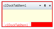
Experiment with the other properties to quickly change the look of the **C1DockControl** elements. For example, the following XAML sets the **Background**, **TabStripForeground**, and **TabControlBackground** properties:

```xml
<my:C1DockControl Height="100" Background="Red" TabStripForeground="Red" TabControlBackground="LightYellow" HorizontalAlignment="Left" Margin="176,100,0,0" Name="c1DockControl1" VerticalAlignment="Top" Width="200">
            <my:C1DockTabControl Height="100" HorizontalAlignment="Left" Name="c1DockTabControl1" VerticalAlignment="Top" Width="200">
                <my:C1DockTabItem Header="c1DockTabItem1" HorizontalAlignment="Left" Name="c1DockTabItem1" VerticalAlignment="Top" />
            </my:C1DockTabControl>
        </my:C1DockControl>
```

The **C1DockControl** will look similar to the following:
![](https://cdn.mescius.io/document-site-files/images/071cfce4-8a59-4c77-94ca-7b05c2184e6d/graphics/clearstylered2.png)