# C1DatePicker Quick Start
## Content
The following quick start guide is intended to get you up and running with the C1DatePicker control. In this quick start, you'll start in Visual Studio to create a new project, add a **C1DatePicker** control to your application, and customize the **C1DatePicker** control.
### Create an Application with DatePicker control
1. In Visual Studio, select **File | New | Project**.
2. In the **New Project** dialog box, select **WPF Application**.
3. Enter a **Name** and **Location** for your project and click **OK** to create the new application.
4. In the Toolbox, double-click the **C1DatePicker** icon to add the **C1DatePicker** control to the application.
You have completed the first step of the **C1DatePicker** quick start. In this step, you created a project and added a **C1DatePicker** control to it. In the next step, you'll customize the control.
### Customize the DatePicker control
To customize the C1DatePicker control, set the following properties from the **Properties** window:
* Set the C1DatePicker.SelectedDateFormat property to **Long**. This will change the date format of the control to include the full week day name and month name.
* Click the drop-down arrow next to the C1DatePicker.SelectedDate property and choose **February 14** (or the desired date) from the drop-down calendar.
* Click the drop-down arrow next to the C1DatePicker.ButtonBackground property and select a color from the drop-down color picker.
Now that you've customized the application, you can run the project and observe the run time behaviors of the control.
### Run the Application
Press **F5** to run the project. Notice the drop-down arrow is the color you specified in the [C1DatePicker.ButtonBackground](/componentone/api/wpf/online-datetimeeditors/dotnet-framework-api/C1.WPF.DateTimeEditors.4.6.2/C1.WPF.DateTimeEditors.C1DatePicker.ButtonBackground.html) property. The [C1DatePicker.SelectedDate](/componentone/api/wpf/online-datetimeeditors/dotnet-api/C1.WPF.DateTimeEditors/C1.WPF.DateTimeEditors.C1DatePicker.SelectedDate.html) should appear in the display box and it should show the full week day and month names.
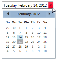
Congratulations – you have completed the quick start. Now that you have finished the quick start, we recommend that you visit the [C1DatePicker Task-Based Help](/componentone/docs/wpf/online-datetimeeditors/datepicker/C1DatePicker_Task-Based_Help) topics.