# UI Automation 

## Content

**C1Calendar** supports User Interface (UI) Automation for identifying calendar elements, inspecting and changing date selection, and navigating calendar views. Automation clients can access dates, weekday headings, the calendar header, and month and year choices.

## Enable UI Automation

Set [AutomationEnabled](/componentone/api/wpf/online-calendar/dotnet-api/C1.WPF.Calendar/C1.WPF.Calendar.C1Calendar.AutomationEnabled.html) to `True` before an automation client first queries the calendar. The effective automation setting defaults to `false`.
The following example enables automation and assigns an automation name and identifier to the calendar:

```xaml
<calendar:C1Calendar
    xmlns:calendar="clr-namespace:C1.WPF.Calendar;assembly=C1.WPF.Calendar"
    x:Name="BookingCalendar"
    AutomationEnabled="True"
    AutomationProperties.Name="Booking date"
    AutomationProperties.AutomationId="BookingCalendar"
    SelectionMode="Single" />
```

For an existing calendar instance, enable automation programmatically before the first automation query:

```csharp
BookingCalendar.AutomationEnabled = true;
```

## Automation Elements and Patterns

The following table lists the automation control types and patterns added by this feature:

| <span class="resizer-hover-zone">Element</span> | <span class="resizer-hover-zone">Automation control type</span> | <span class="resizer-hover-zone">Pattern added</span> |
| ------- | ----------------------- | ------------- |
| <span class="resizer-hover-zone">Calendar</span> | <span class="code" spellcheck="false" data-prosemirror-content-type="mark" data-prosemirror-mark-name="code">Calendar</span> | <span class="code" spellcheck="false" data-prosemirror-content-type="mark" data-prosemirror-mark-name="code">Selection</span> |
| <span class="resizer-hover-zone">Header</span> | <span class="code" spellcheck="false" data-prosemirror-content-type="mark" data-prosemirror-mark-name="code">Button</span> | <span class="code" spellcheck="false" data-prosemirror-content-type="mark" data-prosemirror-mark-name="code">Invoke</span> |
| <span class="resizer-hover-zone">Weekday heading</span> | <span class="code" spellcheck="false" data-prosemirror-content-type="mark" data-prosemirror-mark-name="code">HeaderItem</span> | <span class="resizer-hover-zone">None</span> |
| <span class="resizer-hover-zone">Date cell</span> | <span class="code" spellcheck="false" data-prosemirror-content-type="mark" data-prosemirror-mark-name="code">DataItem</span> | <span class="code" spellcheck="false" data-prosemirror-content-type="mark" data-prosemirror-mark-name="code">SelectionItem</span> |
| <span class="resizer-hover-zone">Month choice</span> | <span class="code" spellcheck="false" data-prosemirror-content-type="mark" data-prosemirror-mark-name="code">Button</span> | <span class="code" spellcheck="false" data-prosemirror-content-type="mark" data-prosemirror-mark-name="code">Invoke</span> |
| <span class="resizer-hover-zone">Year choice</span> | <span class="code" spellcheck="false" data-prosemirror-content-type="mark" data-prosemirror-mark-name="code">Button</span> | <span class="code" spellcheck="false" data-prosemirror-content-type="mark" data-prosemirror-mark-name="code">Invoke</span> |

Calendar elements belonging to inactive pages or view modes are excluded from the calendar’s exposed automation children and from automation control and content views.

### Element Names and Identifiers

Existing nonblank automation names and identifiers take precedence over the following fallback values:

| <span class="resizer-hover-zone">Element</span> | <span class="resizer-hover-zone">Fallback name</span> | <span class="resizer-hover-zone">Fallback automation identifier</span> |
| ------- | ------------- | ------------------------------ |
| <span class="resizer-hover-zone">Header</span> | <span class="resizer-hover-zone">Text from the calendar’s header formatter</span> | <span class="code" spellcheck="false" data-prosemirror-content-type="mark" data-prosemirror-mark-name="code">CalendarHeader\_{ViewMode}</span> |
| <span class="resizer-hover-zone">Weekday heading</span> | <span class="code" spellcheck="false" data-prosemirror-content-type="mark" data-prosemirror-mark-name="code">DayOfWeek</span><span class="resizer-hover-zone"> enum text</span> | <span class="code" spellcheck="false" data-prosemirror-content-type="mark" data-prosemirror-mark-name="code">CalendarDayOfWeek\_{DayOfWeek}</span> |
| <span class="resizer-hover-zone">Date cell</span> | <span class="resizer-hover-zone">Full date, formatted with </span><span class="code" spellcheck="false" data-prosemirror-content-type="mark" data-prosemirror-mark-name="code">"D"</span> | <span class="code" spellcheck="false" data-prosemirror-content-type="mark" data-prosemirror-mark-name="code">CalendarDay\_{date:yyyyMMdd}</span> |
| <span class="resizer-hover-zone">Month choice</span> | <span class="resizer-hover-zone">Month and year, formatted with </span><span class="code" spellcheck="false" data-prosemirror-content-type="mark" data-prosemirror-mark-name="code">"MMMM yyyy"</span> | <span class="code" spellcheck="false" data-prosemirror-content-type="mark" data-prosemirror-mark-name="code">CalendarMonth\_{date:yyyyMM}</span> |
| <span class="resizer-hover-zone">Year choice</span> | <span class="resizer-hover-zone">Year number</span> | <span class="code" spellcheck="false" data-prosemirror-content-type="mark" data-prosemirror-mark-name="code">CalendarYear\_{year}</span> |

Assign **<span class="code" spellcheck="false" data-prosemirror-content-type="mark" data-prosemirror-mark-name="code">AutomationProperties.AutomationId</span>** to specify an application-level identifier for the calendar.
The default previous and next navigation buttons have the automation names **Previous Page** and **Next Page**, respectively.

>type=note
> **Note**: Date and month fallback names follow the current culture. Weekday fallback names use enum text, and the default navigation button names are English literals. Date-derived identifiers are formatted without an explicit invariant culture and should not be assumed identical across cultures and calendars.

## Select Dates

C1Calendar exposes selection information through the <span class="code" spellcheck="false" data-prosemirror-content-type="mark" data-prosemirror-mark-name="code">Selection</span> pattern. Individual date cells expose selection state and actions through the <span class="code" spellcheck="false" data-prosemirror-content-type="mark" data-prosemirror-mark-name="code">SelectionItem</span> pattern.

### Calendar Selection

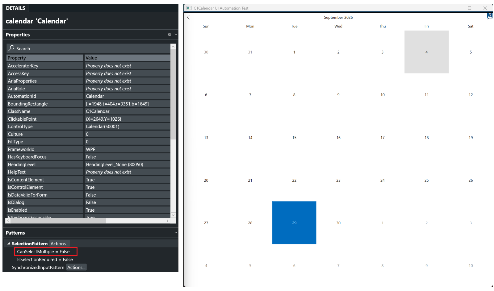
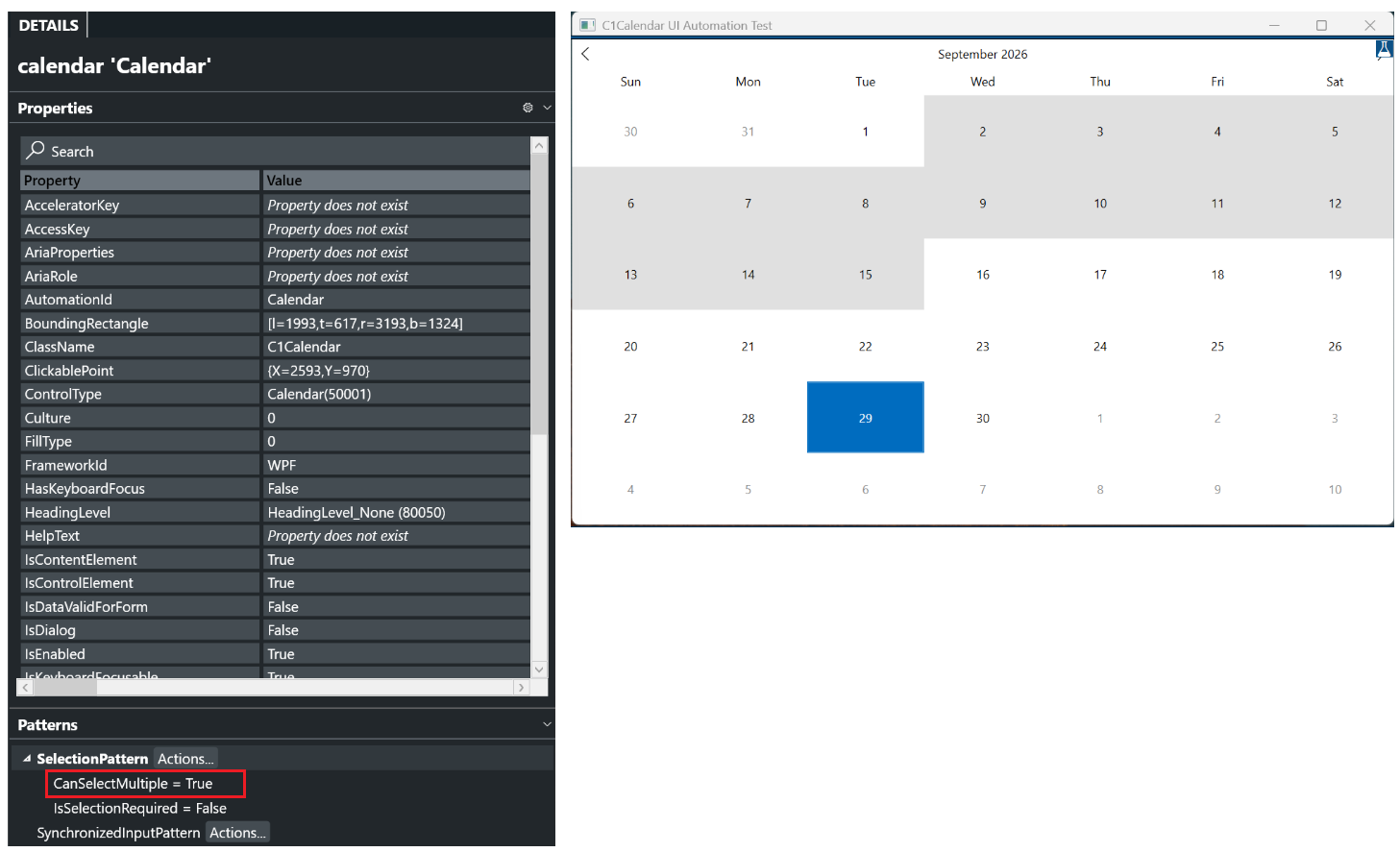
The calendar’s <span class="code" spellcheck="false" data-prosemirror-content-type="mark" data-prosemirror-mark-name="code">Selection</span> pattern exposes the selection in the active view and reports whether multiple selection is allowed through [CanSelectMultiple](/componentone/api/wpf/online-calendar/dotnet-api/C1.WPF.Calendar/C1.WPF.Calendar.Automation.C1CalendarAutomationPeer.CanSelectMultiple.html).
The following image shows [CanSelectMultiple](/componentone/api/wpf/online-calendar/dotnet-api/C1.WPF.Calendar/C1.WPF.Calendar.Automation.C1CalendarAutomationPeer.CanSelectMultiple.html) set to <span class="code" spellcheck="false" data-prosemirror-content-type="mark" data-prosemirror-mark-name="code">False</span> when multiple selection is disabled.
![WPF Calendar Selection pattern with multiple selection disabled.](https://cdn.mescius.io/document-site-files/images/aa932af9-ea21-4e7f-9114-1f57bdf10e97/image-20261008.876b92.png?width=800)
When multiple selection is enabled, [CanSelectMultiple](/componentone/api/wpf/online-calendar/dotnet-api/C1.WPF.Calendar/C1.WPF.Calendar.Automation.C1CalendarAutomationPeer.CanSelectMultiple.html) is **<span class="code" spellcheck="false" data-prosemirror-content-type="mark" data-prosemirror-mark-name="code">True</span>**, as shown in the following image.
![WPF Calendar Selection pattern with multiple selection enabled.](https://cdn.mescius.io/document-site-files/images/aa932af9-ea21-4e7f-9114-1f57bdf10e97/image-20261008.d8d22c.png?width=800)

### Date-Cell Selection

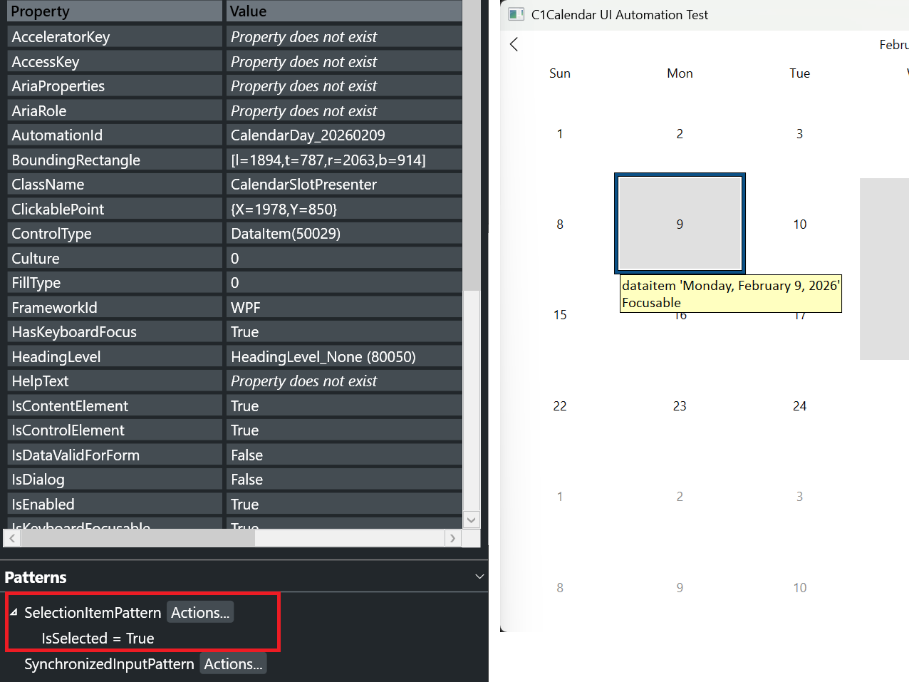
Date cells expose the **<span class="code" spellcheck="false" data-prosemirror-content-type="mark" data-prosemirror-mark-name="code">SelectionItem</span>** pattern for the following actions:

* Select a date.
* Add a date to the selection.
* Remove a selected date.

The following image shows a date cell’s automation properties and selection state in Accessibility Insights for Windows. **<span class="code" spellcheck="false" data-prosemirror-content-type="mark" data-prosemirror-mark-name="code">IsSelected</span>** is set to <span class="code" spellcheck="false" data-prosemirror-content-type="mark" data-prosemirror-mark-name="code">True</span>.
![WPF Calendar Date-cell SelectionItem pattern showing IsSelected set to True.](https://cdn.mescius.io/document-site-files/images/aa932af9-ea21-4e7f-9114-1f57bdf10e97/image-20261008.04d87b.png?width=800)

## Navigate Calendar Views

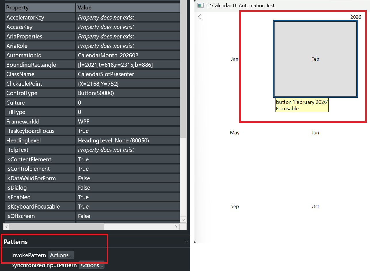
The header, month choices, and year choices expose the <span class="code" spellcheck="false" data-prosemirror-content-type="mark" data-prosemirror-mark-name="code">Invoke</span> pattern:

* Invoking the header cycles through Month, Year, and Decade views, then returns to Month view.
* Invoking a month in Year view opens that month.
* Invoking a year in Decade view opens that year’s month choices.

The following image shows a month choice in Accessibility Insights for Windows as a button with the **<span class="code" spellcheck="false" data-prosemirror-content-type="mark" data-prosemirror-mark-name="code">InvokePattern</span>**.
![WPF Calendar Accessibility Insights showing a month choice as a button with the Invoke pattern](https://cdn.mescius.io/document-site-files/images/aa932af9-ea21-4e7f-9114-1f57bdf10e97/image-20261008.9f3265.png?width=800)
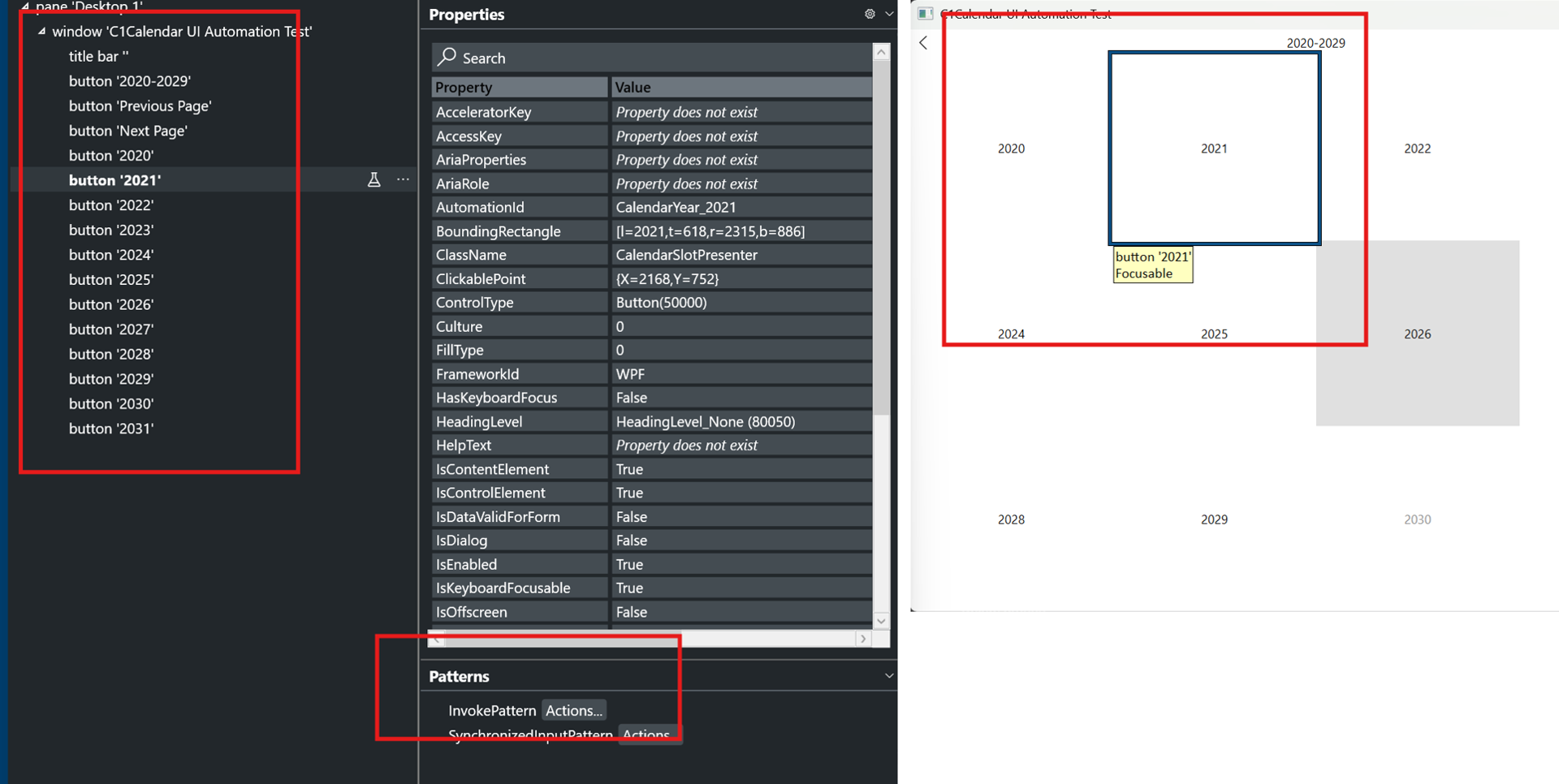
The following image shows a year choice in Decade view. Accessibility Insights for Windows displays its <span class="code" spellcheck="false" data-prosemirror-content-type="mark" data-prosemirror-mark-name="code">Button</span> control type and **<span class="code" spellcheck="false" data-prosemirror-content-type="mark" data-prosemirror-mark-name="code">InvokePattern</span>**.
![WPF Calendar Accessibility Insights showing a year choice in Decade view as a button with the Invoke pattern.](https://cdn.mescius.io/document-site-files/images/aa932af9-ea21-4e7f-9114-1f57bdf10e97/image-20261008.428808.png?width=800)
For information about calendar views, see [Display Modes](/componentone/docs/wpf/online-calendar/behavior/display-modes). For general calendar navigation, see [Navigation](/componentone/docs/wpf/online-calendar/behavior/navigation).

## Focus Reporting

When keyboard focus is within the calendar, automation reports the selected date or current month or year as focused.