# Windows Elements
## Content
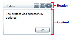
This section provides a visual and descriptive overview of the elements that comprise the C1Window control. Like a typical dialog box, the C1Window control includes two main elements: a header and a content area:
### Header
The header area includes the typical caption bar elements including title text and **Minimize**, **Maximize**, and **Close** buttons:
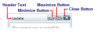
You can set the text in the header with the **Header** property. You can set the visibility of the buttons using the [ShowCloseButton](/componentone/api/wpf/online-basiclibrary/dotnet-framework-api/C1.WPF.4.6.2/C1.WPF.C1Window.ShowCloseButton.html), [ShowMaximizeButton](/componentone/api/wpf/online-basiclibrary/dotnet-framework-api/C1.WPF.4.6.2/C1.WPF.C1Window.ShowMaximizeButton.html), and [ShowMinimizeButton](/componentone/api/wpf/online-basiclibrary/dotnet-framework-api/C1.WPF.4.6.2/C1.WPF.C1Window.ShowMinimizeButton.html) properties. By default all three properties are **True** and the buttons are visible. You can also set the **Header** property to a **UIElement**, which would allow you to add an icon next to the text in the caption bar.
**Setting HeaderText**
You can set the Header text in XAML markup, in code, or at design time.
* **In XAML**
To set the Header text, use the following markup:
```xml
```
* **In Code**
Use the following code to set the Header property:
```vbnet
Me.C1Window1.Header = "Hello World!"
```
```csharp
this.c1window1.Header = "Hello World!";
```
* **At Design Time**
To set the Header property at design time, complete the following steps:
1. Click the **C1Window** control once to select it.
2. Navigate to the Properties window and locate the Header item.
3. Click in the text box next to the Header item, and enter "Hello World!" or some other text.
This will set the Header property and the text in the caption bar of the dialog window to the text you chose.
**Hiding Header Buttons**
By default the window displays **Minimize**, **Maximize**, and **Close** buttons, but you can customize this at design time, in XAML, and in code.
* **In XAML**
Use markup similar to the following to set the visibility for the header buttons:
```xml
```
* **In Code**
Use code similar to the following to set the visibility for the header buttons:
```vbnet
Me.C1Window1.ShowMaximizeButton = False
Me.C1Window1.ShowMinimizeButton = False
```
```csharp
this.c1window1.ShowMaximizeButton = false;
this.c1window1.ShowMinimizeButton = false;
```
* **At Design Time**
To hide the **Maximize** and **Minimize** buttons, complete the following steps:
1. Click the **C1Window** control once to select it.
2. Navigate to the Properties window.
3. Locate the **ShowMaximizeButton** item and clear the check box next to the item.
4. Locate the **ShowMinimizeButton** item and clear the check box next to the item.
### Content
The content area of the **C1Window** control can be set using the **Content** property. The content area can contain controls, a panel (such as a Grid or StackPanel) that contains controls, text, or other elements. You can, for example, set the **Content** property to a **UserControl** that contains many controls and elements.
Setting the **Content** property is simple using XAML markup:
```xml
```